I’m a product & UX designer with 8+ years of experience across India and the Netherlands. I take digital products from research to shipped UI — user flows, design systems and usability testing for web and mobile.
Ik ben product- & UX-ontwerper met 8+ jaar ervaring in India en Nederland. Ik breng digitale producten van onderzoek tot opgeleverde UI — user flows, design systems en usability testing voor web en mobiel.
Trained at NID Ahmedabad, with an MSc in Digital Design from the Amsterdam University of Applied Sciences. I’ve led design at Havells India, Infosys Digital, KATHA and the Digital Society School. A few selected projects are below.
Opgeleid aan het NID Ahmedabad, met een MSc Digital Design van de Hogeschool van Amsterdam. Ik heb design geleid bij Havells India, Infosys Digital, KATHA en de Digital Society School. Hieronder een selectie van mijn werk.
A selection of projects I’ve worked on. For detailed case studies, I’m happy to walk you through them — get in touch.
Een selectie van projecten waaraan ik heb gewerkt. Uitgebreide case studies loop ik graag met je door — neem contact op.
Product Design · Design Systems · Visual Identity
Productontwerp · Design systems · Visuele identiteit
Can an AI trip planner feel as warm as the holiday it’s planning?
Kan een AI-reisplanner net zo warm voelen als de vakantie die hij plant?
Brand and design system for TripGoGo’s AI trip planner — colour, typography and UI components, built from the ground up.
Merk en design system voor de AI-reisplanner van TripGoGo — kleur, typografie en UI-componenten, vanaf nul opgebouwd.
UX Research · Product Design · Sustainability
UX-onderzoek · Productontwerp · Duurzaamheid
Every website has a carbon cost. Design agencies had no way to see theirs.
Elke website heeft een CO₂-prijs. Designbureaus konden die van hen niet zien.
A benchmarking tool that helps design agencies evaluate and improve their digital sustainability, project by project. Built with Faraday Digital Agency.
Een benchmarking-tool waarmee designbureaus hun digitale duurzaamheid per project evalueren en verbeteren. Gebouwd met Faraday Digital Agency.
Game Design · UX Research · Media Literacy
Game design · UX-onderzoek · Mediawijsheid
What does responsible AI look like inside a newsroom?
Hoe ziet verantwoorde AI eruit op een redactie?
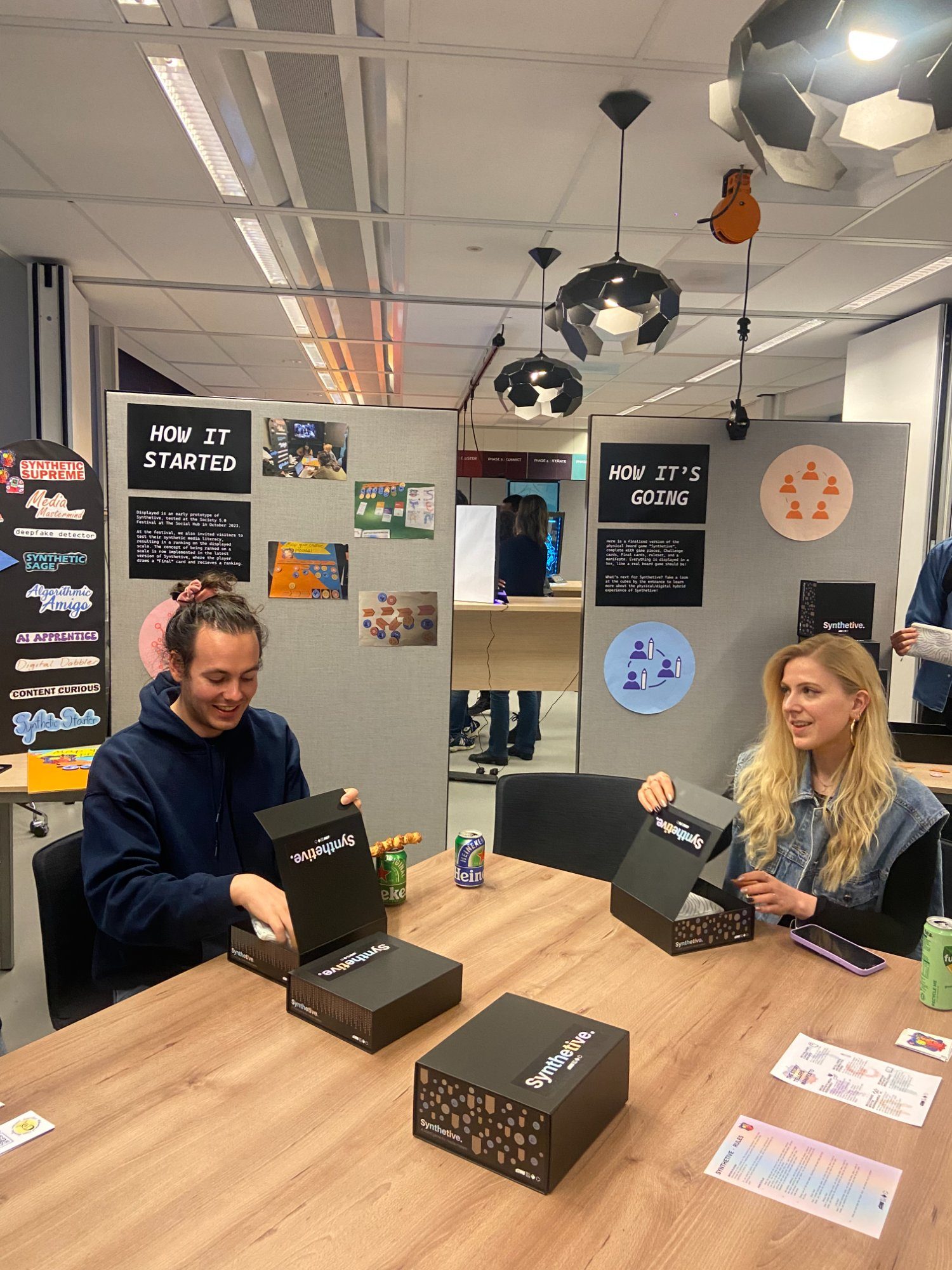
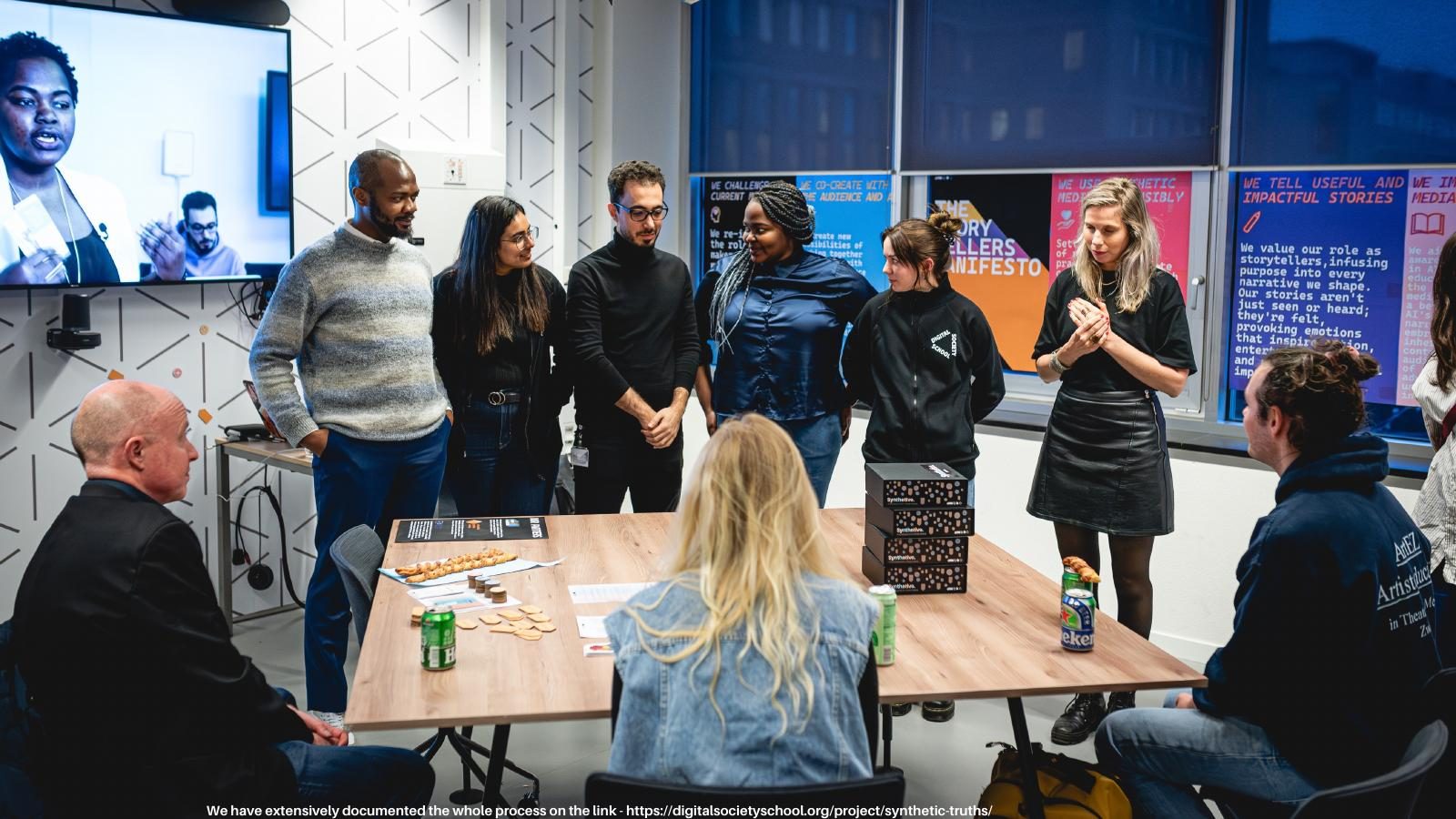
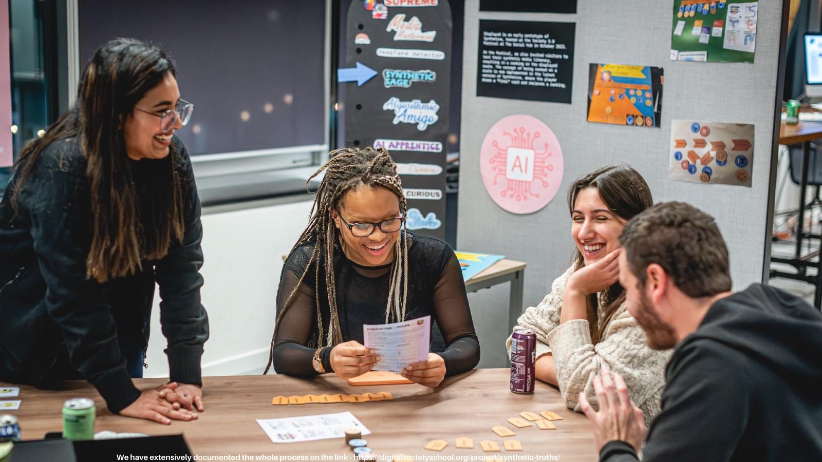
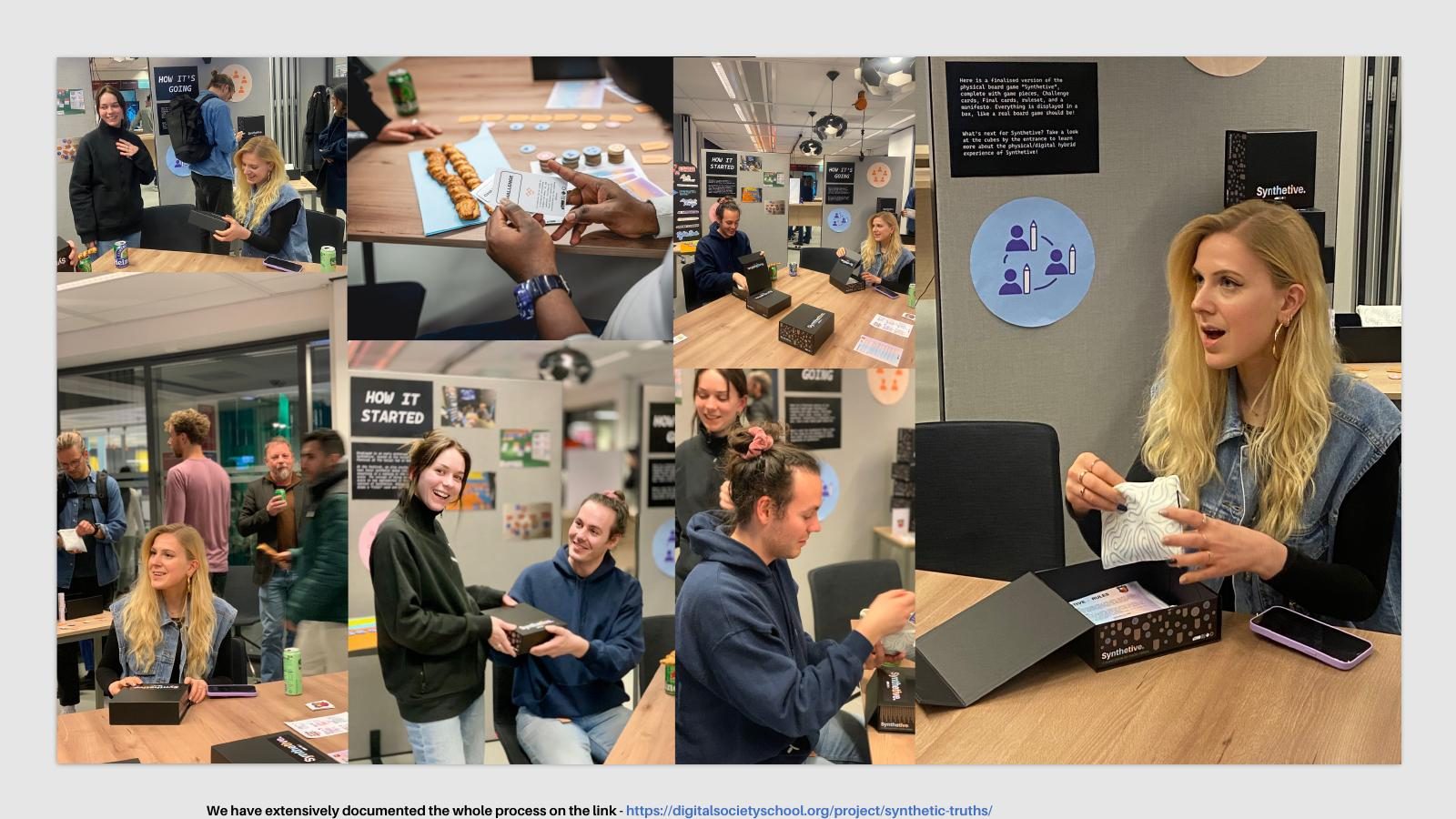
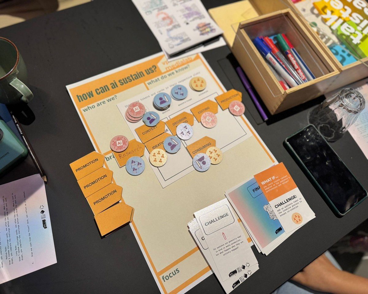
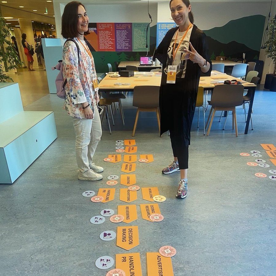
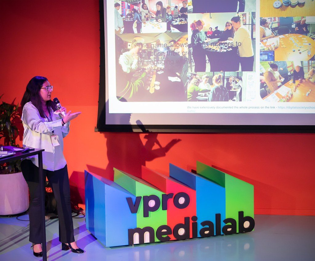
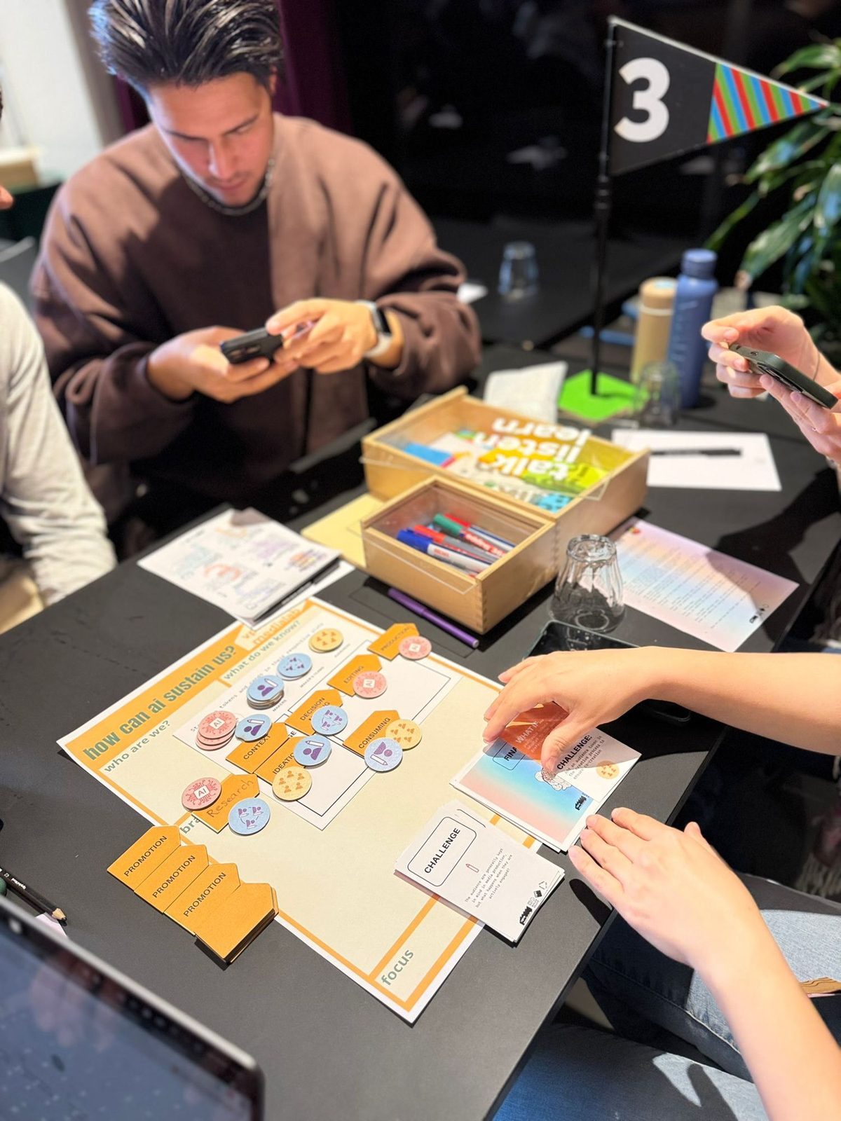
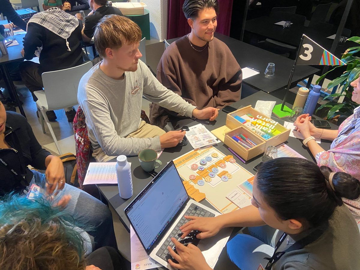
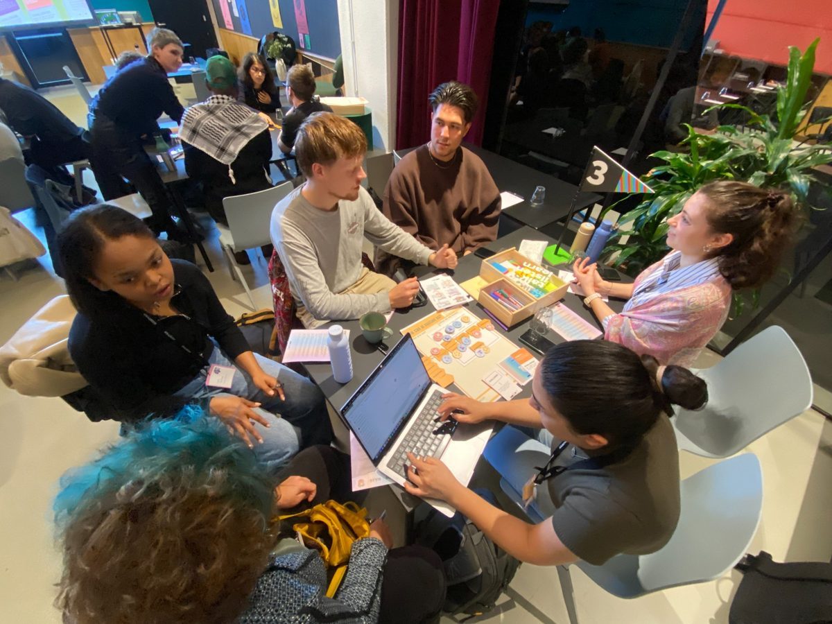
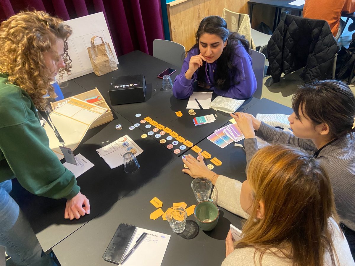
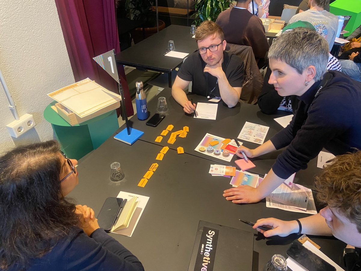
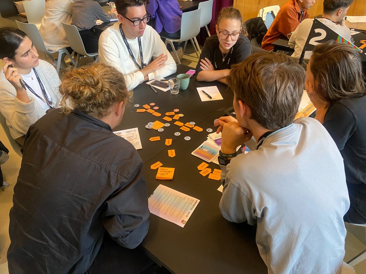
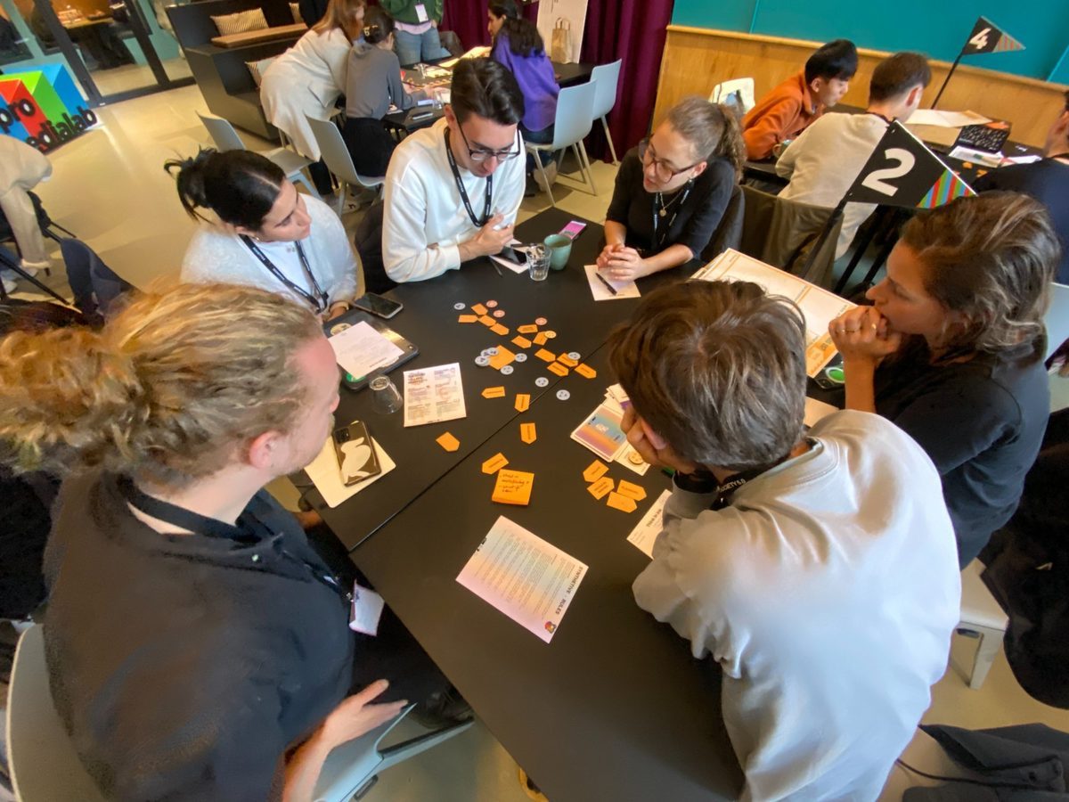
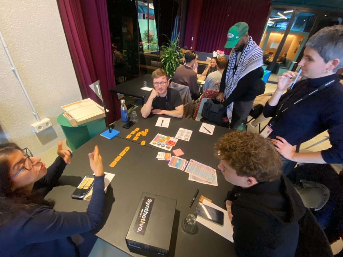
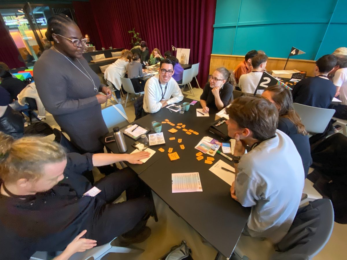
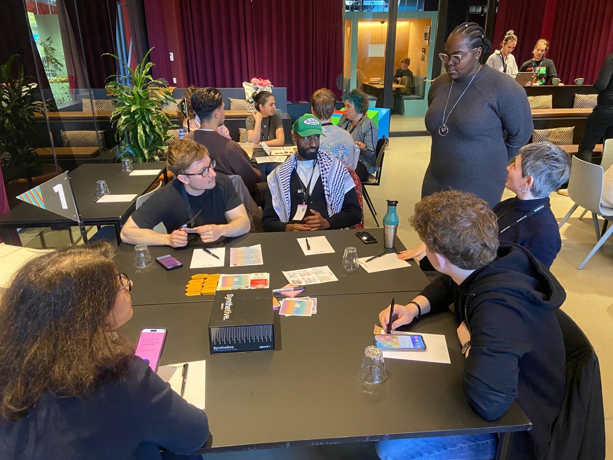
A card-based game co-designed with VPRO Medialab and 10+ media stakeholders. Winner of the Go HvA Public Choice Award 2024.
Een kaartspel, samen ontworpen met VPRO Medialab en 10+ mediapartijen. Winnaar van de Go HvA Public Choice Award 2024.
Interaction Design · Physical + Digital · Speculative Design
Wat zou een gebouw zich herinneren, als je het vroeg?
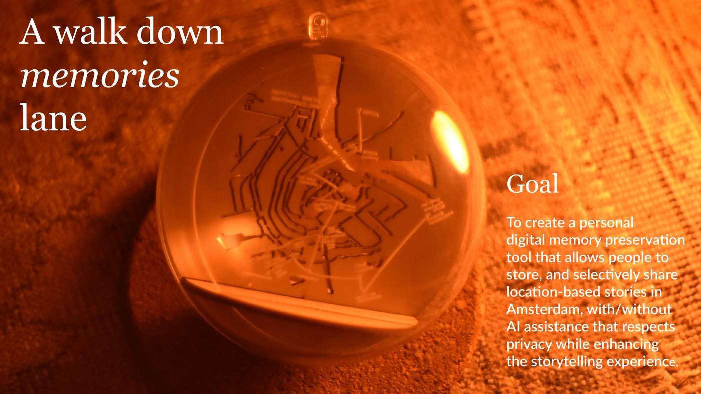
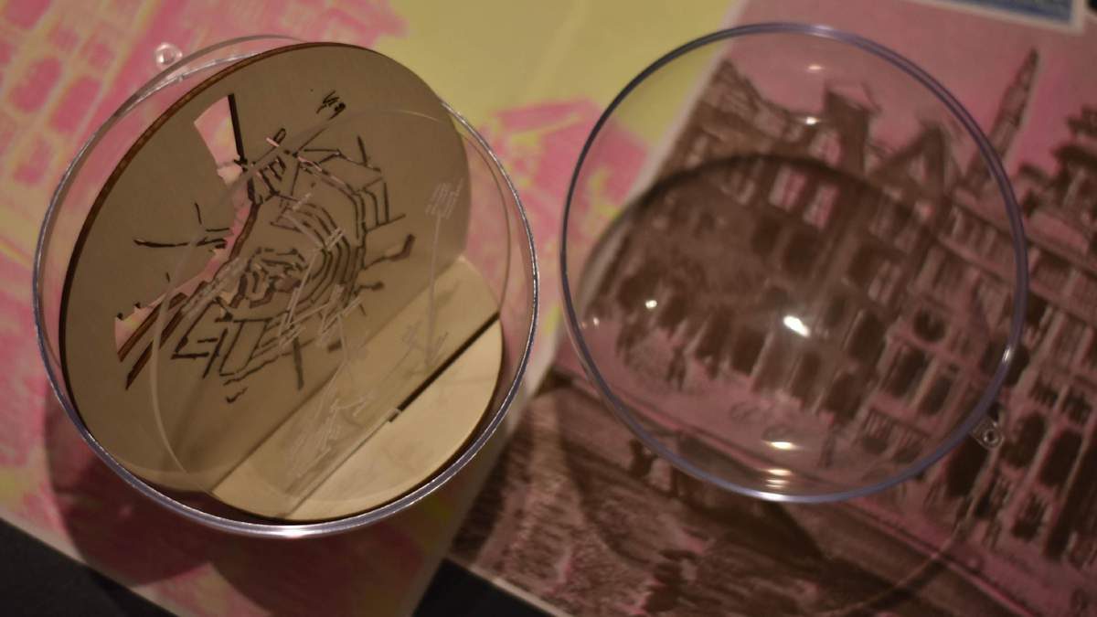
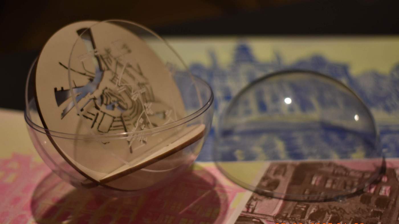
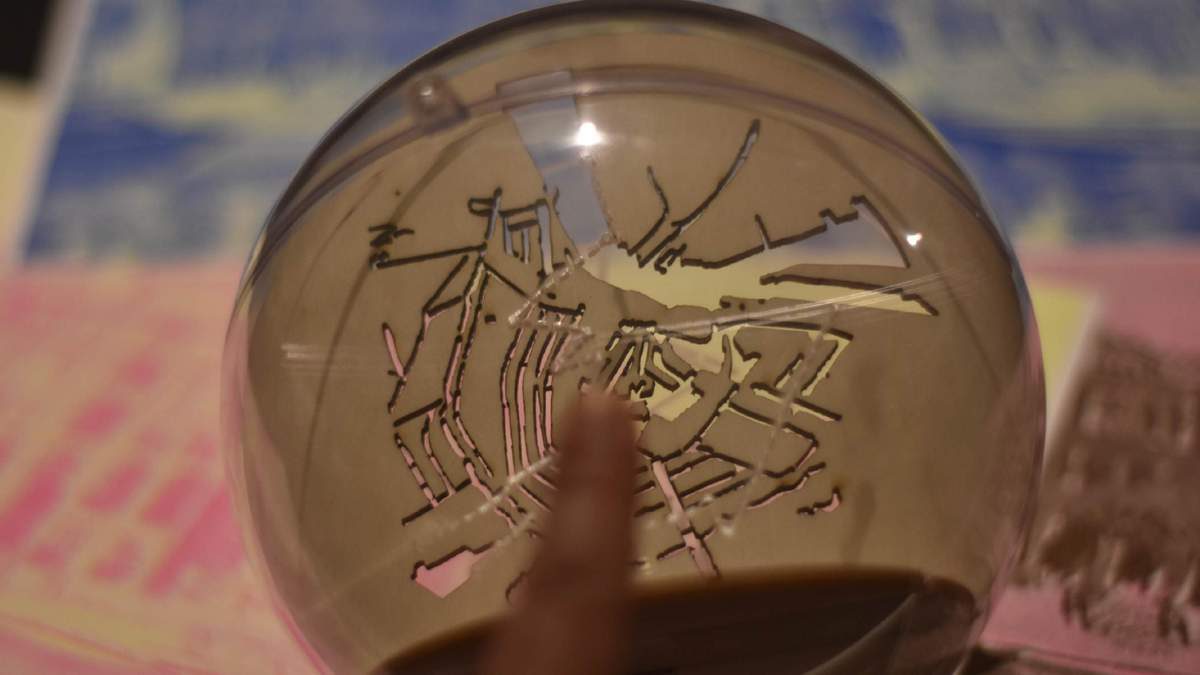
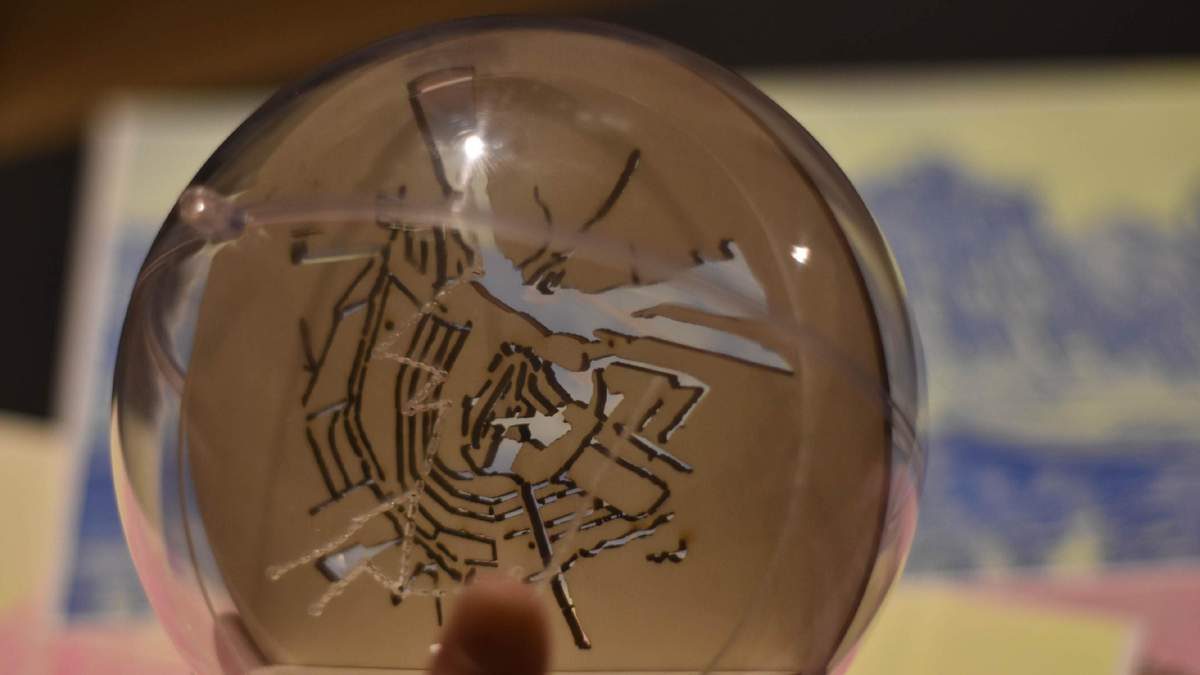
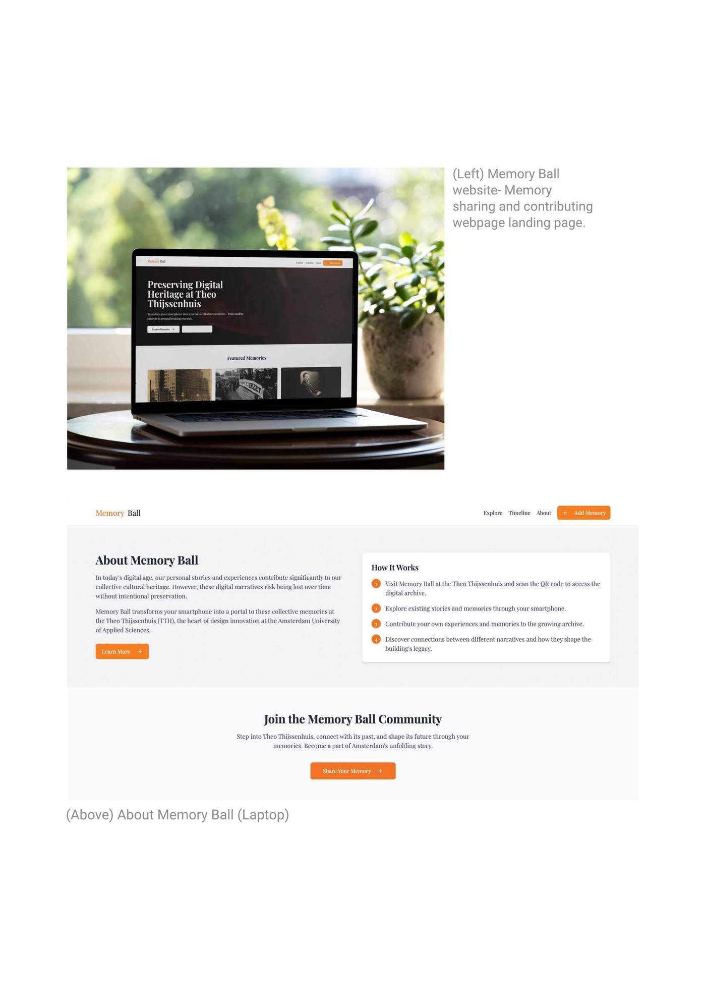
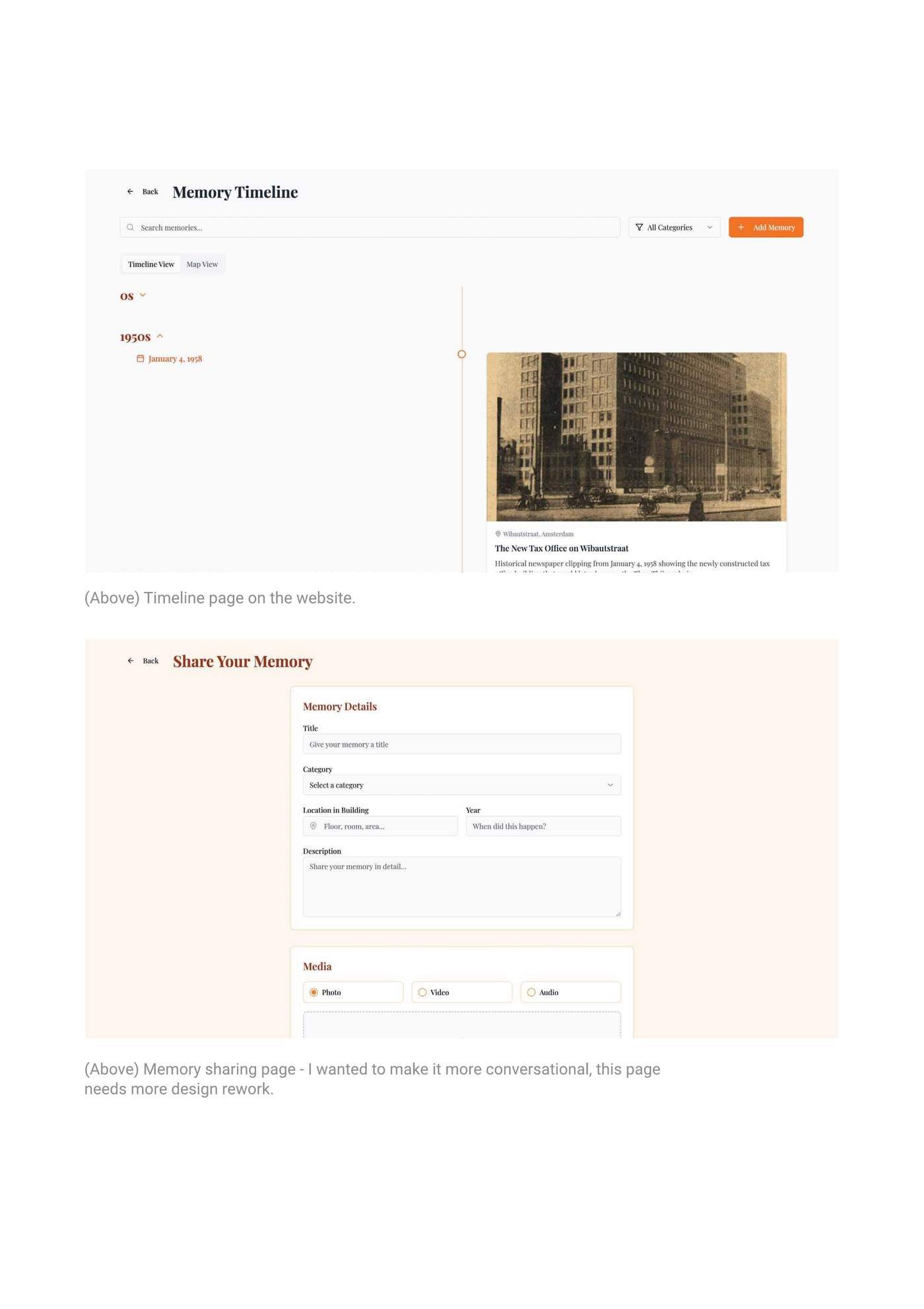
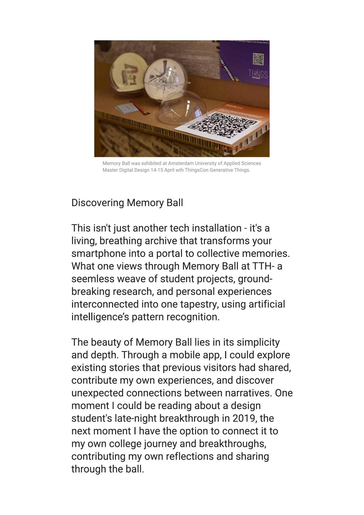
A proximity-sensing bronze sphere and web app at HvA’s Theo Thijssenhuis. Featured in the ThingsCon State of Responsible Technology Report 2025.
Een bronzen bol met nabijheidssensor en een web-app in het Theo Thijssenhuis (HvA). Opgenomen in het ThingsCon State of Responsible Technology Report 2025.
Service Design · Co-design · Toolkit Design
Service design · Co-design · Toolkitontwerp
How do you start the conversation no one wants to have?
Hoe begin je het gesprek dat niemand wil voeren?
A deck of 50+ prompt cards that guides end-of-life conversations, from memorial wishes to digital legacy. Presented at RSD14 (OCAD University, Toronto). Co-created with Victor Jimoh, Dewi Lagerberg and Vera Karulina.
Een set van 50+ gesprekskaarten die gesprekken over het levenseinde begeleidt, van uitvaartwensen tot digitale nalatenschap. Gepresenteerd op RSD14 (OCAD University, Toronto). Samen ontwikkeld met Victor Jimoh, Dewi Lagerberg en Vera Karulina.
More workMeer werk
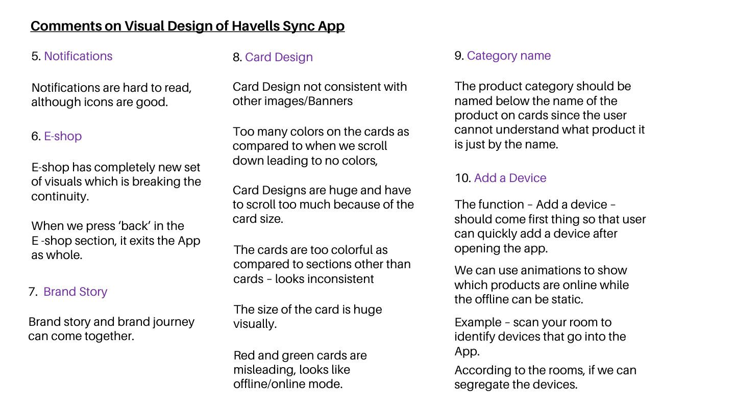
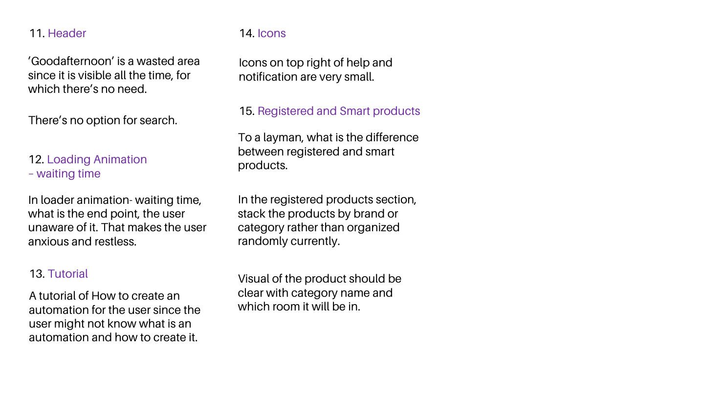
Havells Sync — App Audit & Redesign
Havells Sync — App-audit & herontwerp
Full audit of a smart home app, turned into ten prioritised redesign recommendations.
Volledige audit van een smart-home-app, vertaald naar tien geprioriteerde herontwerp-aanbevelingen.
UX Audit
UX-audit
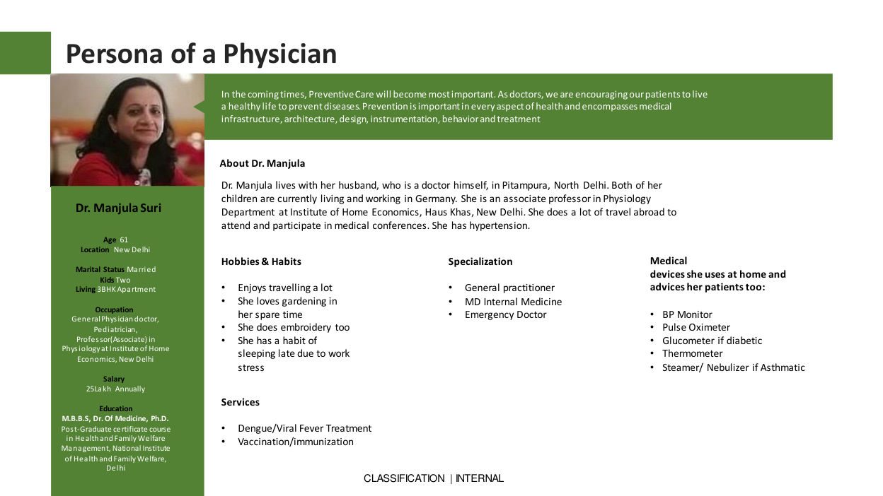
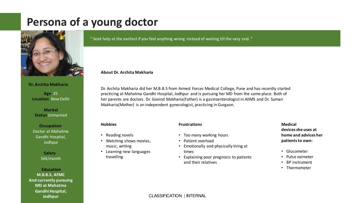
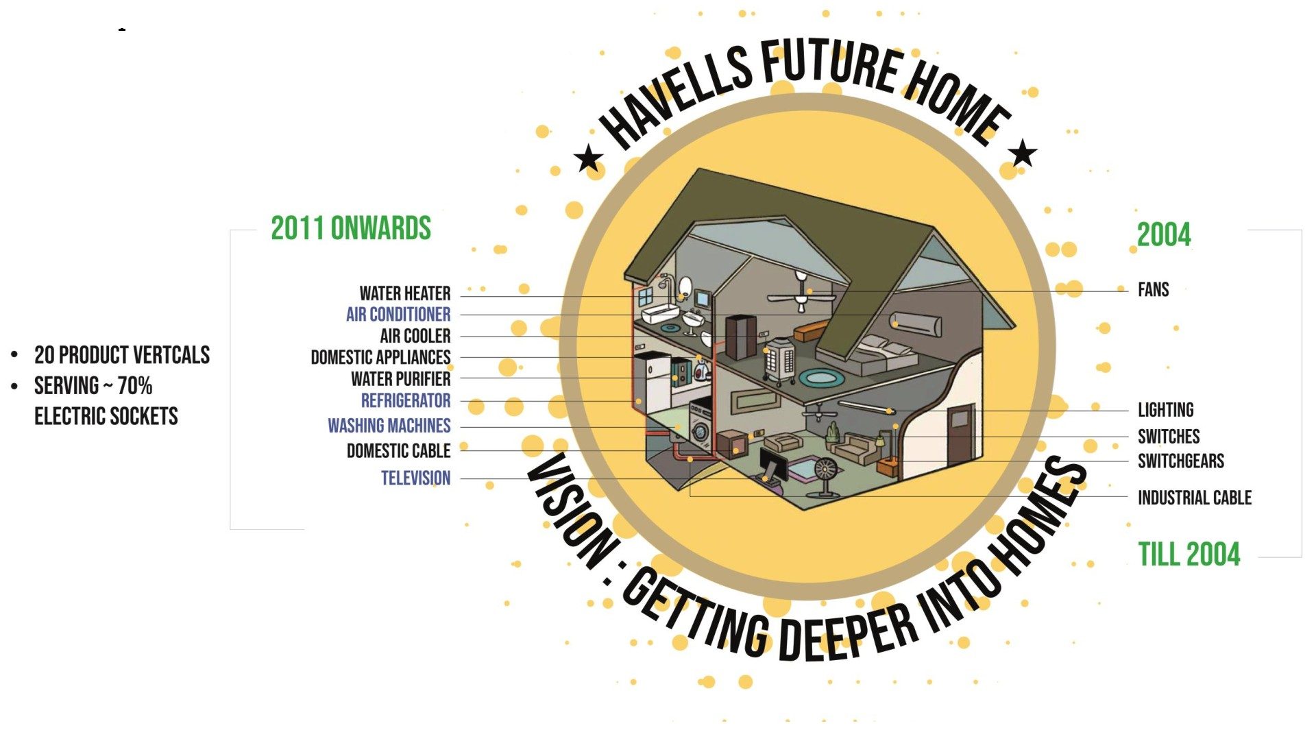
Havells WellTech
Havells WellTech
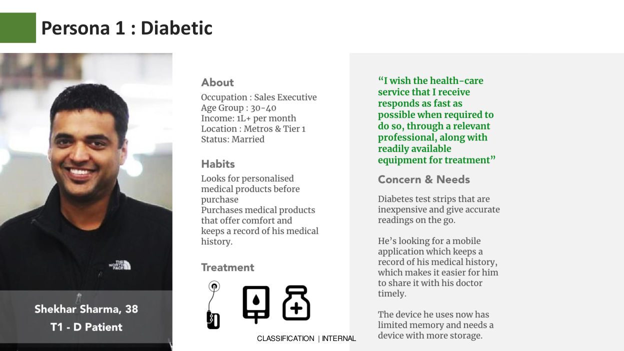
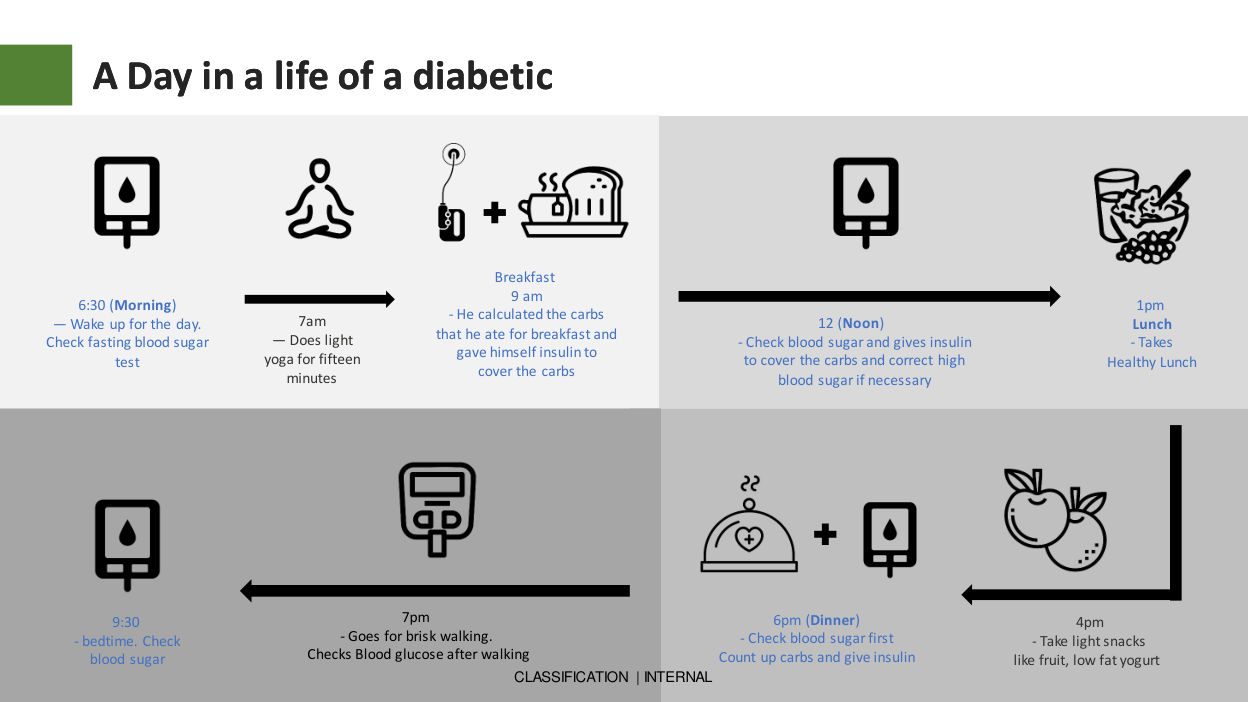
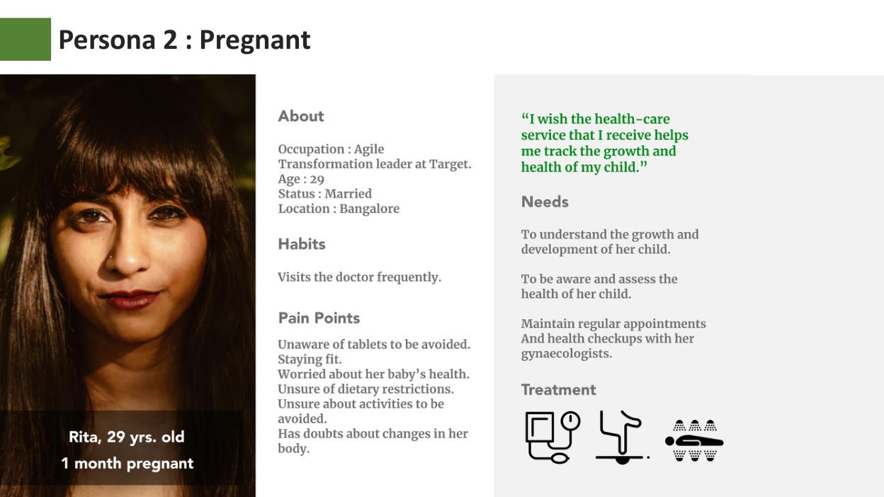
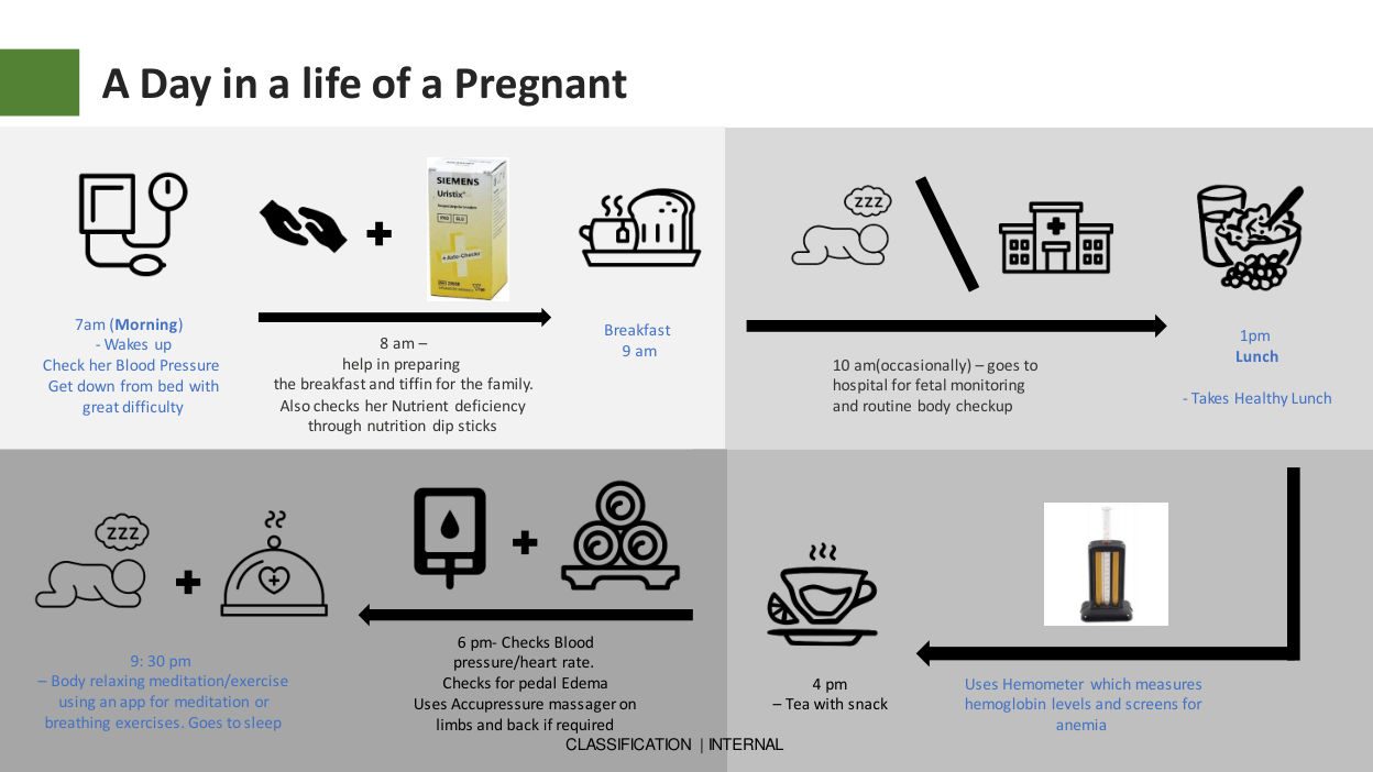
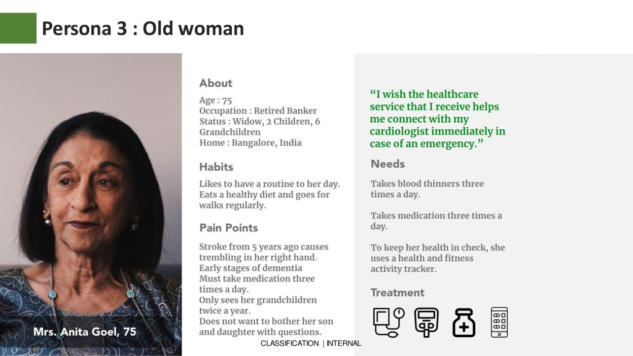
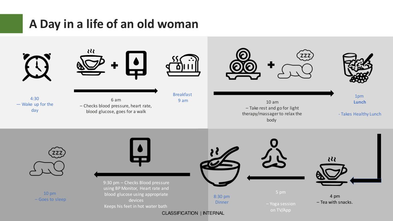
Consumer research, personas and a go-to-market strategy for India’s home healthcare market.
Consumentenonderzoek, persona’s en een go-to-marketstrategie voor de Indiase home-healthcaremarkt.
Product Strategy
Productstrategie
Feelscape — A 3D Storybook
Feelscape — Een 3D Verhalenboek
Tactile + audio map that teaches visually impaired children (4–6) real-world concepts without Braille.
Tactiele audio-kaart die visueel beperkte kinderen (4–6) concepten leert zonder Braille.
Accessibility
Toegankelijkheid
Synthetive: Election Edition
Synthetive: Verkiezingseditie
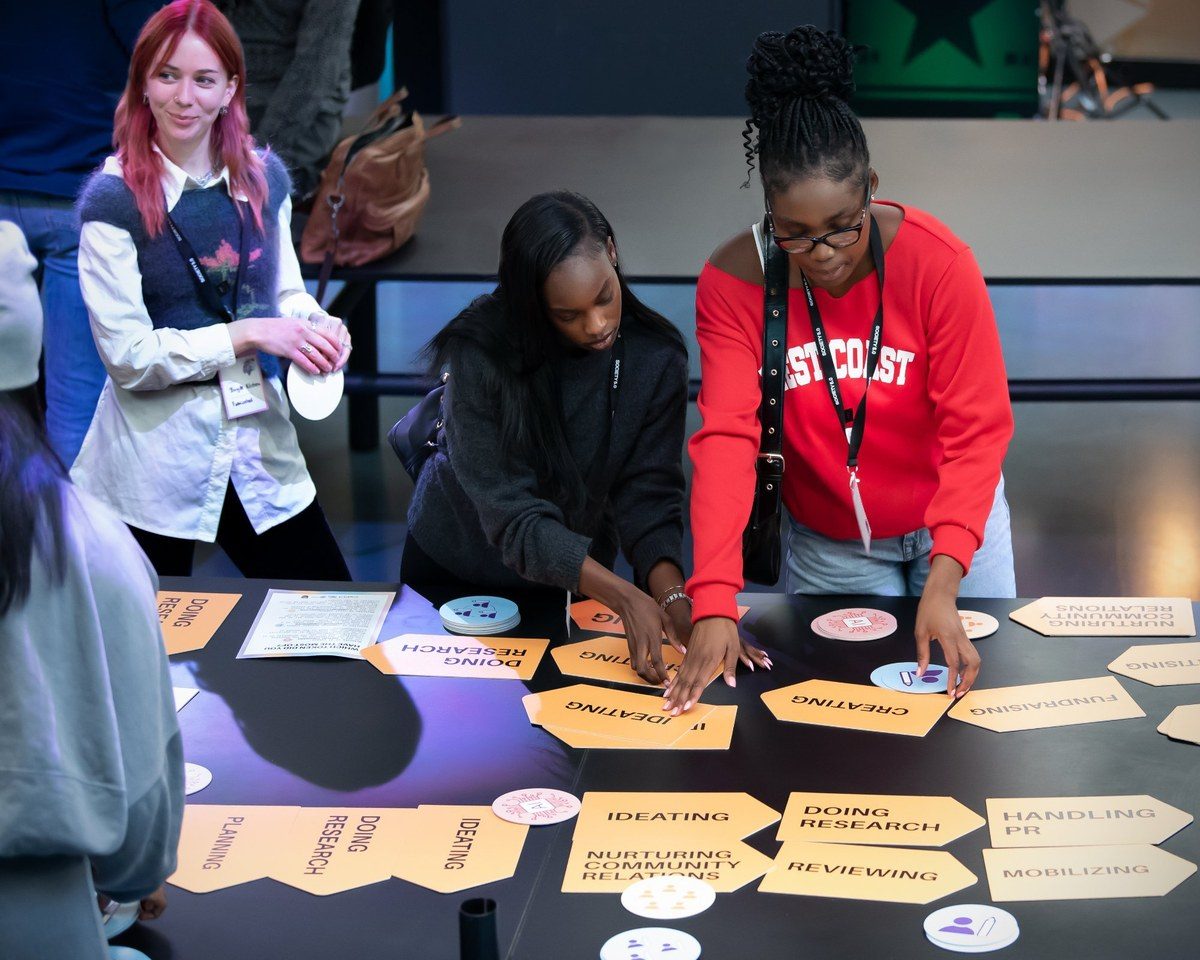
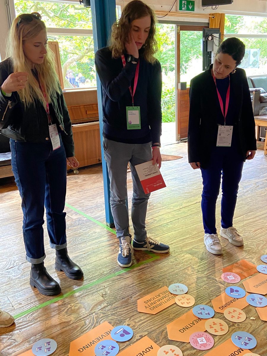
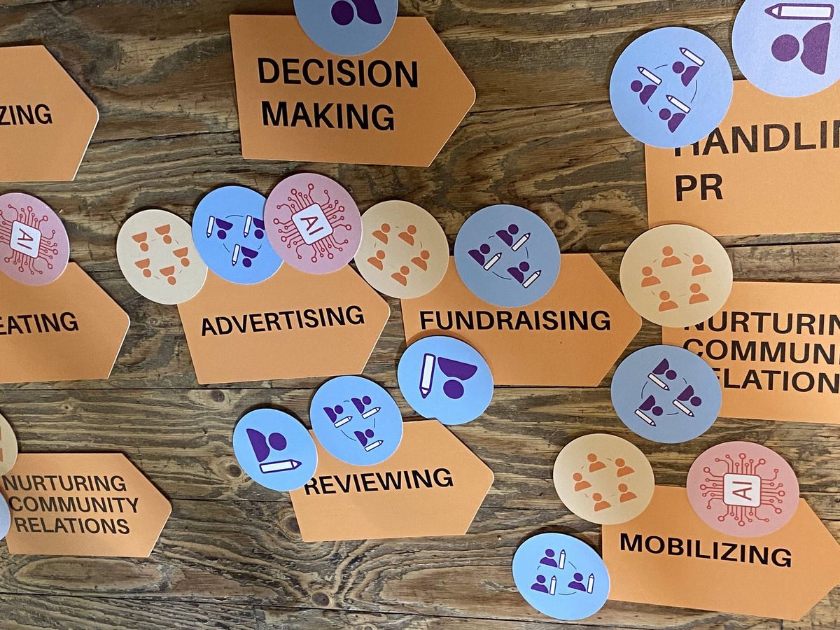
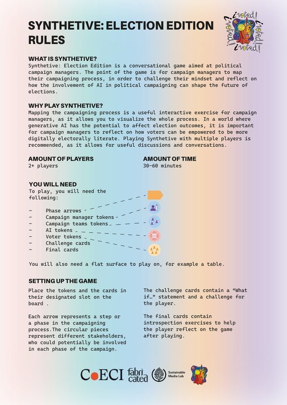
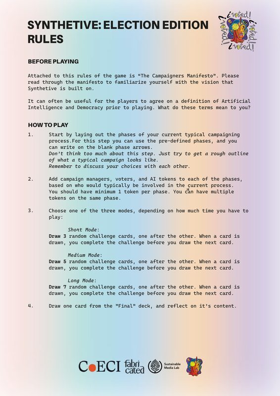
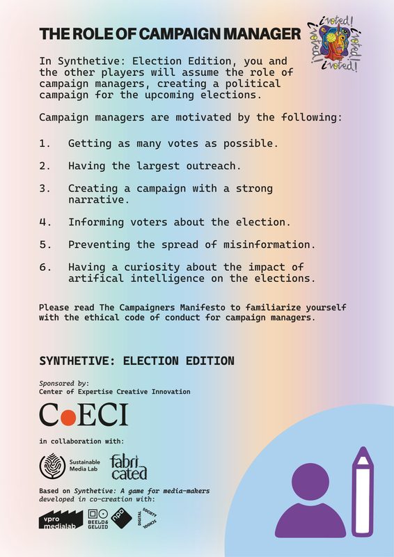
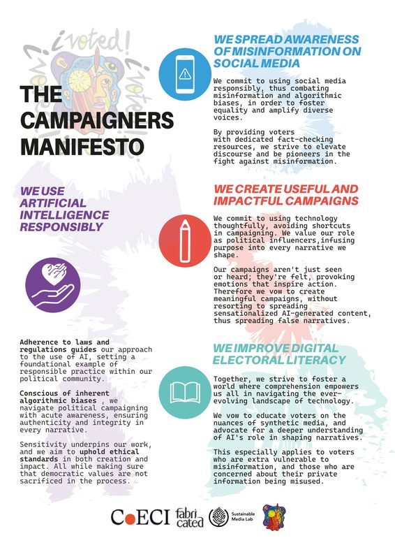
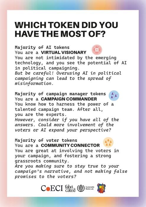
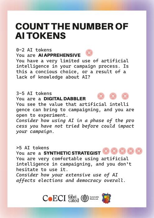
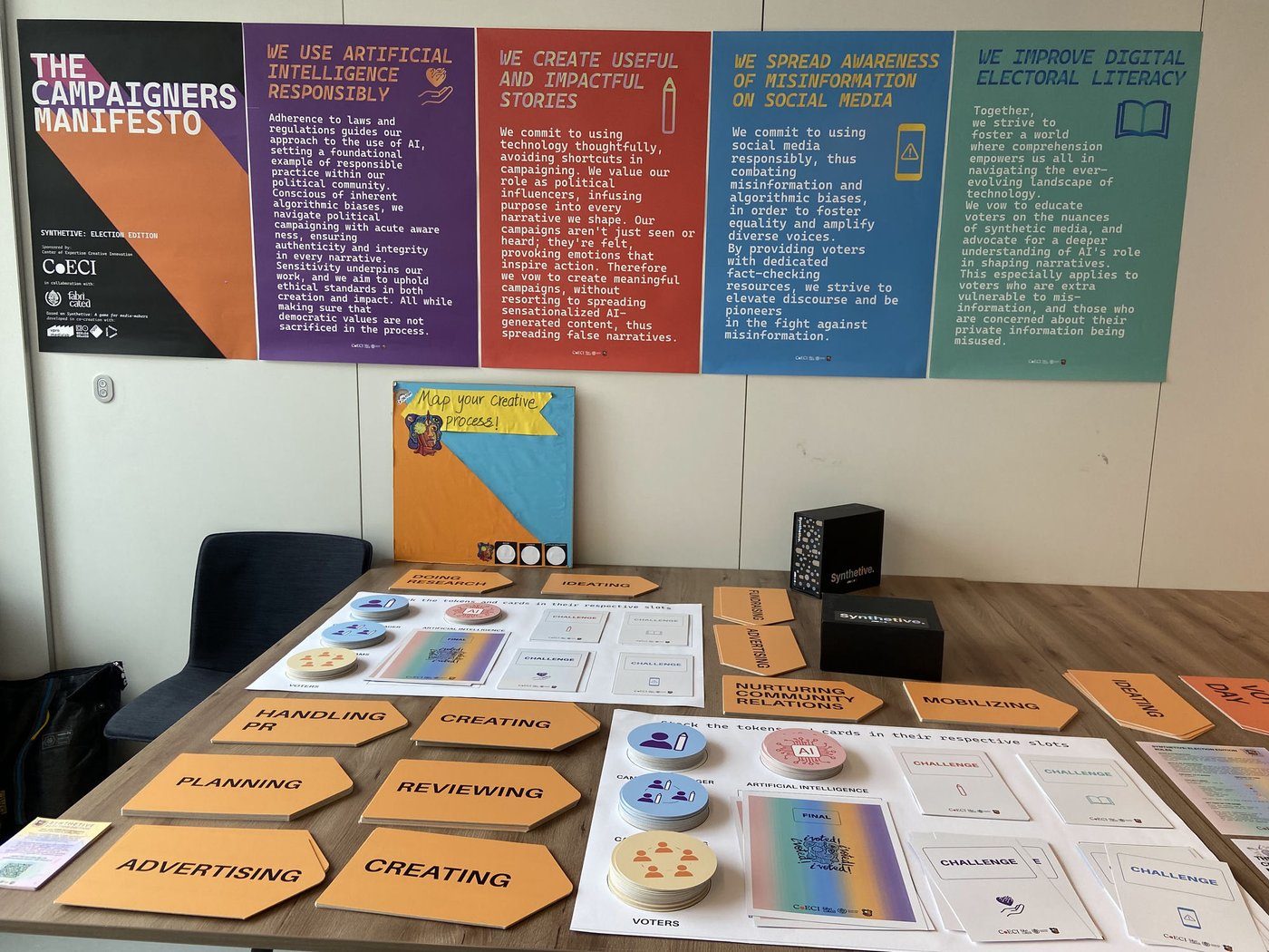
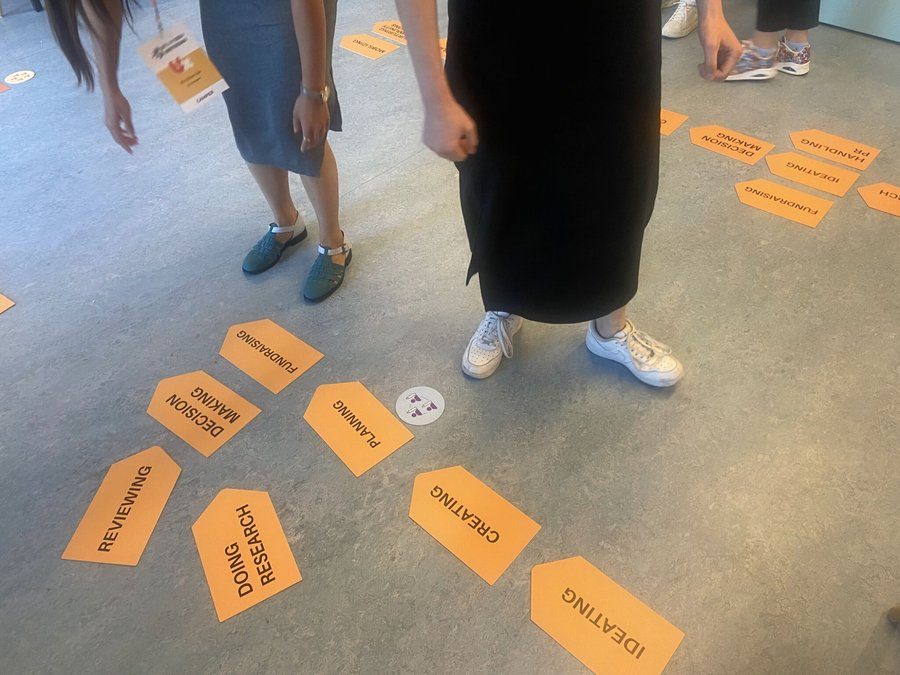
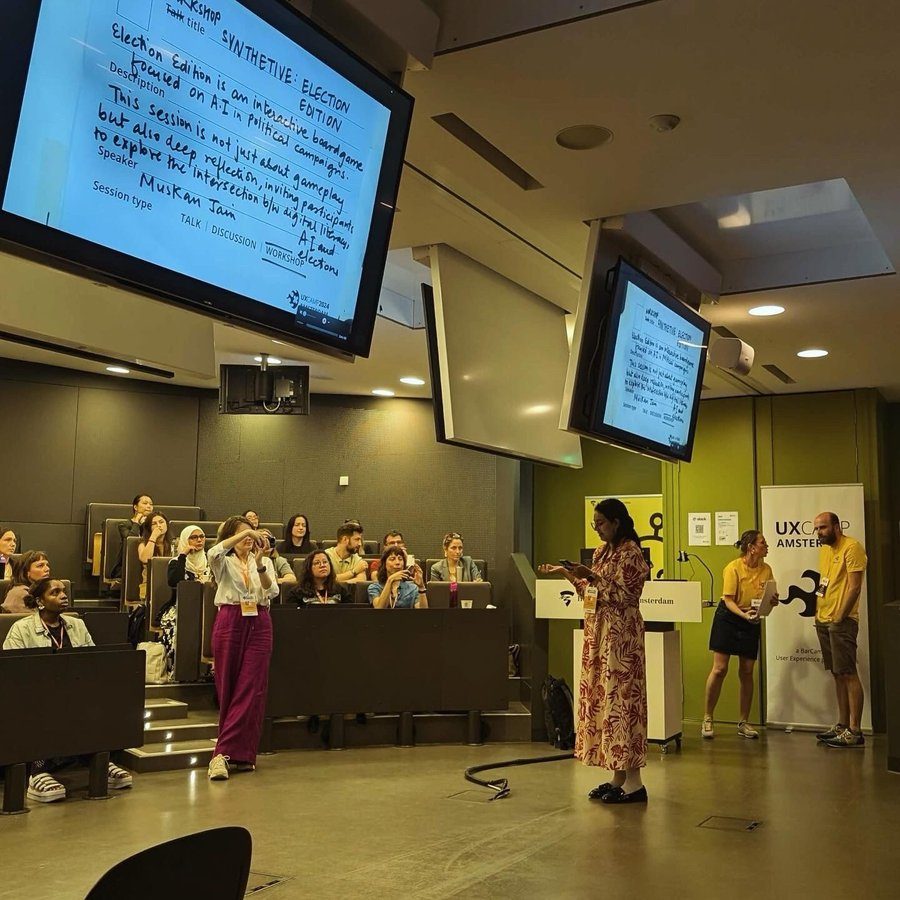
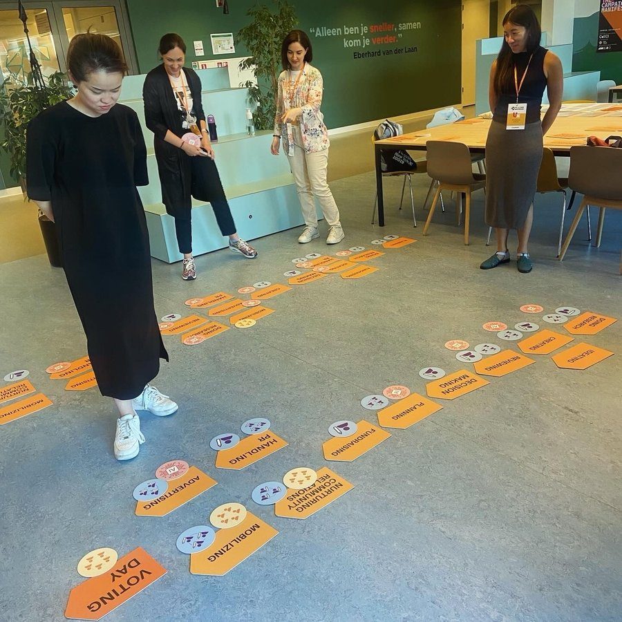
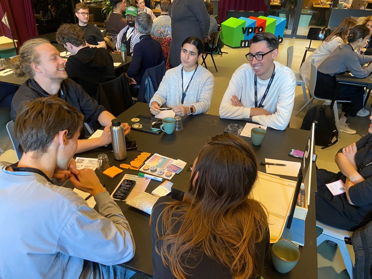
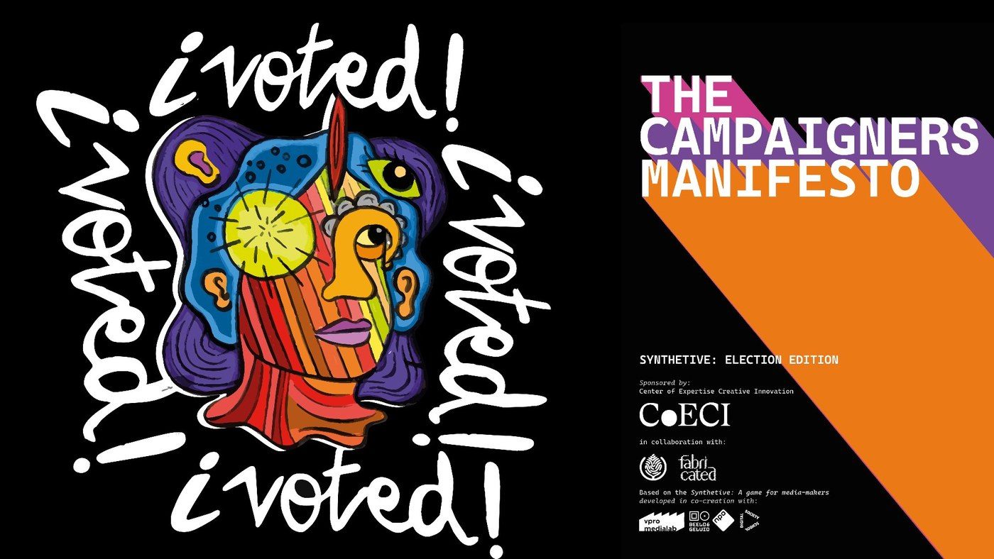
Boardgame on the (ir)responsible use of AI in political campaigns. Shown at VPRO Medialab, Society 5.0 and MozFest.
Bordspel over (on)verantwoord AI-gebruik in politieke campagnes. Getoond bij VPRO Medialab, Society 5.0 en MozFest.
Game Design
Game design
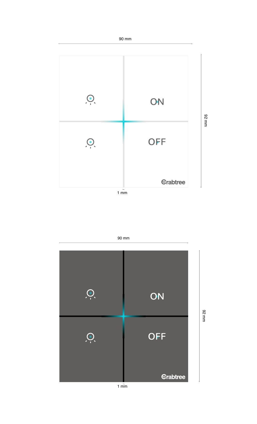
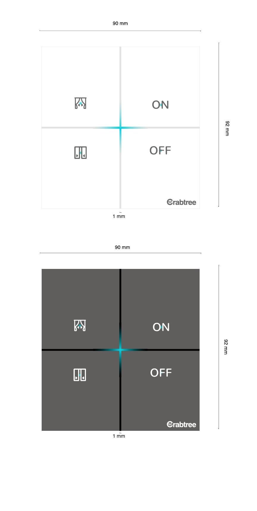
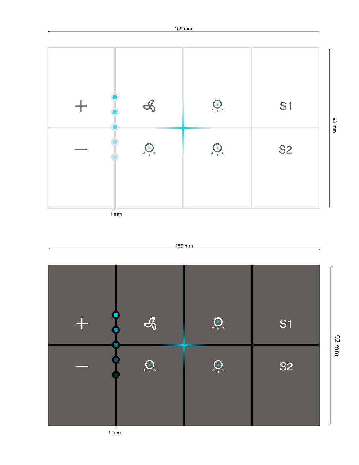
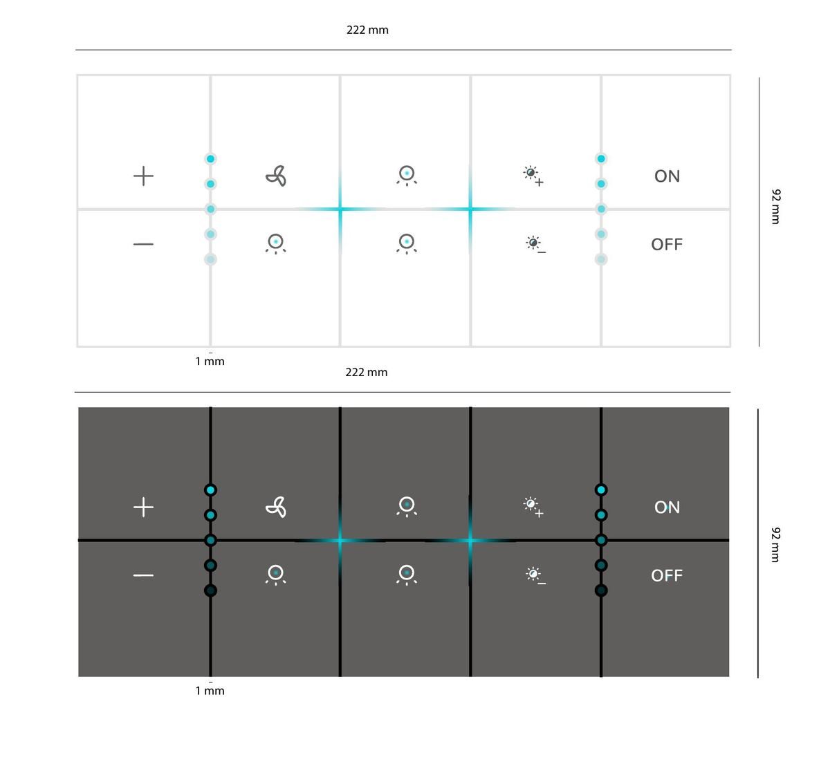
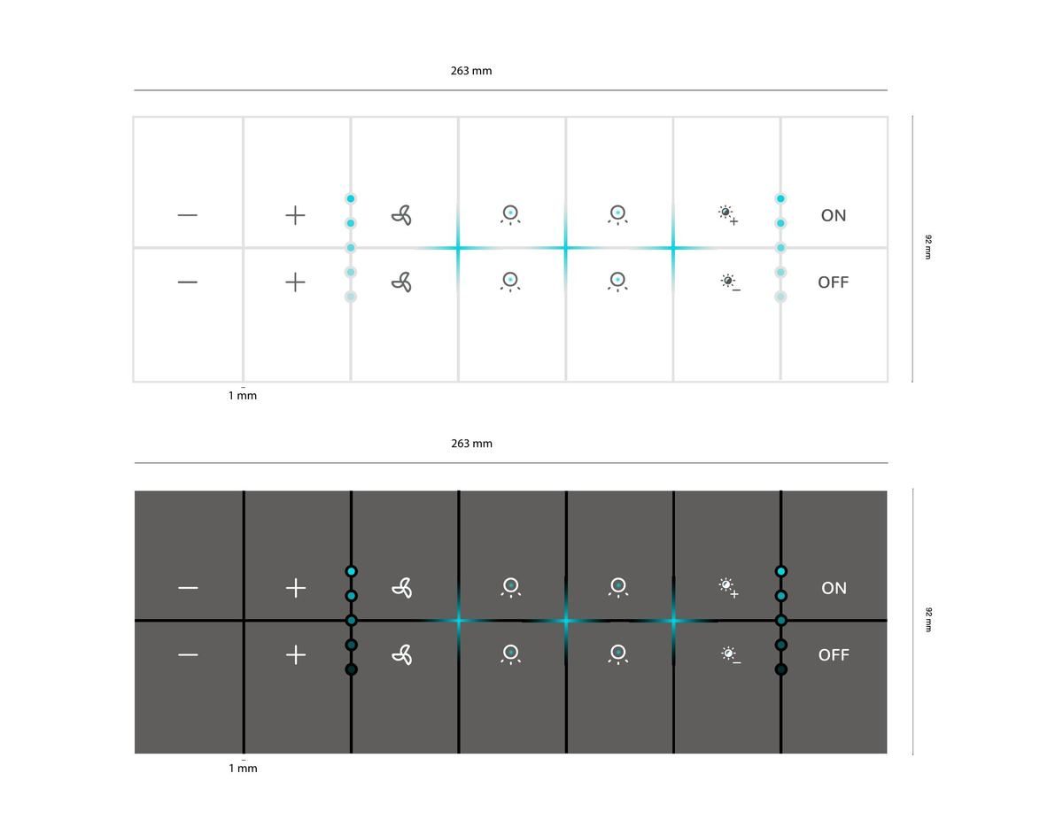
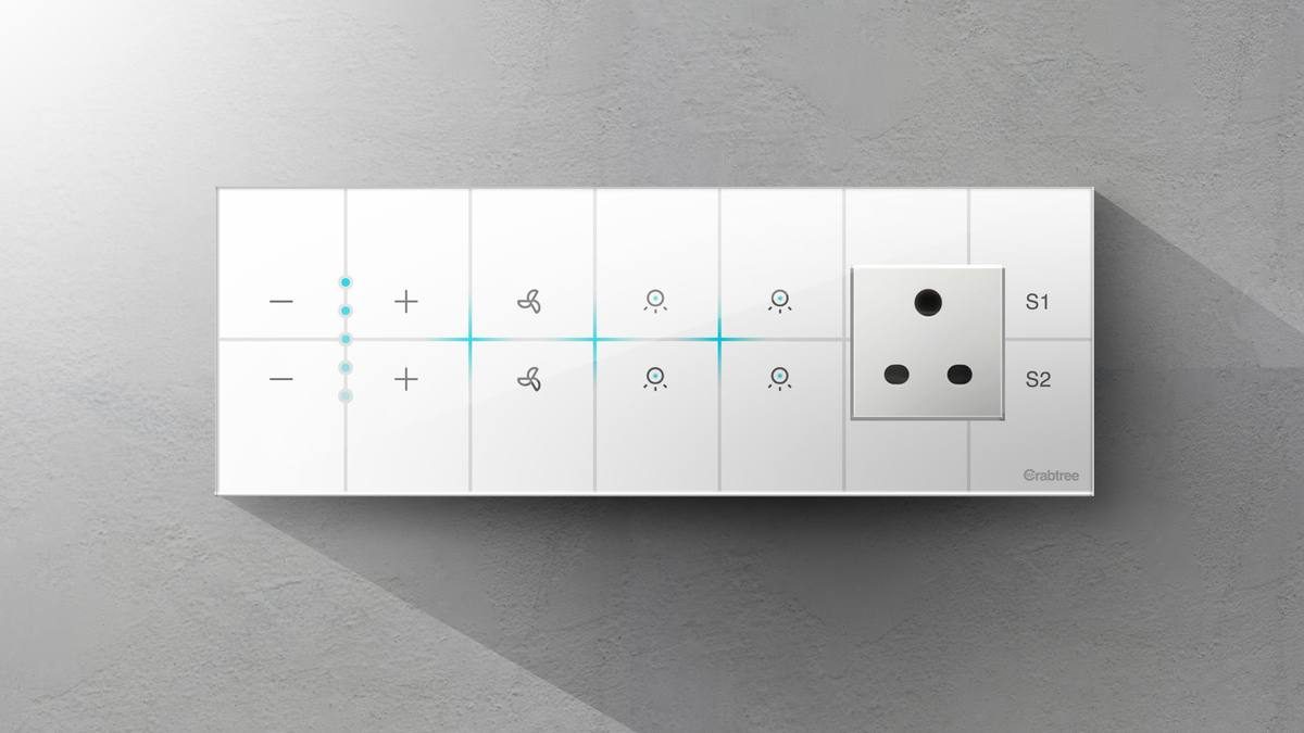
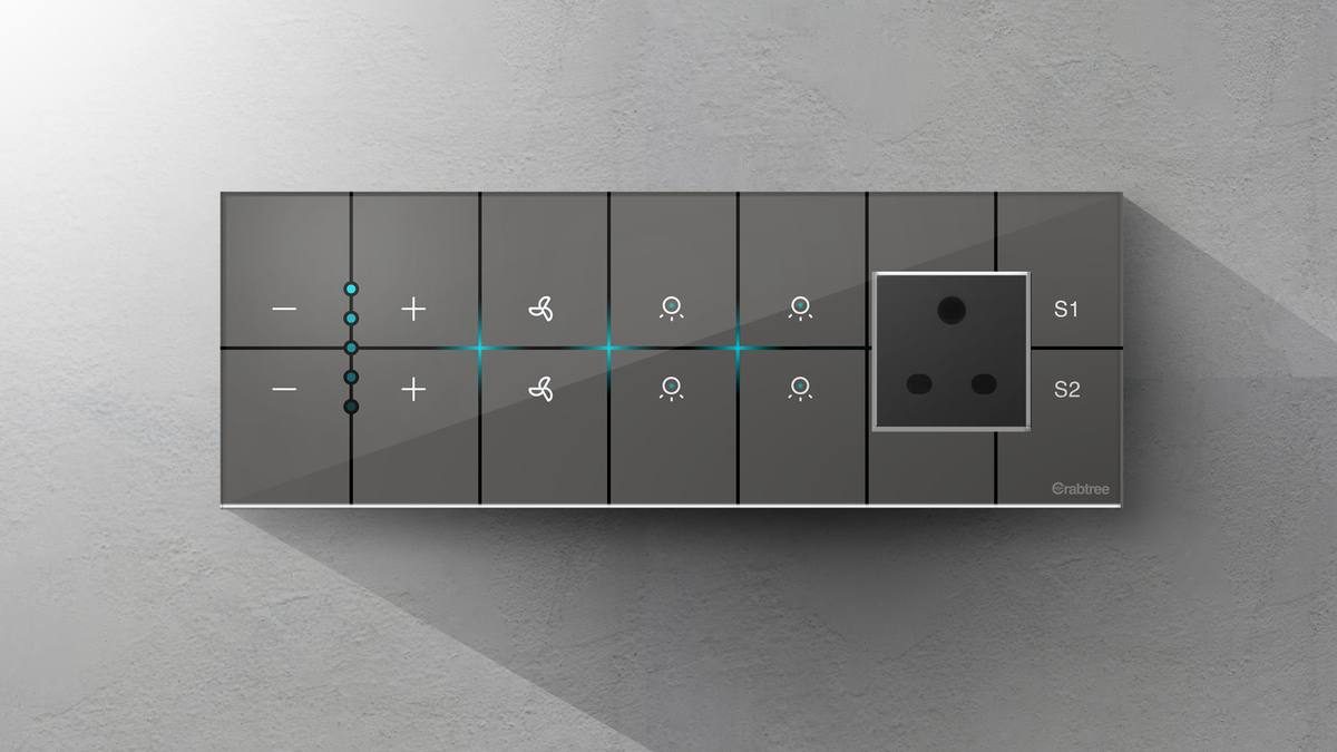
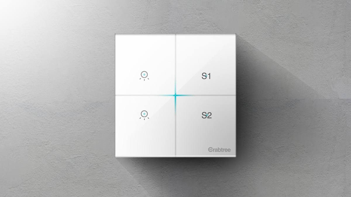
Crabtree iSense — Touch Switch
Crabtree iSense — Aanraakschakelaar
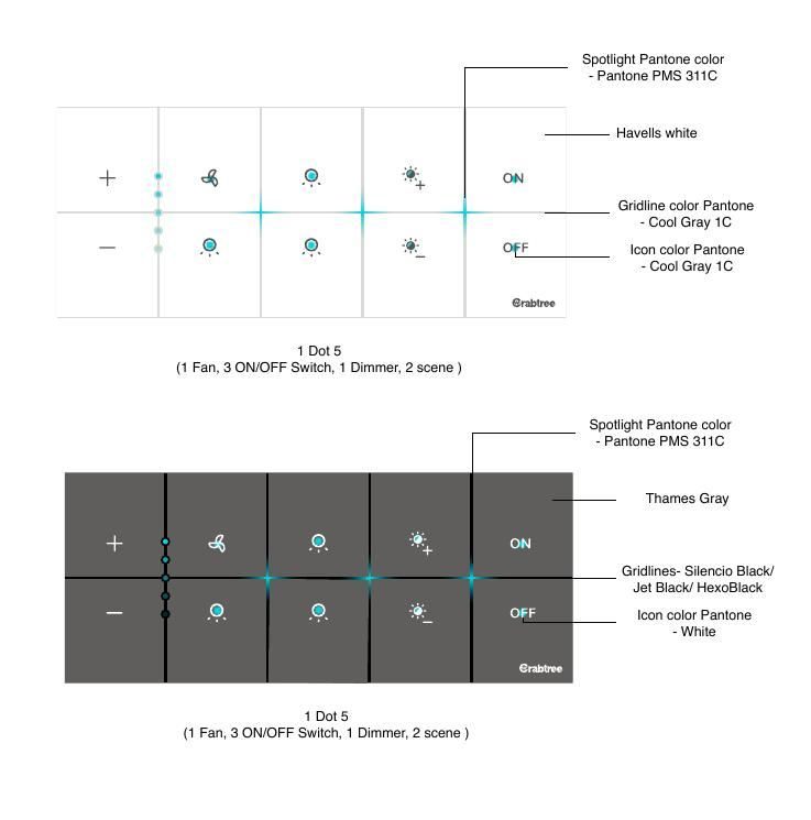
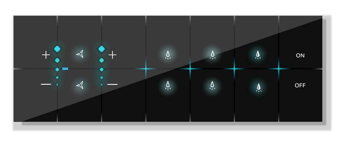
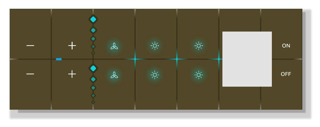
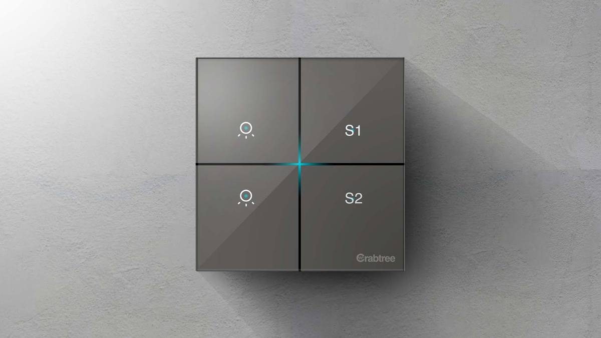
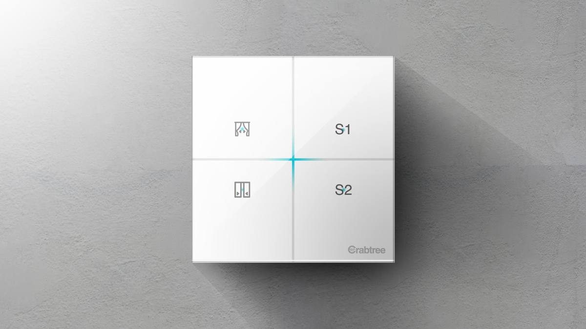
Hardware design system: icon vocabulary, Pantone colour tokens and a full SKU matrix.
Hardware-design system: icoonvocabulaire, Pantone-kleurtokens en een complete SKU-matrix.
Design System
Design system
Iconography for Havells
Iconografie voor Havells
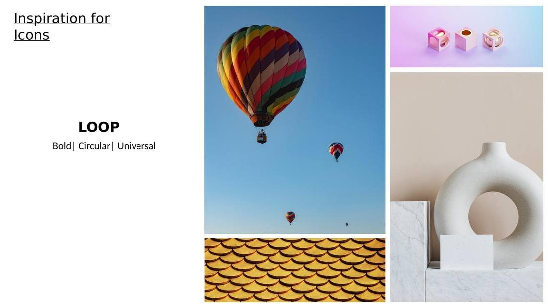
One icon language across five sub-brands, from cross-product audit to anatomy framework.
Eén icoontaal voor vijf sub-merken, van cross-product audit tot anatomie-framework.
Visual Design
Visueel ontwerp
Havells Enviro Konnect
Havells Enviro Konnect
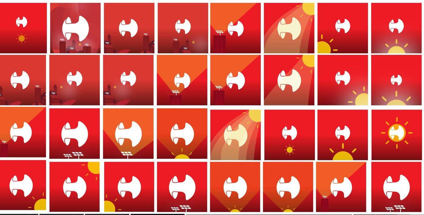
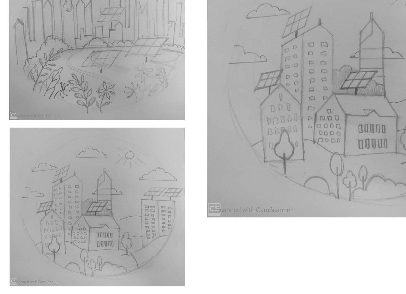
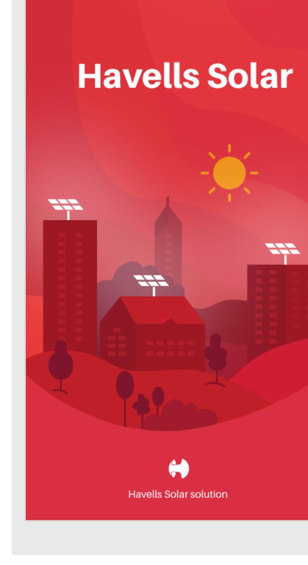
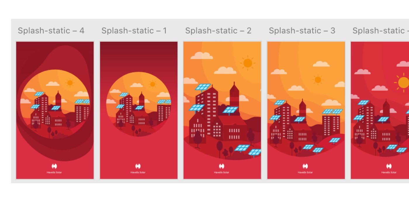
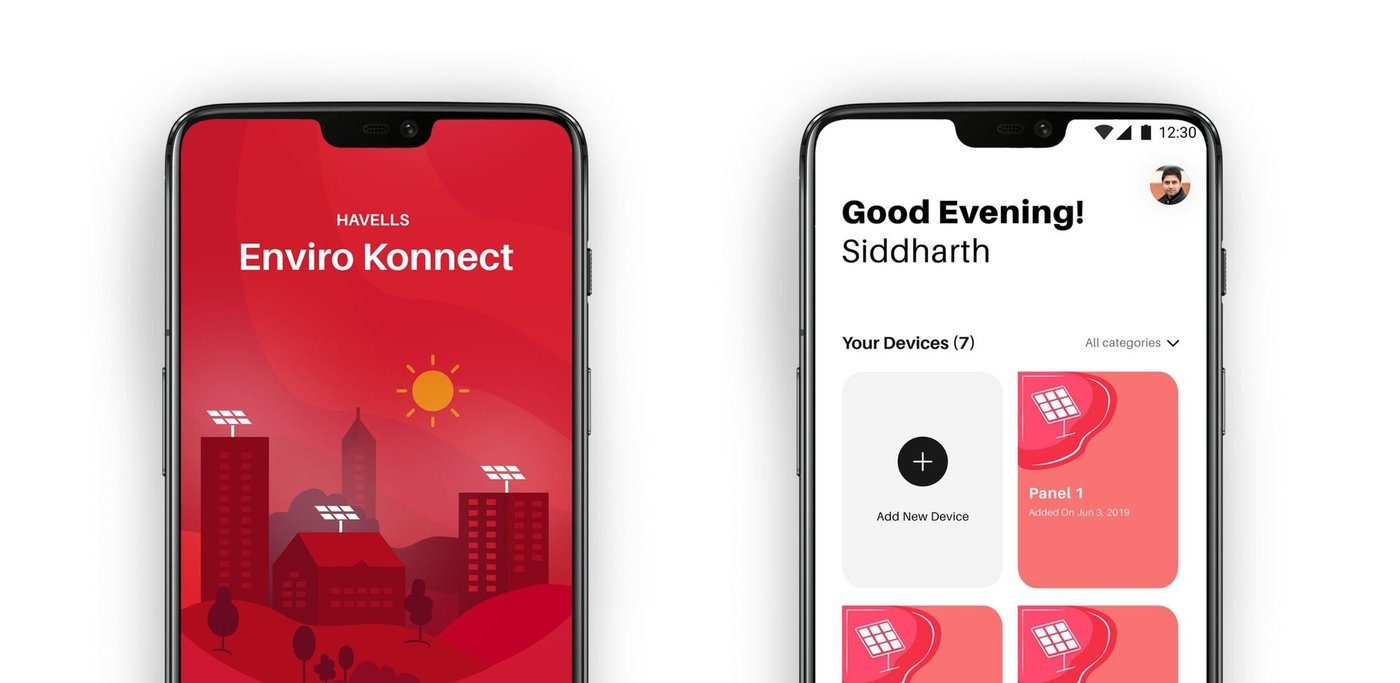
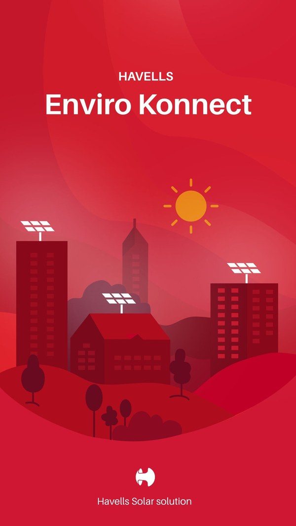
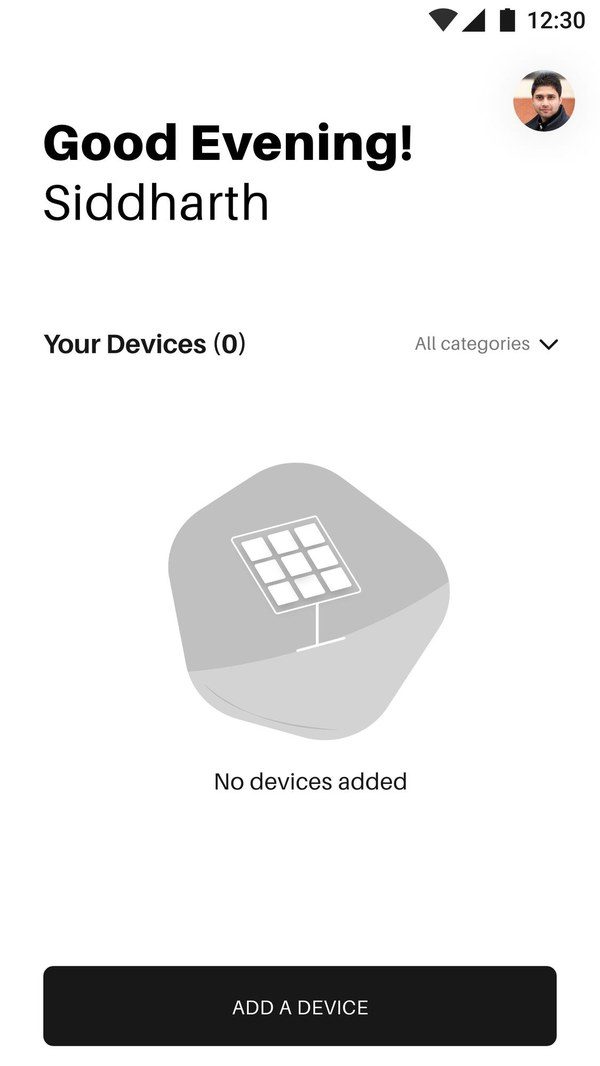
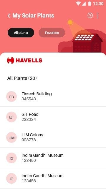
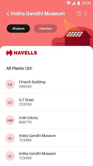
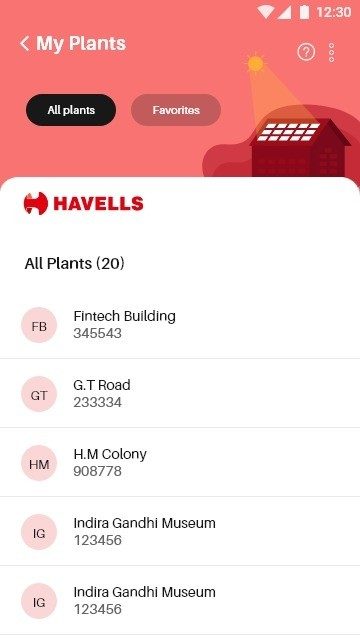
App icon, splash illustration and UI icons for a solar panel registration app — sketch to Play Store.
App-icoon, splash-illustratie en UI-iconen voor een zonnepaneel-app — van schets tot Play Store.
Icon Design
Icoonontwerp
Crabtree Smart Home Illustrations
Crabtree Smart Home Illustraties
Product illustrations and animations for three smart home devices in the Crabtree app.
Productillustraties en animaties voor drie smart-home-apparaten in de Crabtree-app.
Illustration
Illustratie
Ramco ERP — The Next Frontier
Ramco ERP — De Volgende Grens
60-second LED screen film for Ramco ERP User Meet 2025, from a 30-scene storyboard to final render.
LED-film van 60 seconden voor Ramco ERP User Meet 2025, van storyboard met 30 scènes tot eindrender.
Featured — ThingsCon State of Responsible Technology Report
Opgenomen — ThingsCon State of Responsible Technology Report
Memory Ball
2025
Shortlisted — GoHvA Sustainability Award
Shortlist — GoHvA Sustainability Award
Exploring Digital Legacy & Sustainability · with Vera Karulina, Victor Jimoh & Dewi Lagerberg
2024
Funding — Centre of Expertise Creative Innovation
Financiering — Centre of Expertise Creative Innovation
Synthetive: Election Edition · Sustainable Media Lab & Digital Society School
2024
Public Award — GoHvA Game Changers
Publieksprijs — GoHvA Game Changers
Synthetic Truths project · Amsterdam UAS
ExperienceErvaring
Eight years, one direction.
Acht jaar, één richting.
Feb 2024 — present
feb 2024 — heden
Independent UX & Product Designer
Zelfstandig UX- & productontwerper
Studio Muskabun · Amsterdam · Freelance
Mar — Aug 2026
mrt — aug 2026
Visual Designer (Freelance)
Visual Designer (freelance)
Scope Impact (Helsinki) · for Halla Health
Nov 2025 — Mar 2026
nov 2025 — mrt 2026
UX Designer (Internship)
UX Designer (stage)
TripGoGo V.O.F. · Amsterdam
May — Oct 2024
mei — okt 2024
Product Designer
Product Designer
Digital Society School / CoCI Netherlands
Feb — Oct 2024
feb — okt 2024
Creative Director & UX Lead
Creative Director & UX Lead
Katha India · Remote
Sep 2023 — Jan 2024
sep 2023 — jan 2024
Design Researcher
Design Researcher
Digital Society School, HvA · Amsterdam
Jul 2019 — Aug 2023
jul 2019 — aug 2023
Visual & Motion Designer
Visual & Motion Designer
Havells India Ltd. · Noida
Jul — Dec 2018
jul — dec 2018
UX Designer (Lead)
UX Designer (Lead)
Infosys · Bangalore
2017 — 2018
2017 — 2018
Digital Media Designer
Digital Media Designer
Katha Digital Lab · New Delhi
EducationOpleiding
2024 — 2025
2024 — 2025
MSc Digital Design
MSc Digital Design
Amsterdam University of Applied Sciences (HvA)
2013 — 2018
2013 — 2018
BDes Animation Film Design
BDes Animatiefilmontwerp
National Institute of Design · Ahmedabad
ContactContact
Let’s talk.
Laten we praten.
I’m looking for a product or UX design role in Amsterdam or North Holland — in education, media, AI or civic innovation. Feel free to read my CV, or reach out via LinkedIn or email.
Ik zoek een rol als product- of UX-ontwerper in Amsterdam of Noord-Holland — in onderwijs, media, AI of civic innovation. Lees gerust mijn cv, of neem contact op via LinkedIn of e-mail.
A structured audit of the Havells Sync app — benchmarked against 2023 product design standards across visual language, interaction patterns, and component quality — delivered as ten prioritised redesign recommendations.
Een gestructureerde audit van de Havells Sync app — vergeleken met de productdesignstandaarden van 2023 op visuele taal, interactiepatronen en componentkwaliteit — opgeleverd als tien geprioriteerde herontwerp-aanbevelingen.
Ten prioritised redesign recommendations for the Havells Sync app — grounded in a full visual and interaction audit.
Audited the Havells Sync app against current product design standards — mapping visual language gaps, weak interaction patterns, and outdated components — then consolidated findings into ten evidence-backed redesign recommendations, delivered as a 62-page brief.
🔍
App Audit
A systematic review of the Havells Sync app across visual language, loading states, navigation, typography, cards, and motion — identifying gaps against 2023 product standards.
🎛️
Benchmarking
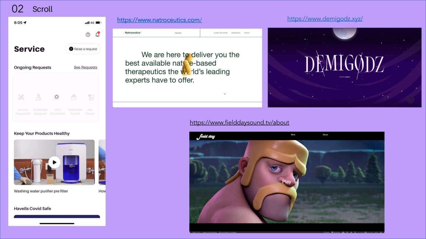
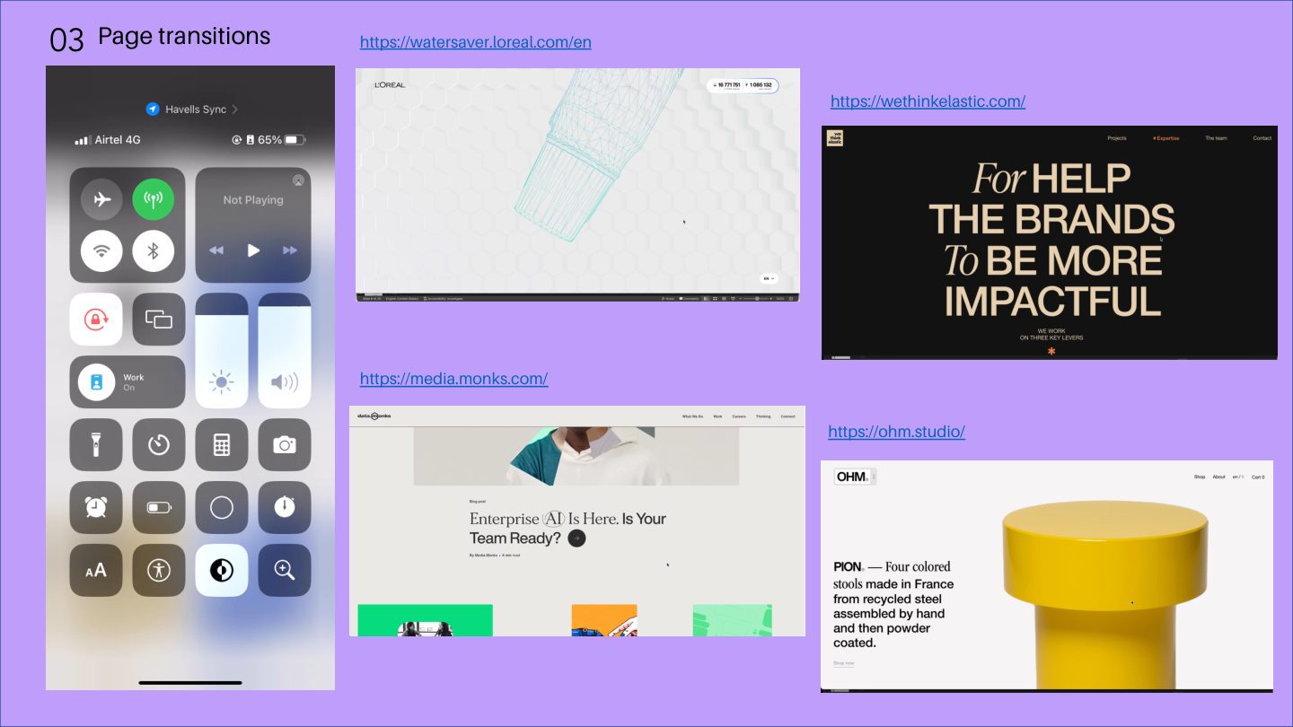
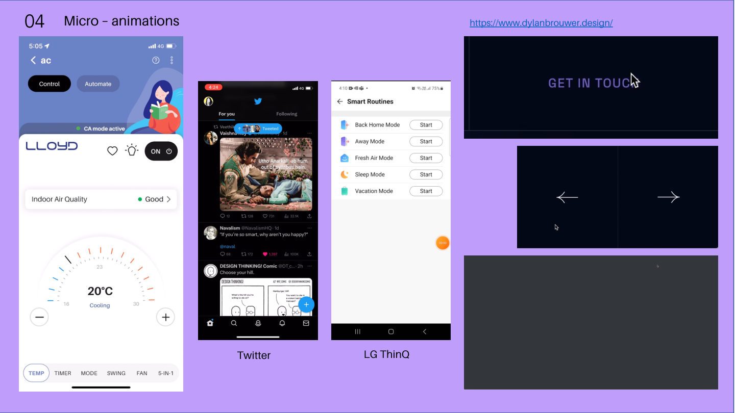
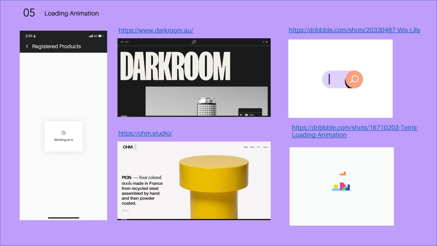
Nine interaction categories benchmarked — splash screens, scroll, transitions, micro-animations, loading states, onboarding, illustrations, card layouts, and dark mode.
📲
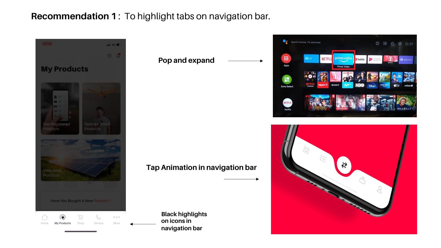
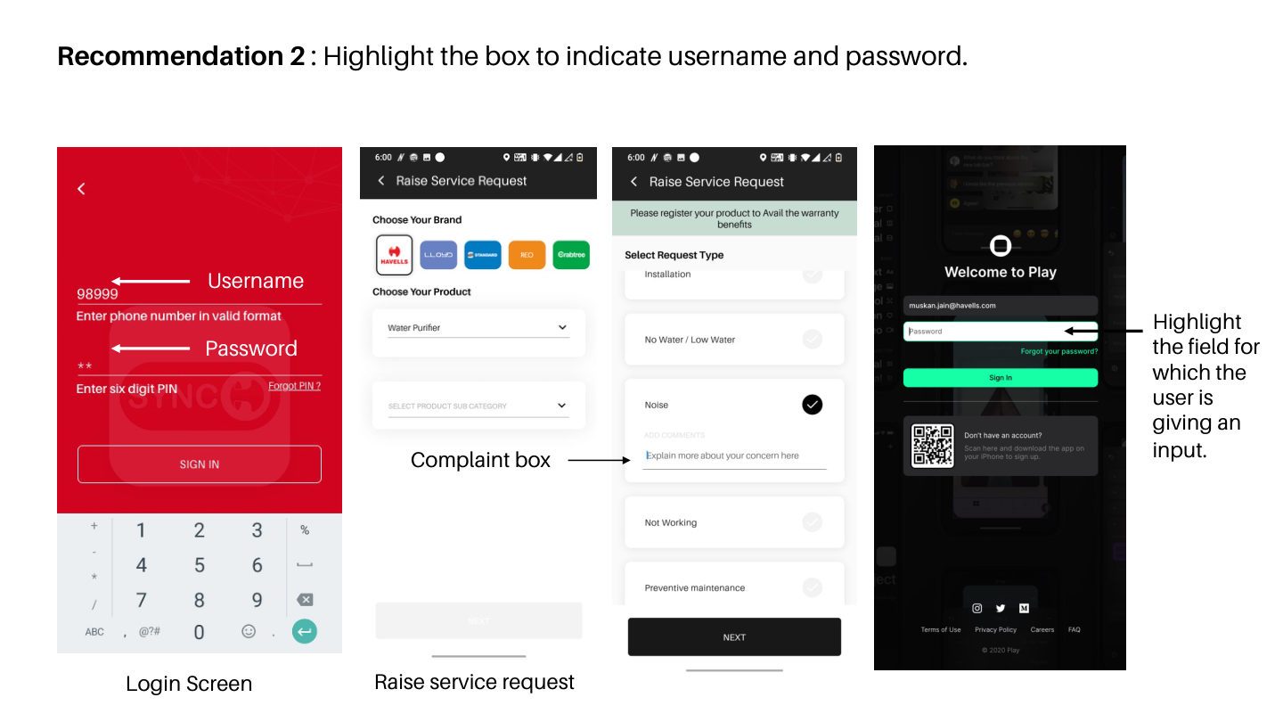
10 Redesign Recommendations
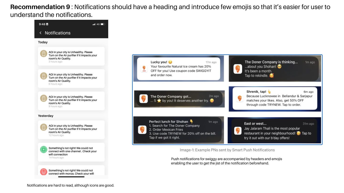
Ten prioritised, evidence-backed redesign improvements — from navigation hierarchy and loading patterns to card density, colour usage, and notification design.
Visual Designer (Full-time) · Havells India · Havells Sync App · 62-page deliverable · March 2023
✦ 01 — The Problem
The Havells Sync app worked — but it didn't feel like a 2023 product.
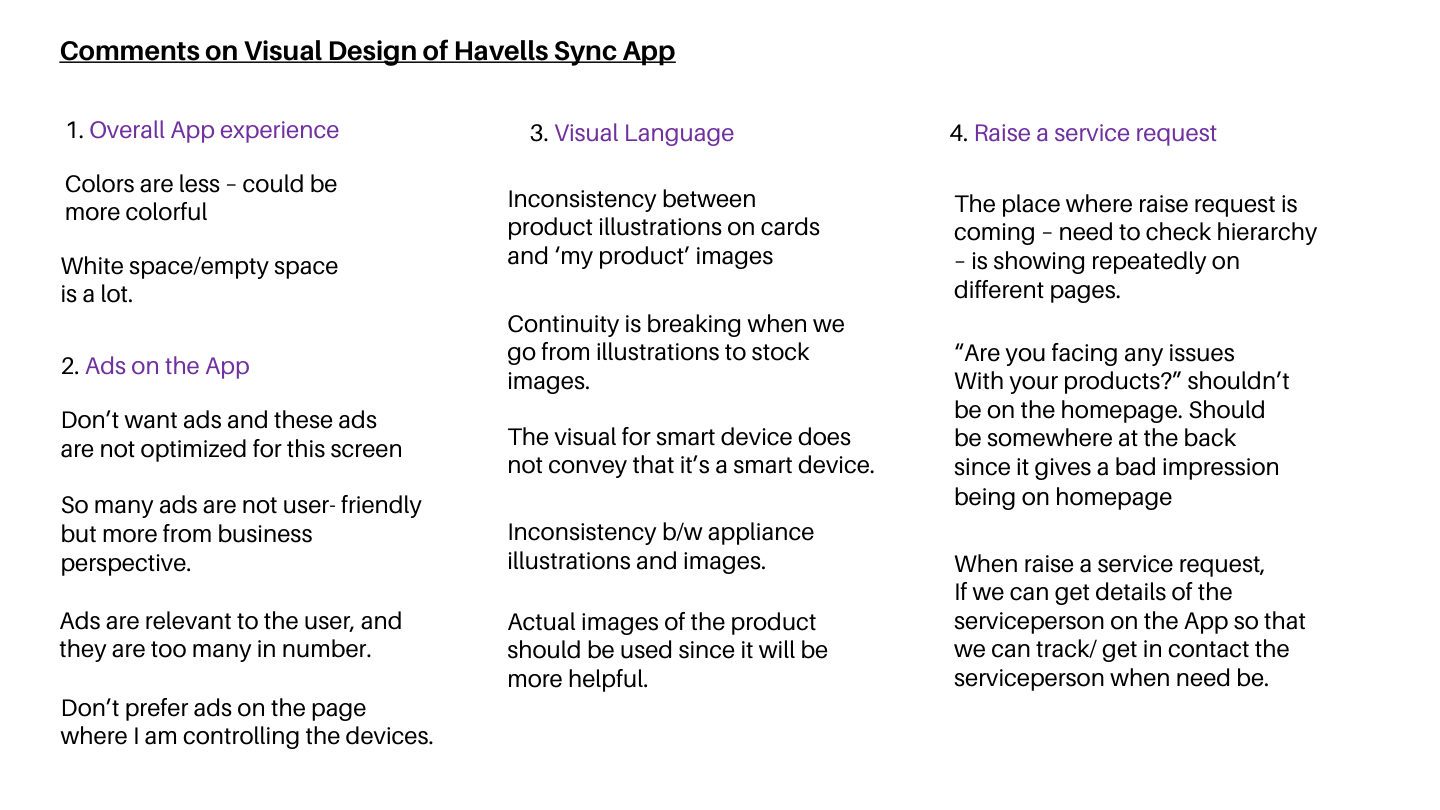
Working at Havells, I noticed something: the Sync app worked, but it didn't feel considered. Loading animations were generic. Cards were oversized. Navigation used unlabelled icons. The visual language felt borrowed from an earlier era of mobile design.
The brief was open: audit where the app falls short and identify what could be improved. I used that freedom to build a structured audit — not a mood board, but a working document grounded in benchmarking and evidence.
The question I kept coming back to: what would it take to make this feel like an app someone cared about?
Research Questions
Where does the Havells Sync app fall short of 2023 product standards?
Which interaction patterns are best-in-class — and what is Sync missing?
Which gaps are highest priority to address first?
How do top brands use colour, type, and motion — and how can Sync learn from them?
Scope
6
Audit Categories
9
Interaction Patterns
10
App Recommendations
62
Page Document
02 — Key Decisions
Three decisions that shaped the audit.
A structured audit could have been subjective. These were the calls that gave it credibility — as evidence, as a working document, and as something that could actually be acted on.
Decision 01
Systematic audit, not opinion
Nine benchmarked categories against 2023 product standards, not aesthetic preferences. Every finding tied to evidence. Opinion doesn't survive a first review meeting — especially not with a team that has shipped a live product.
Impact: findings were presented as evidence, not preferences — no pushback on subjectivity.
Decision 02
Benchmark against best-in-class, not direct competitors
Measuring Sync against the strongest interaction patterns globally — not against adjacent products in the same category — set the ceiling high. Aspiration creates better recommendations than comparison.
Impact: recommendations were actionable against a world-class bar, not a local one.
Decision 03
10 prioritised recommendations, not 50 observations
Filtering six audit categories into exactly ten actionable, ranked recommendations made the deliverable something that could actually be placed on a product roadmap. A 50-finding audit gets filed; a 10-recommendation brief gets actioned.
Impact: 62-page deliverable with a clear priority hierarchy — structured for a product team to act on directly.
✦ 03 — The Work: App Audit & Gaps
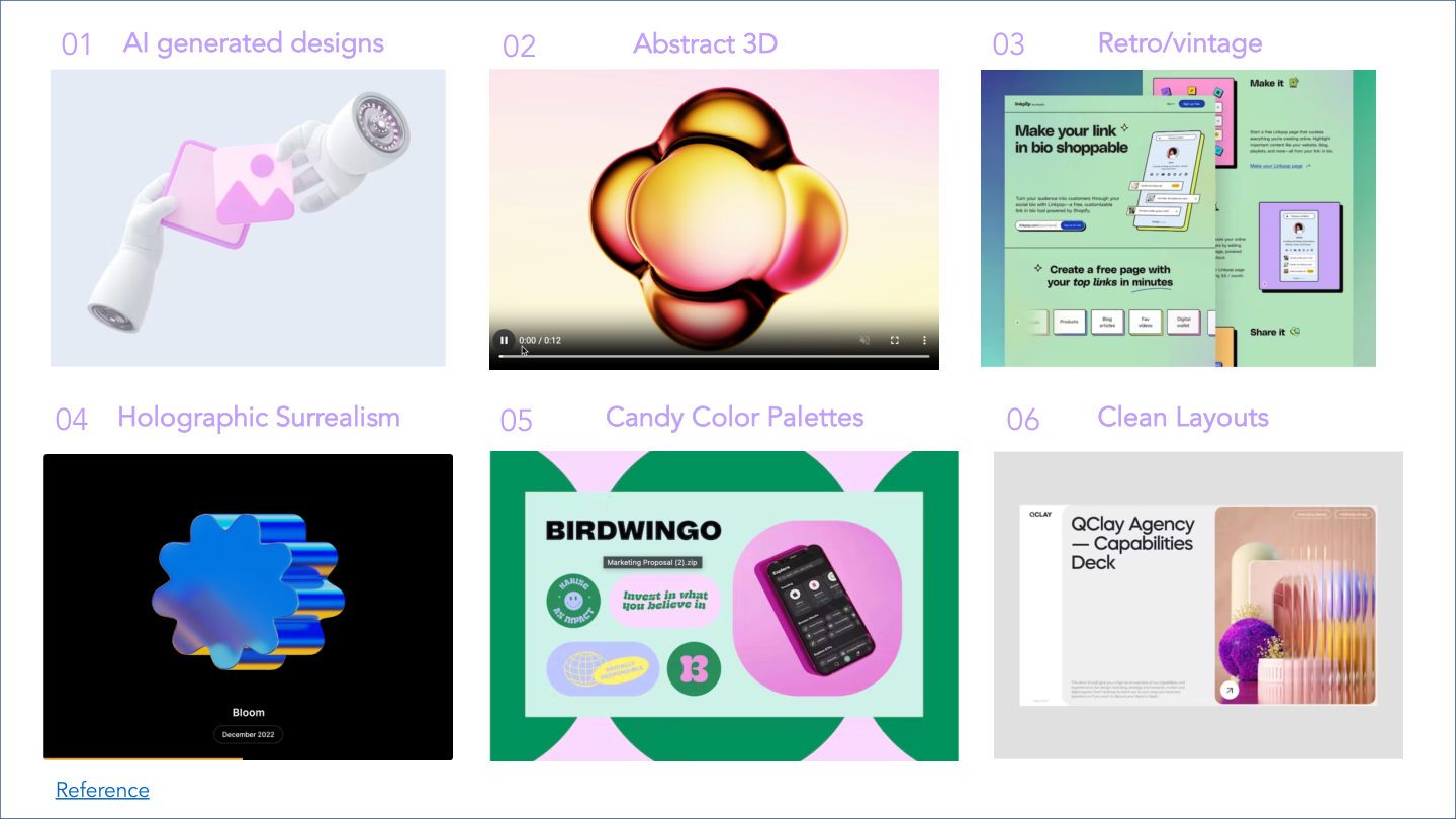
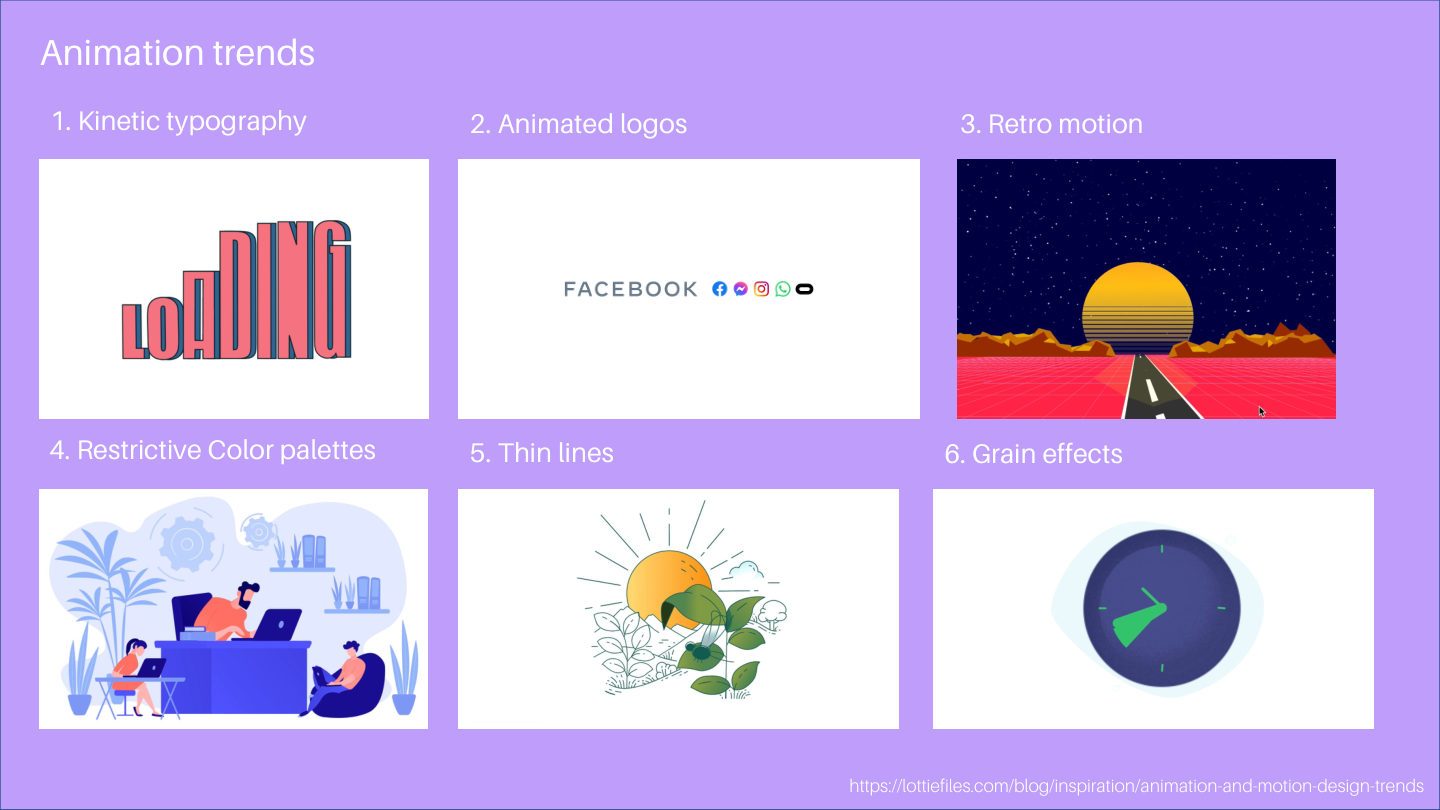
Research across six major directions shaping digital product aesthetics — from holographic surrealism to AI-generated design, studied through real brand case studies.
1 / 10
✦ The Work — Interaction Patterns
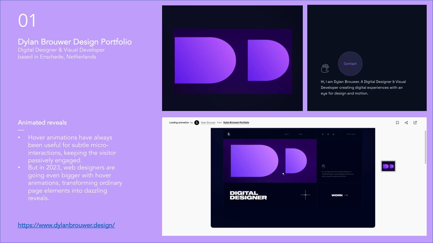
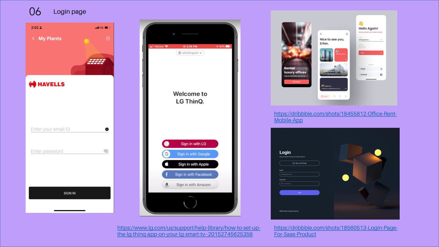
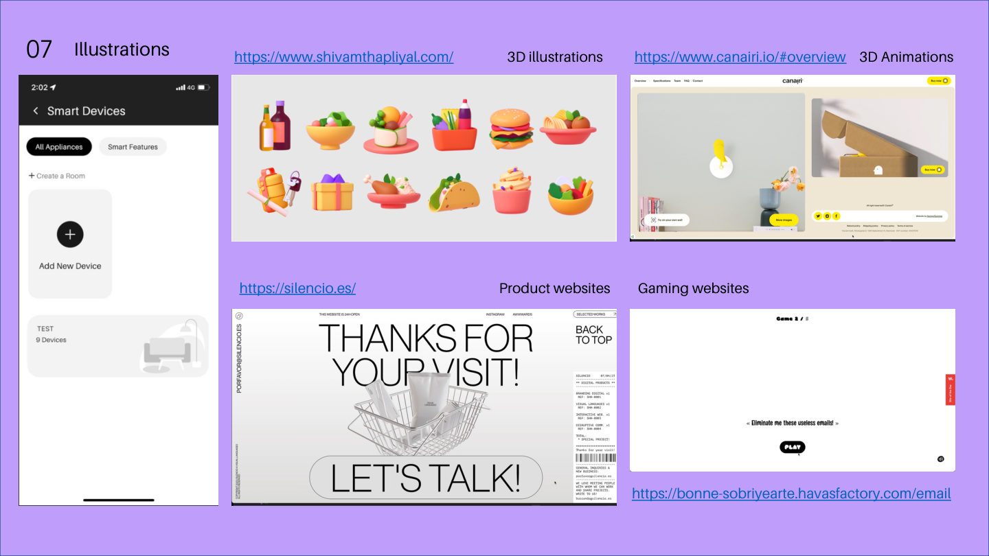
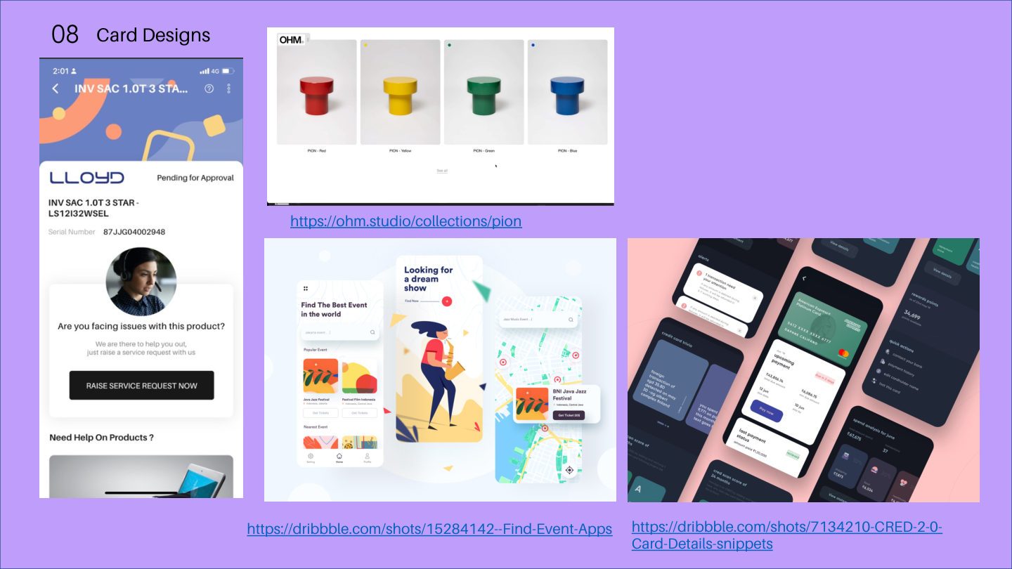
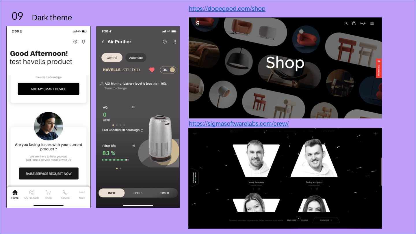
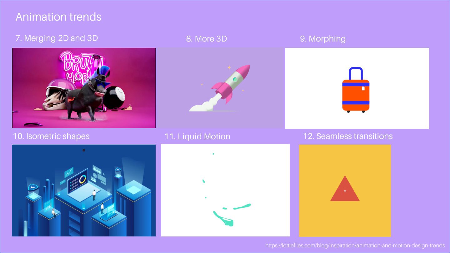
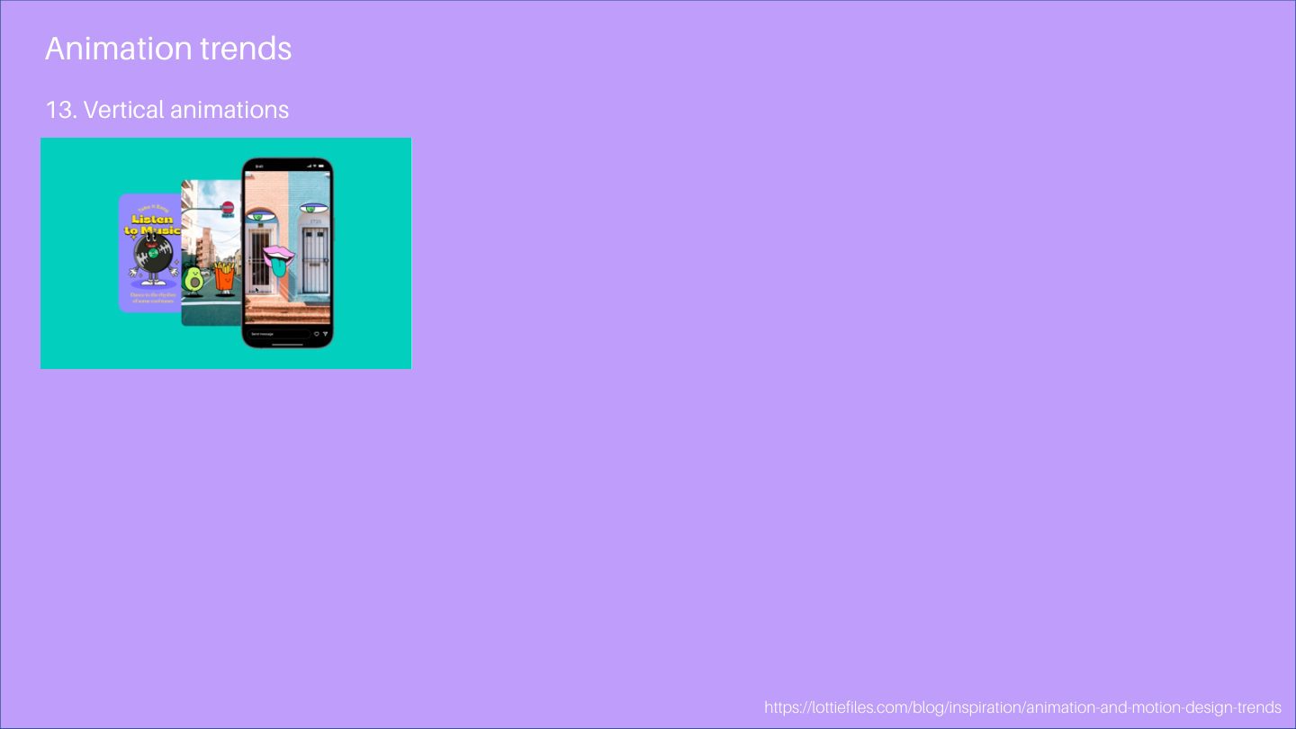
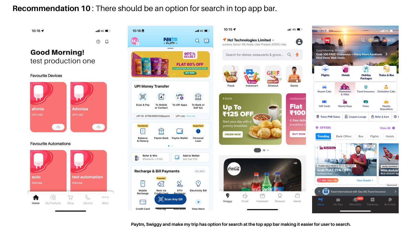
Nine interaction patterns identified as high-opportunity applications for the Havells product ecosystem — from splash screens to dark mode, each studied through live examples.
1 / 11
✦ The Work — Visual Language Analysis
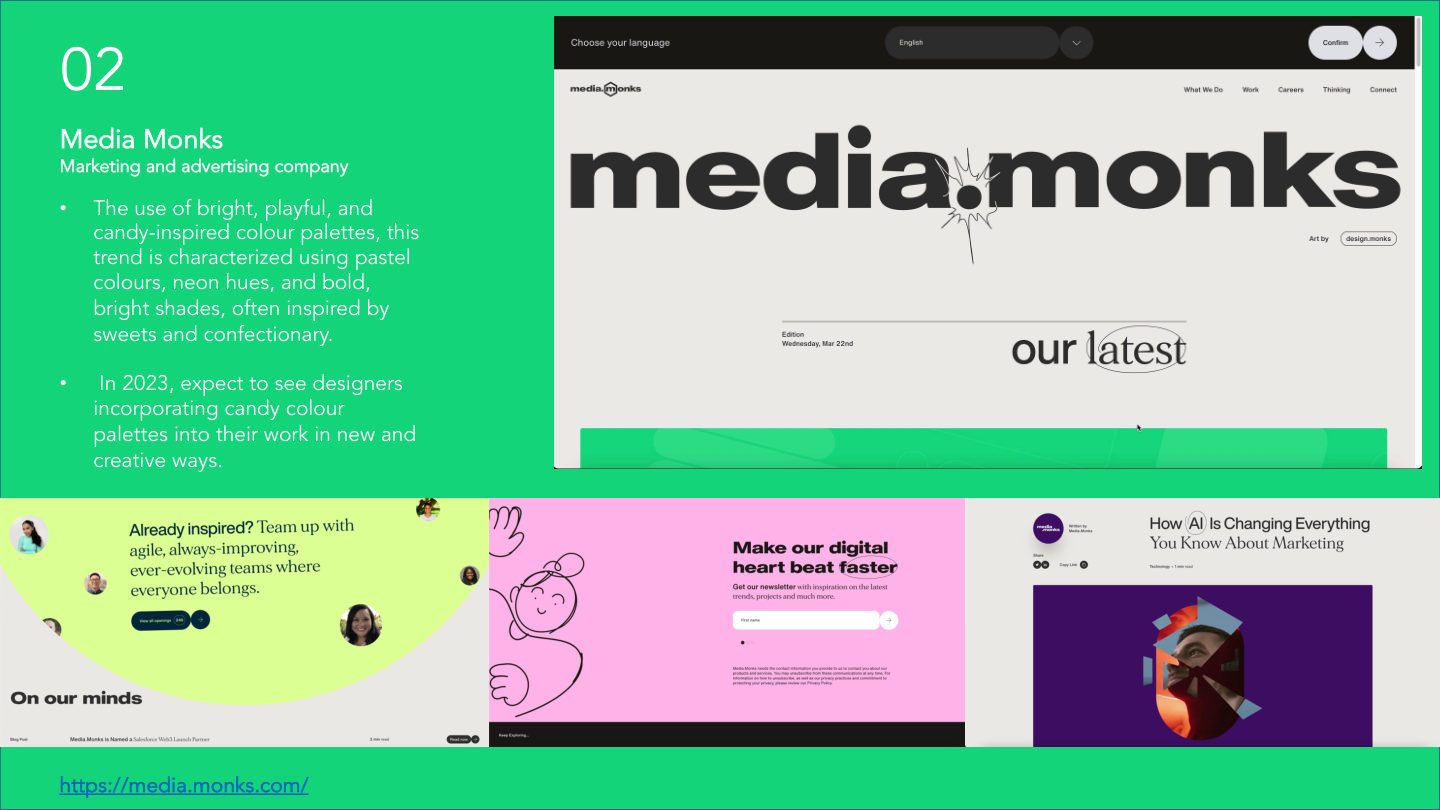
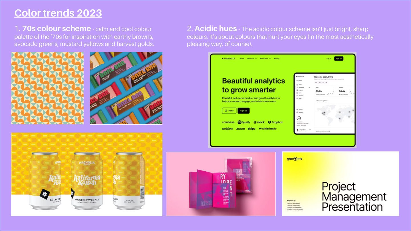
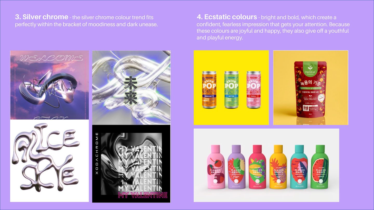
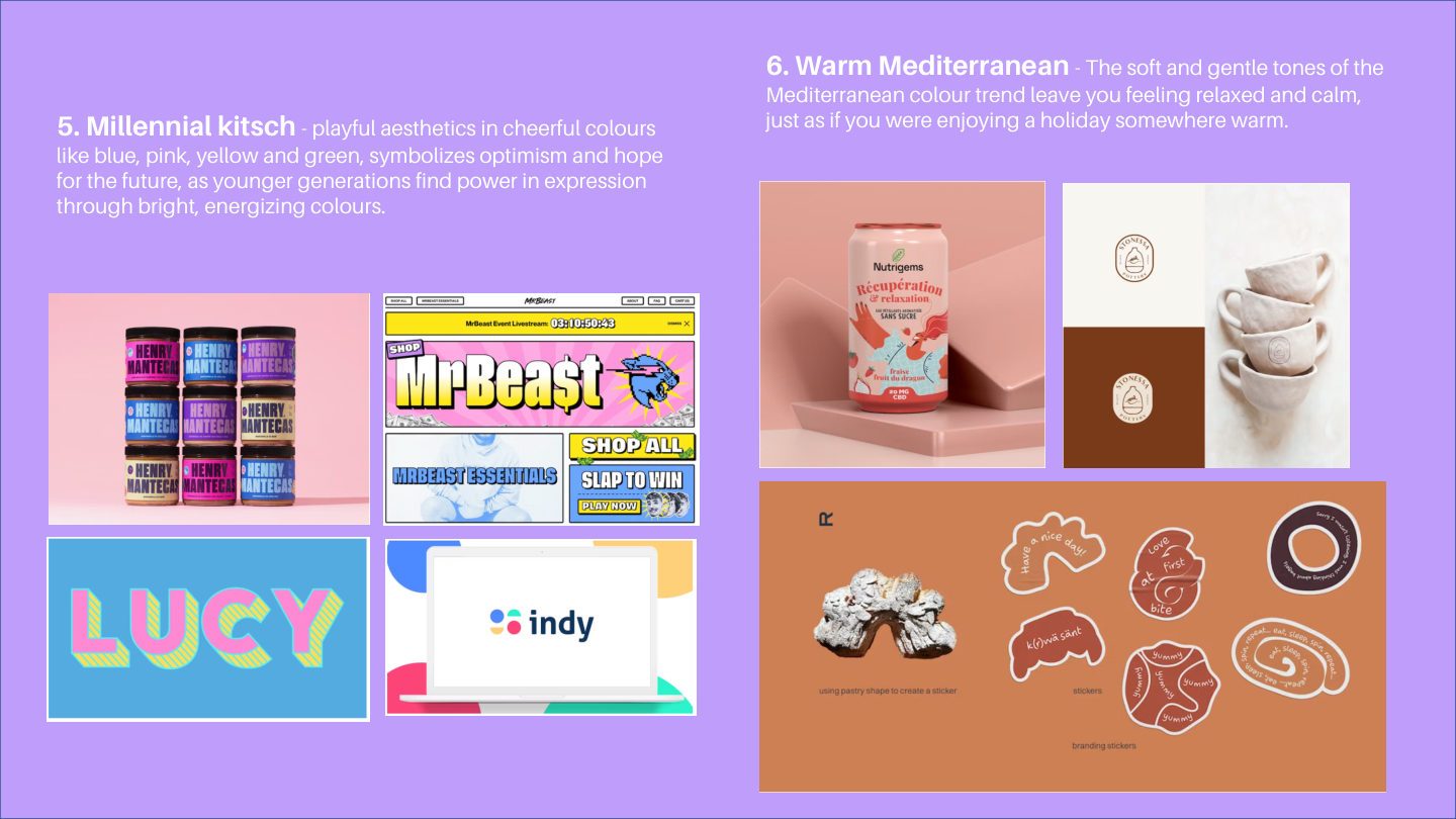
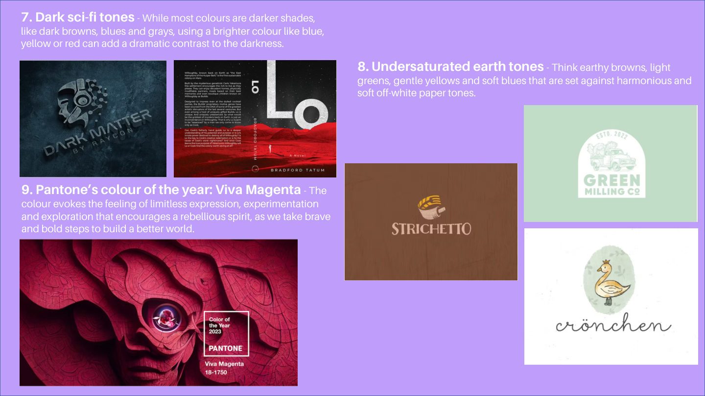
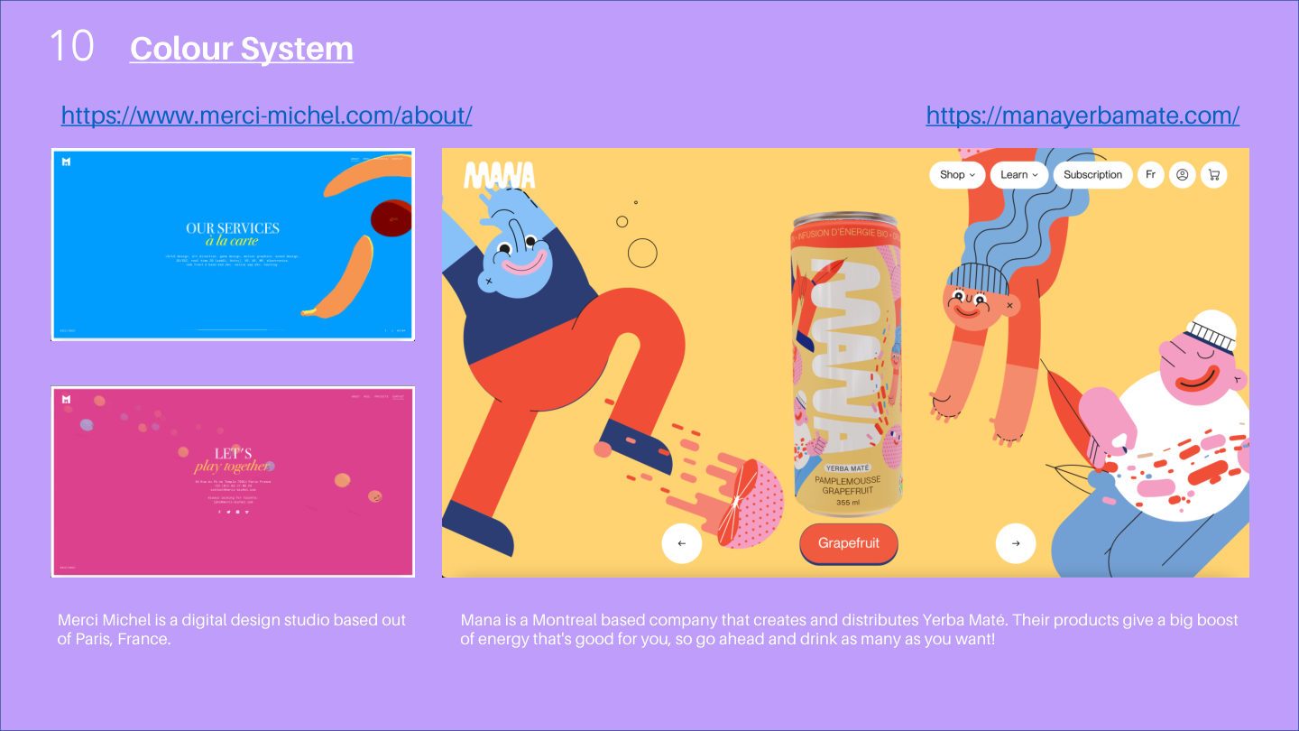
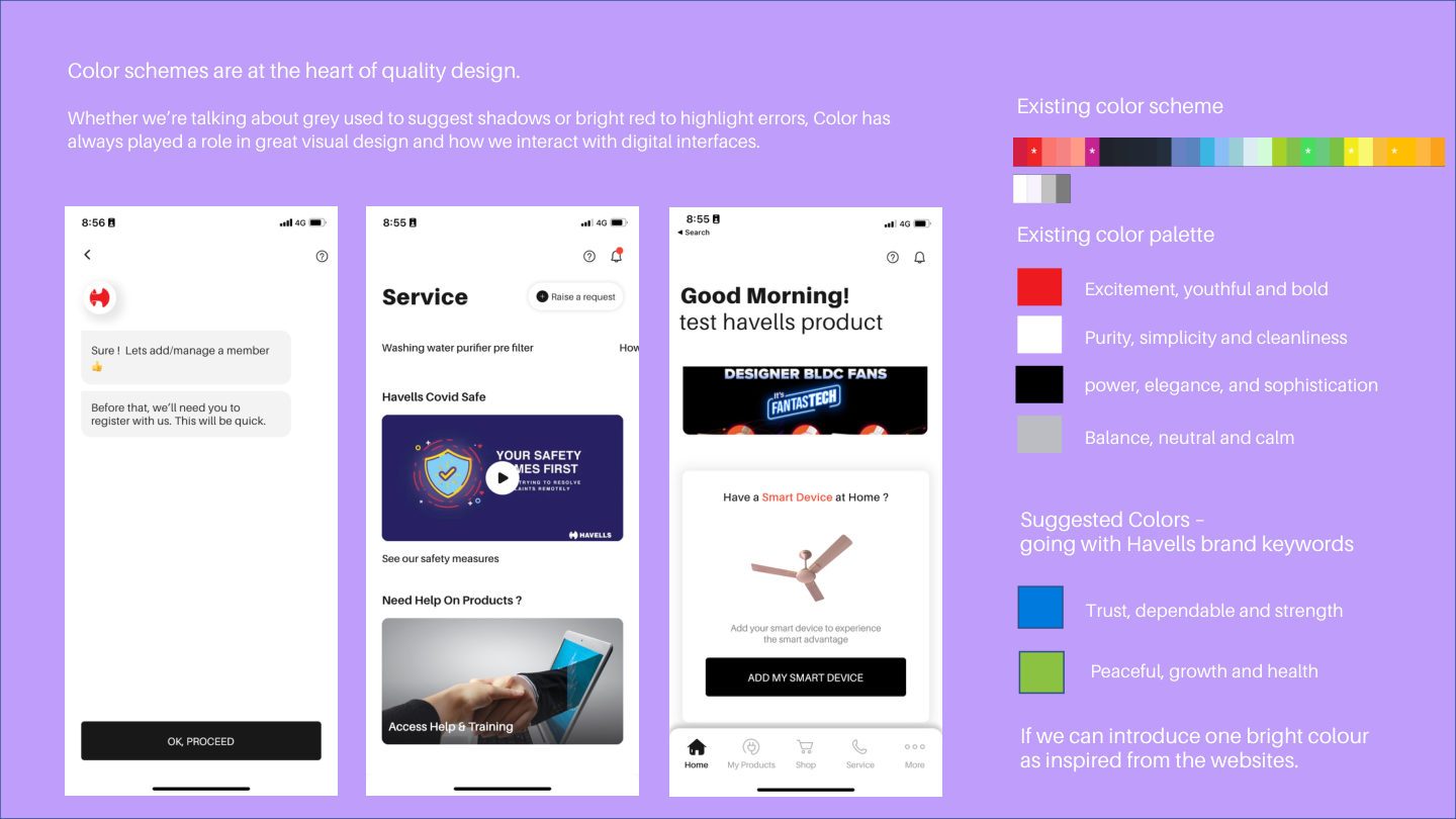
Analysis of 2023 colour movements — from acidic hues and millennial kitsch to dark sci-fi tones — mapped for relevance to Havells' health-tech positioning.
1 / 6
✦ The Work — Component & Pattern Gaps
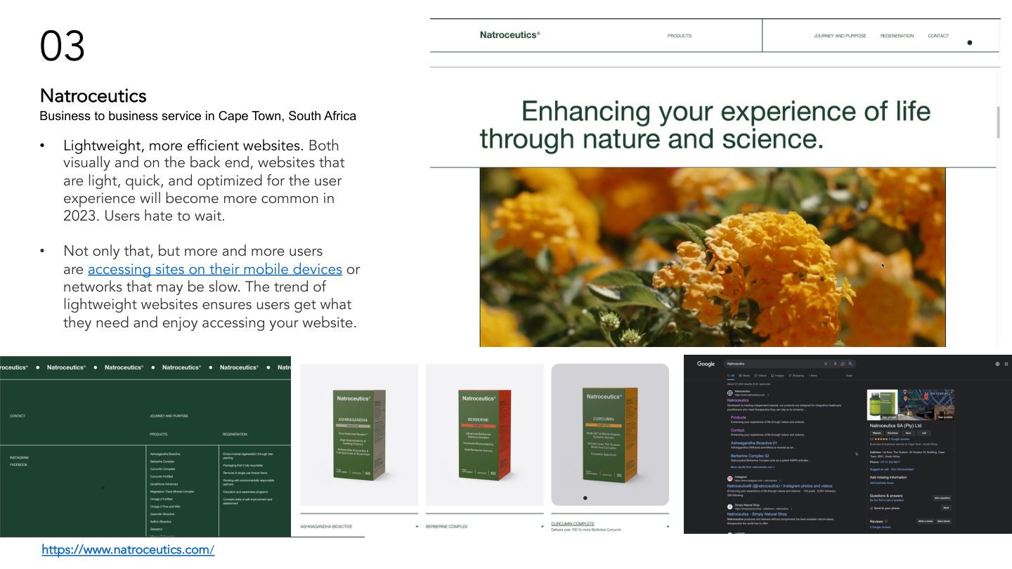
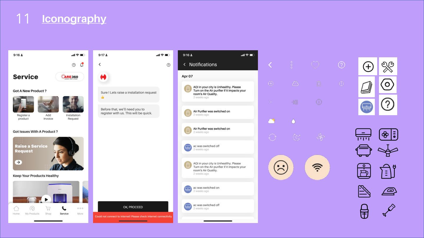
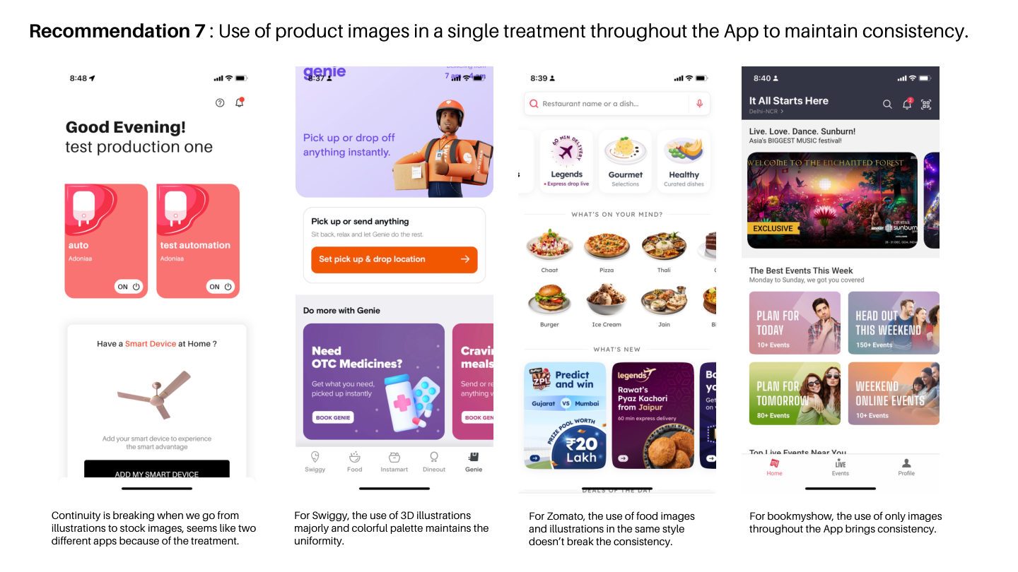
Deep-dive into UI building blocks: iconography, typography hierarchy, button design, navigation patterns, data visualisation, and animation trends — with live reference examples.
1 / 20
✦ 04 — Outcome: Redesign Recommendations
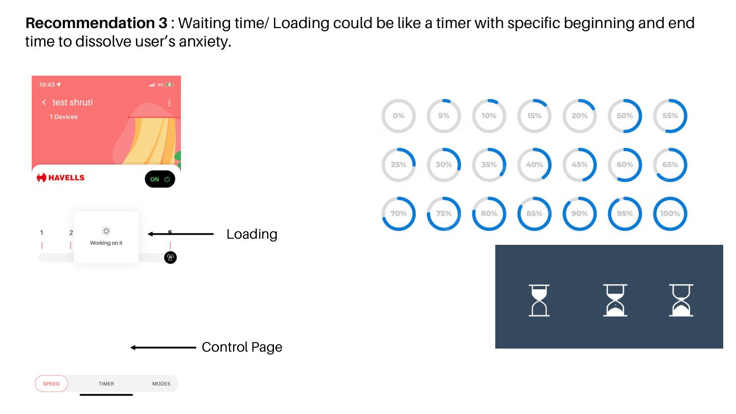
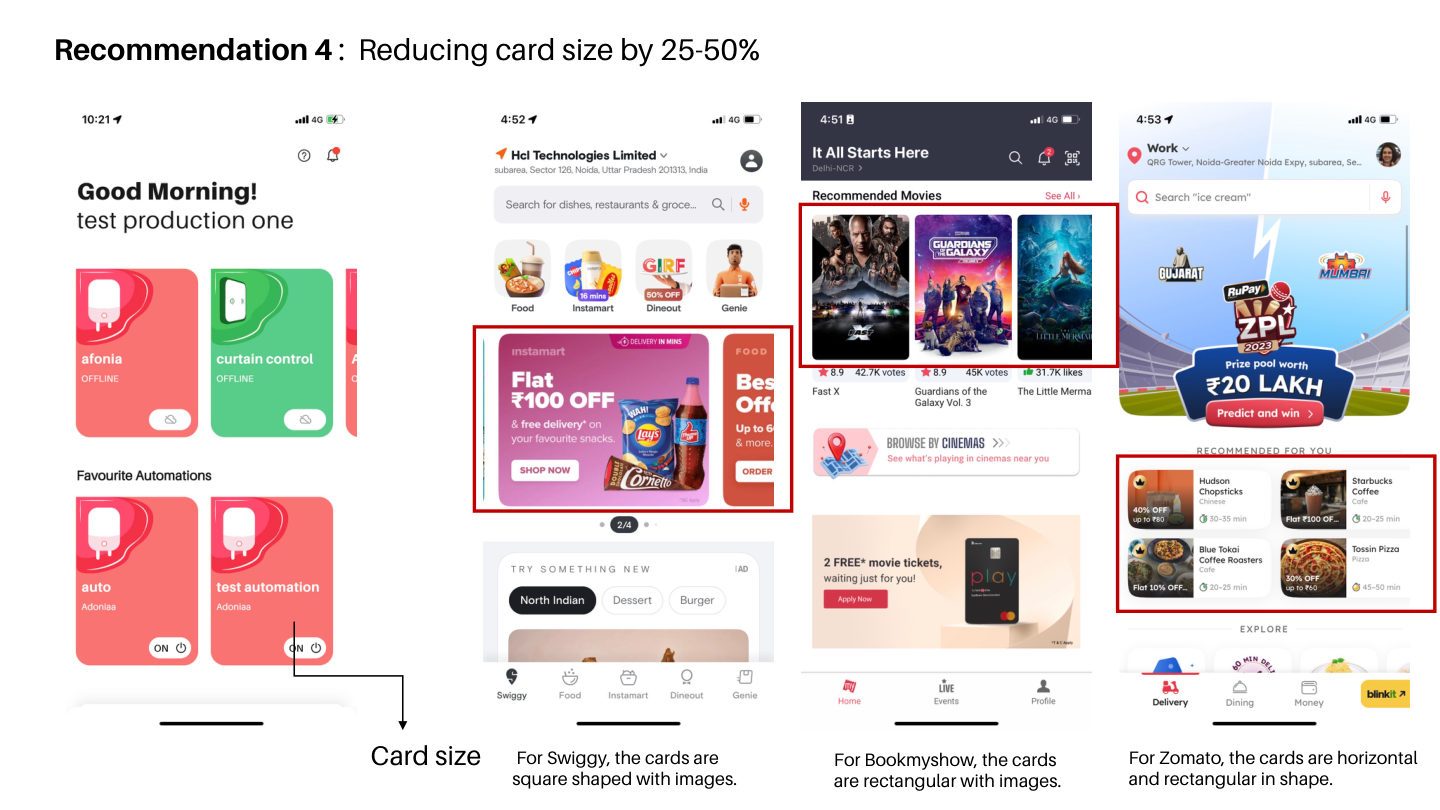
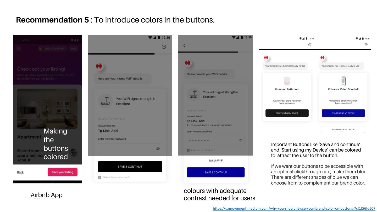
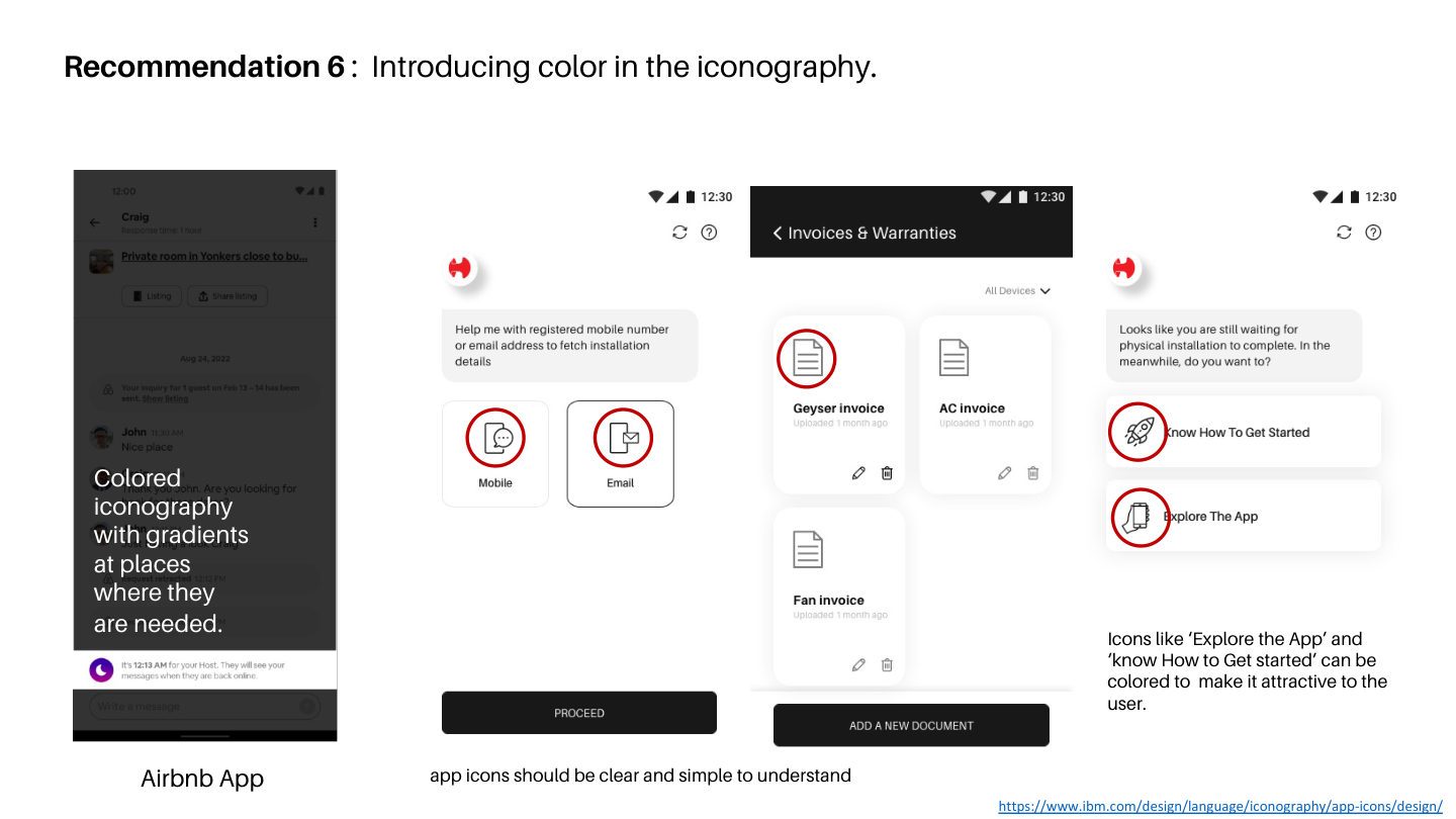
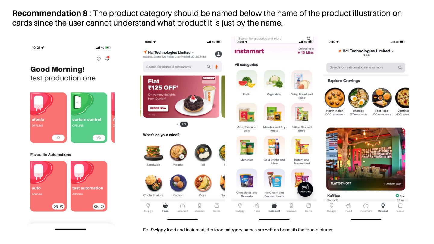
Ten concrete recommendations for the Havells Sync app, grounded in the research above — from navigation hierarchy and loading patterns to card density and colour in UI.
1 / 14
ICN
Visual Design · Icon Systems · Brand Language
Visueel design · Iconensystemen · Merktaal
Iconography for Havells
Setting the design language for an electrical giant — auditing icons across five product sub-brands, benchmarking against global competitors, and defining an icon anatomy framework built on Havells brand values.
De designtaal van een elektriciteitsgigant vormgeven — iconen auditeren over vijf product-sub-merken, vergelijken met wereldwijde concurrenten en een framework voor icoonanatomie definiëren op basis van de merkwaarden van Havells.
RoleRol
Visual Designer (Full-time)
ContextContext
Havells India
Scope
5 sub-brands · 9 competitors · Icon anatomy system
Deliverable
Icon language framework + library brief
✦ Final Outcome
A design language and icon anatomy framework that gave every Havells product line a unified visual voice.
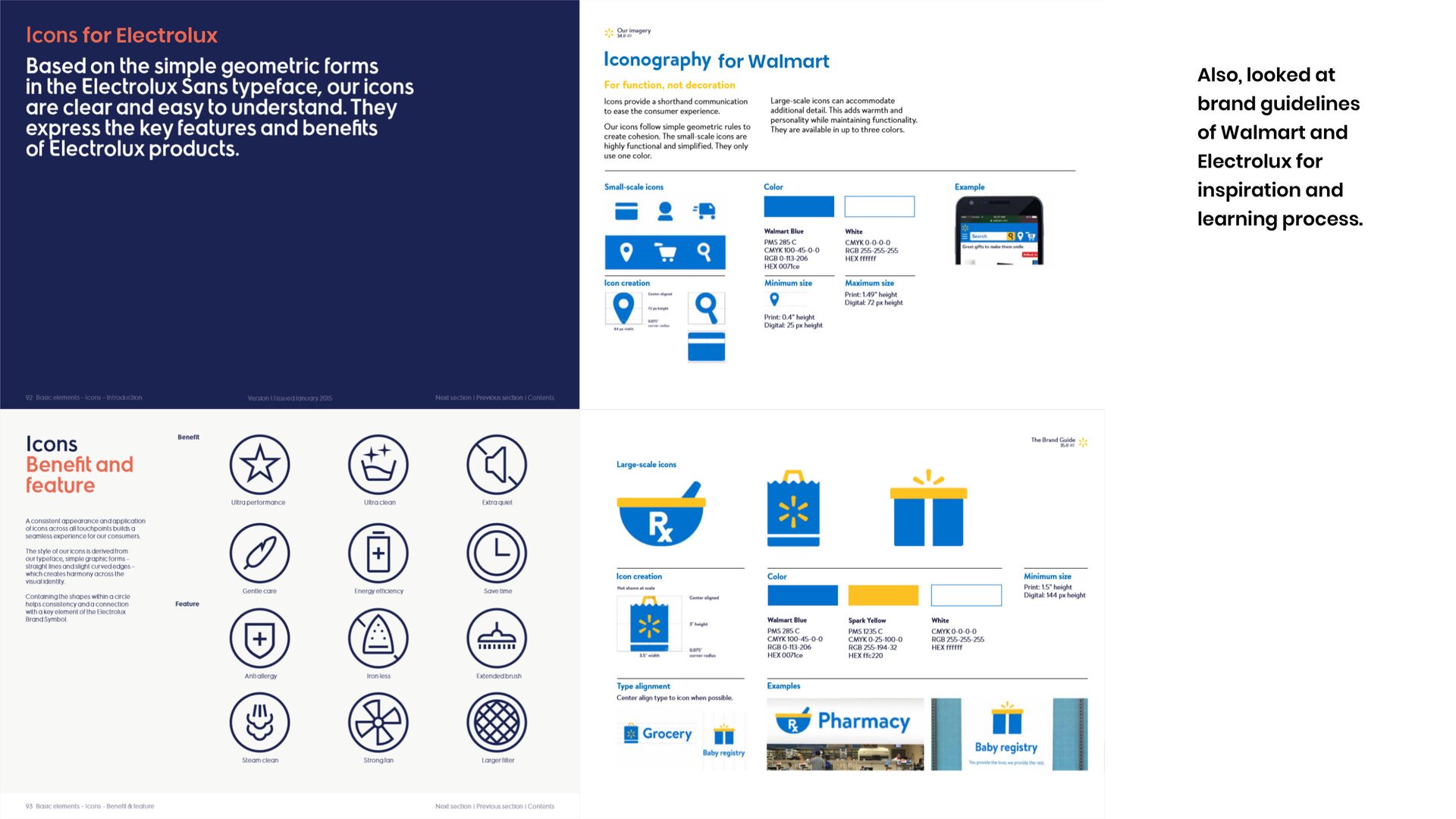
Researched icon systems across Havells, Crabtree, Lloyd, Standard, and Reo product lines — then benchmarked against Walmart, Electrolux, LG, and Aquaguard to define a guiding icon style, anatomy, and set of principles for use across all Havells physical and digital products.
🔍
Icon Audit
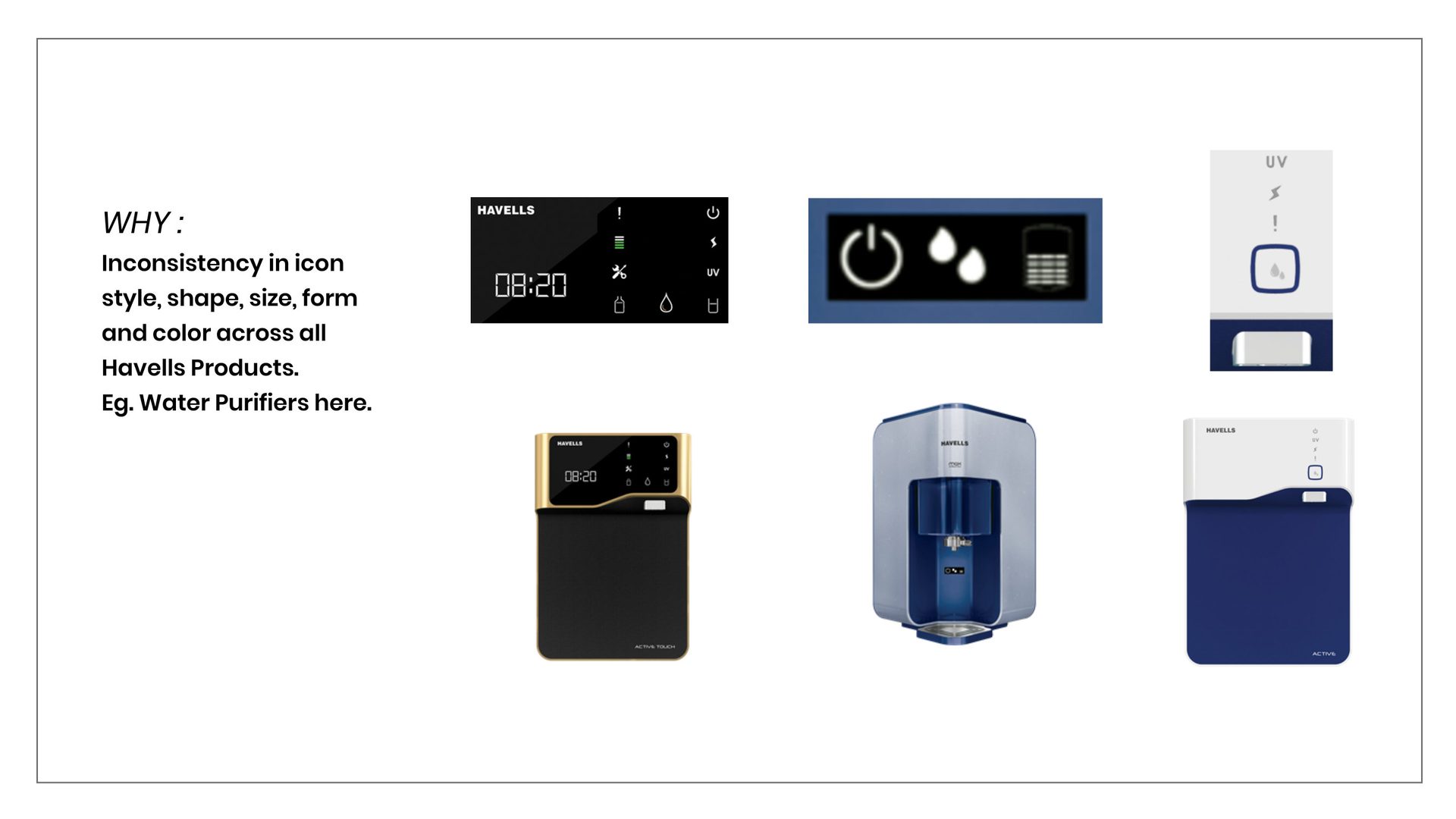
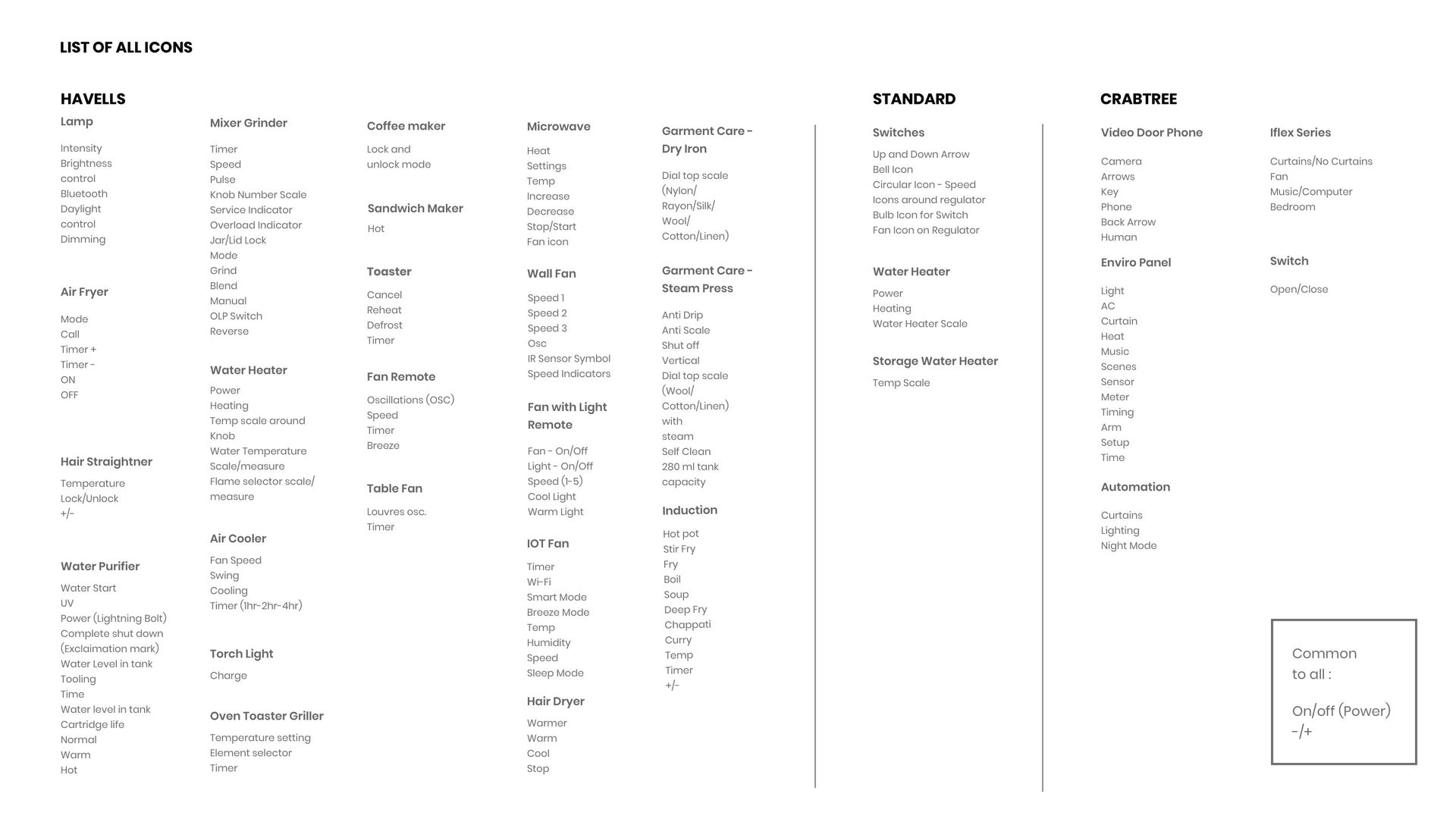
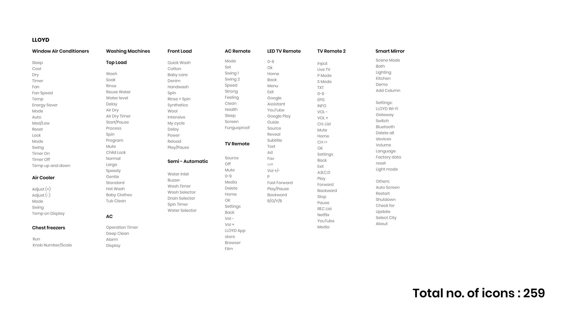
Mapped existing icons across all Havells sub-brands — uncovering inconsistency in style, shape, size, form, and colour.
📐
Style Framework
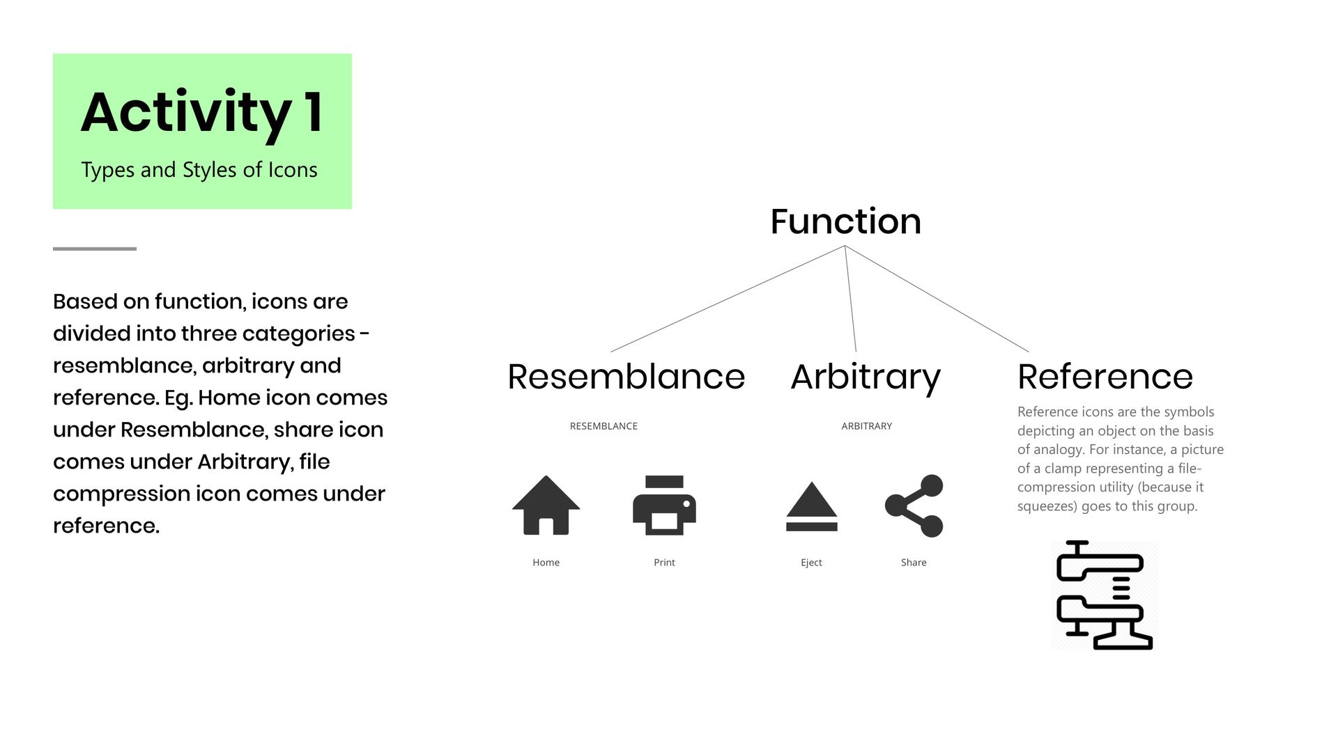
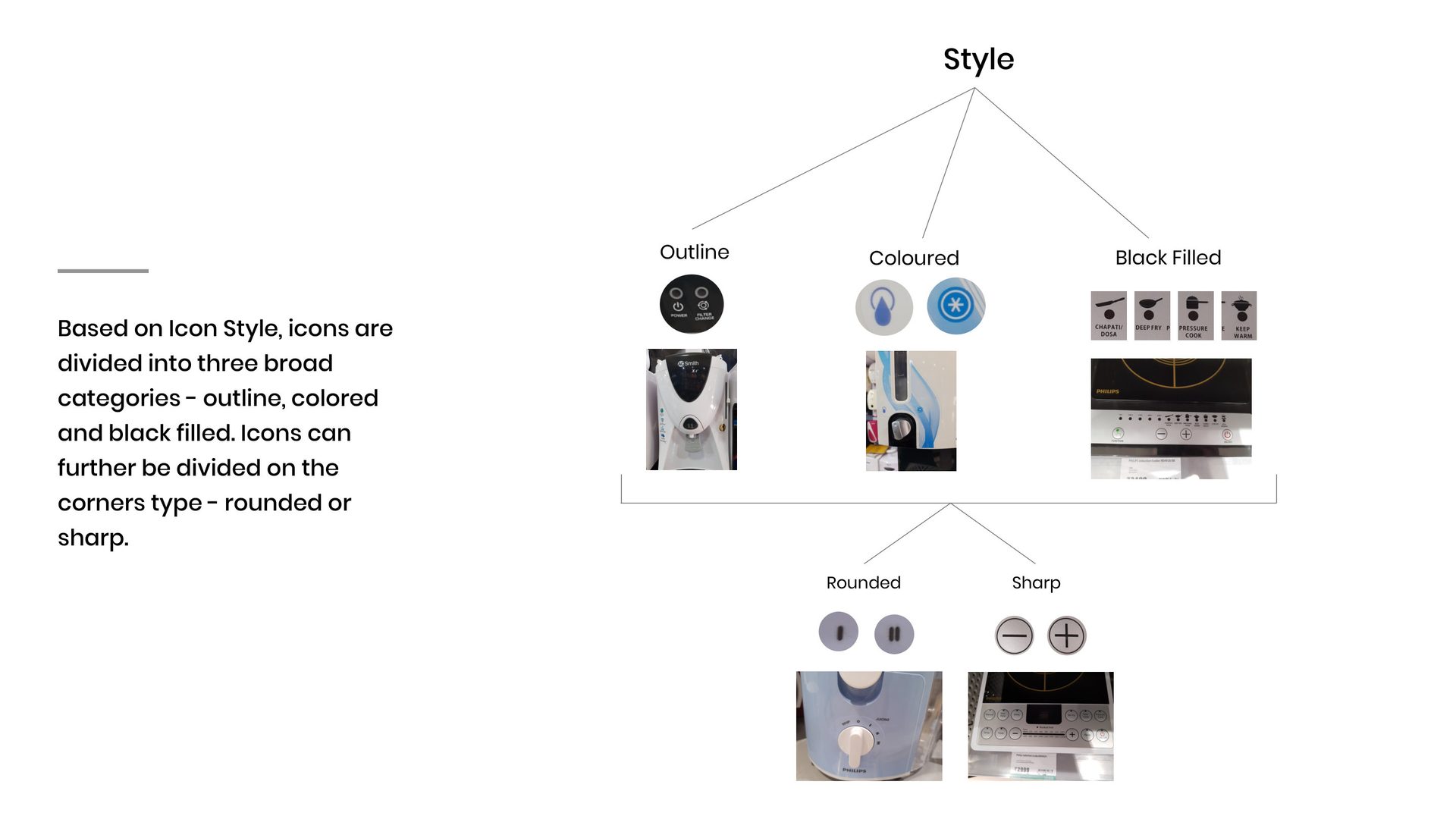
Defined icon taxonomy by type (function, resemblance, arbitrary) and style (outline, filled, coloured) — with rounded vs. sharp corner rules.
🎯
Brand-Rooted Principles
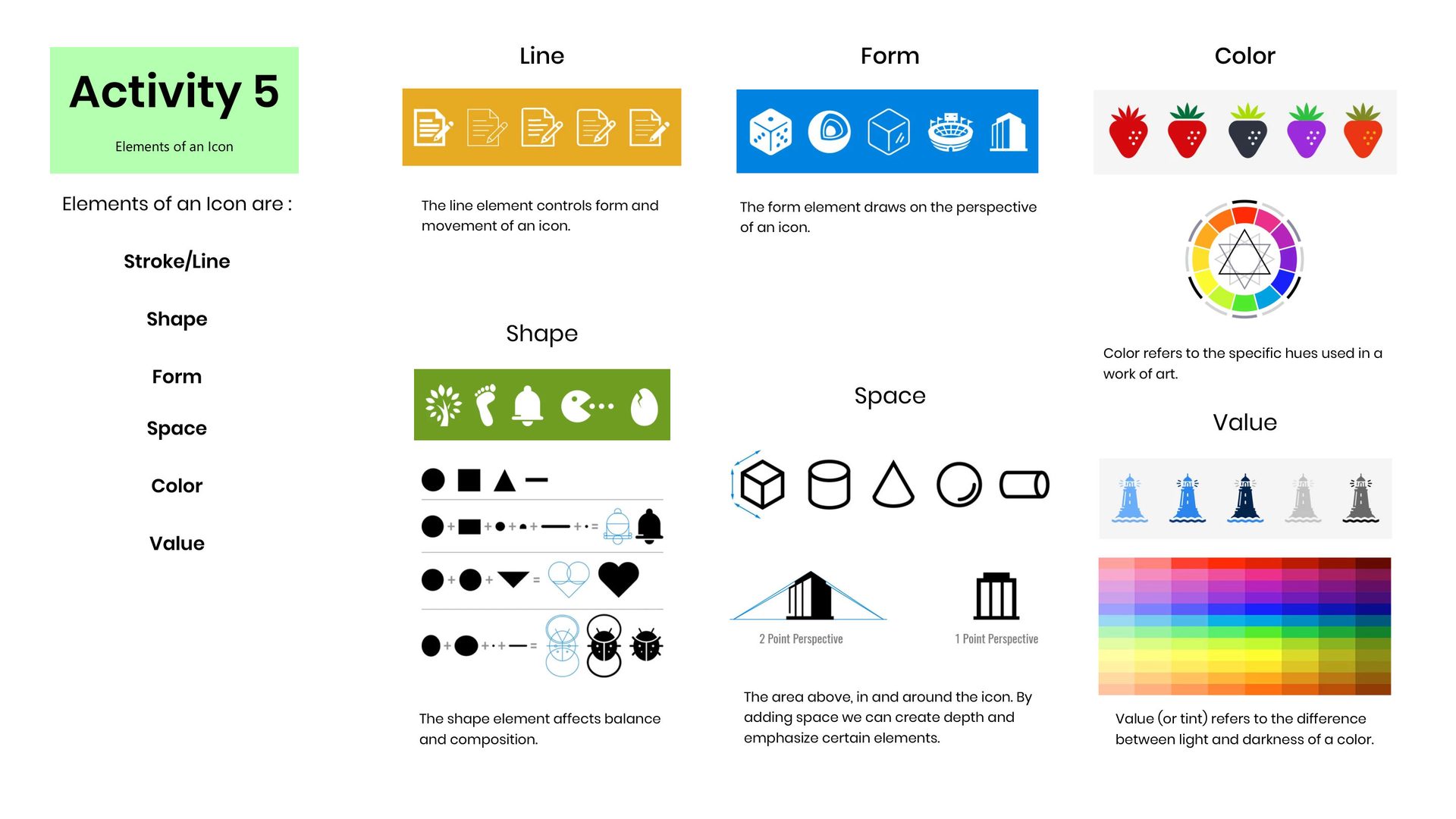
Six guiding principles for icon anatomy — stroke, shape, form, space, colour, and value — grounded in Havells brand attributes.
🏭
Cross-Product Library
A starting icon vocabulary covering all Havells product categories — from water purifiers and ACs to smart home and switchgear.
Full-time Visual Designer · Havells India · Icon Design Language
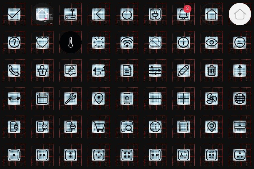
✦ The Result — 54-Icon Library
The complete icon set for Havells and its sub-brands — spanning smart home control, device states, utilities, security, and user actions. All icons follow the unified style, stroke weight, corner radius, and bounding area defined through the research and anatomy framework below.
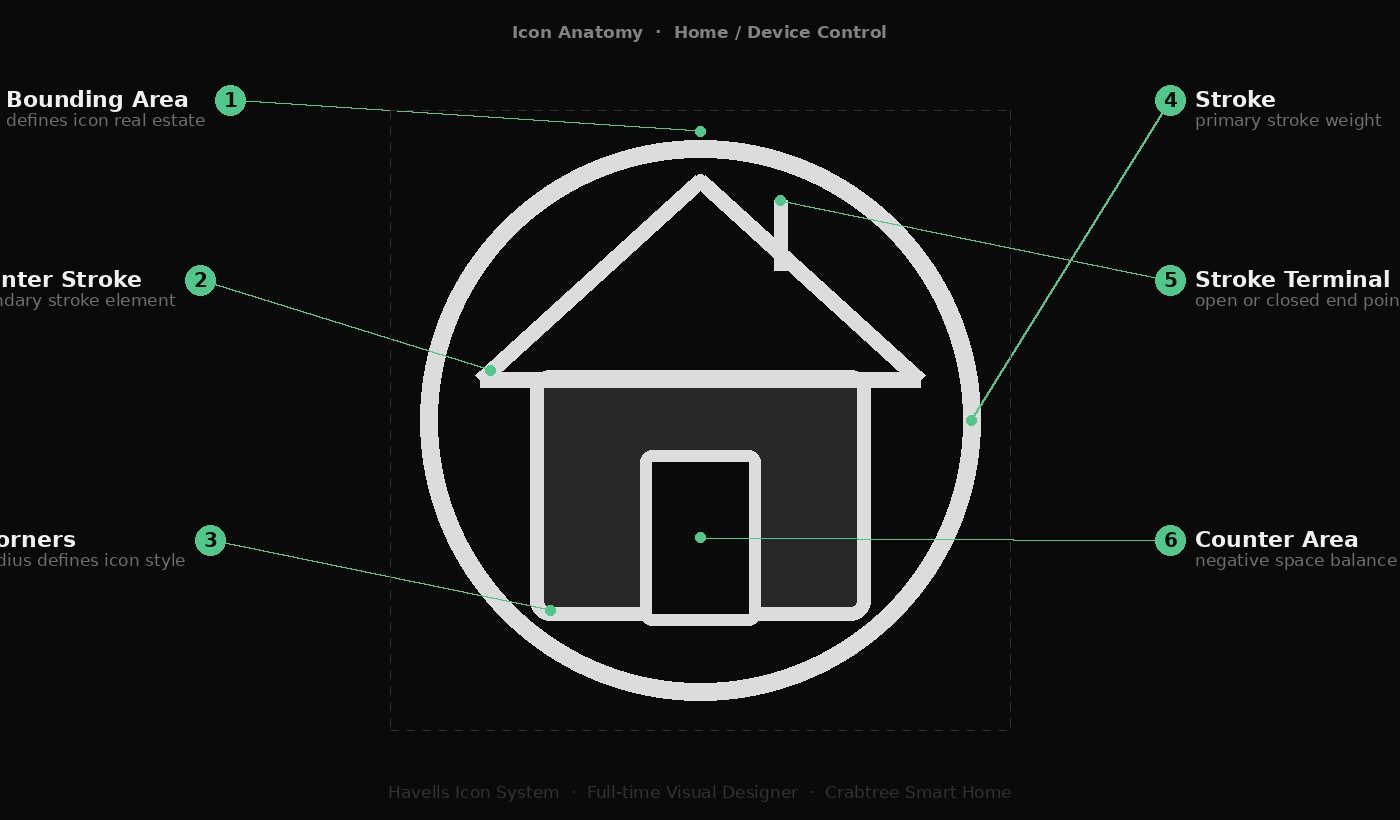
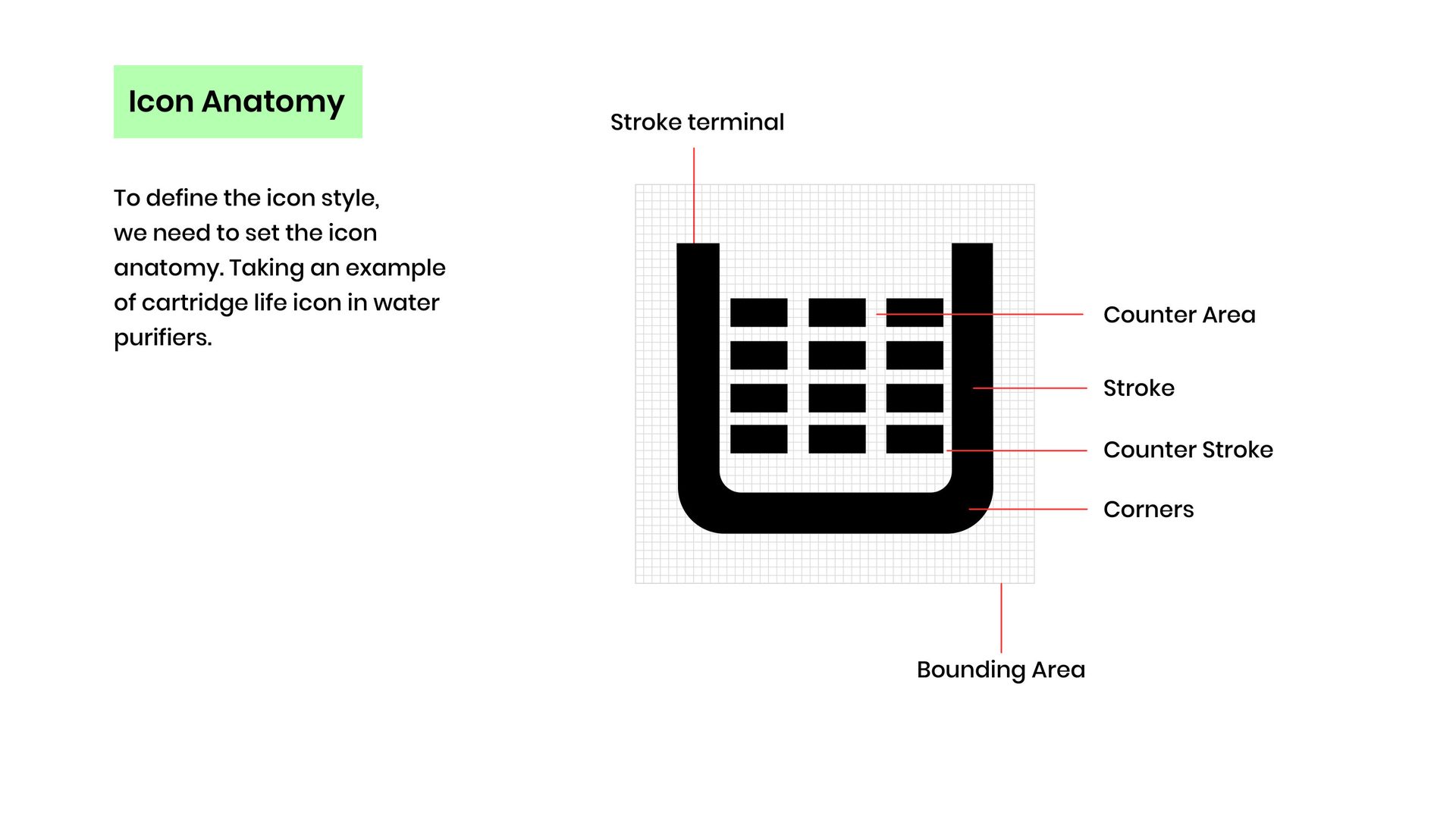
Every icon in the system is governed by six anatomical elements — each a design decision, not a default. Defining these upfront is what makes 54 icons feel like one family.
1Bounding Area
The containing circle — defines how much real estate each icon occupies.
2Counter Stroke
Secondary strokes (e.g. roof slopes) — same weight as primary for visual consistency.
3Corners
Rounded corners — the same radius used across all icons defines the style signature.
4Stroke
Primary stroke weight — governs visual heaviness and readability at all sizes.
5Stroke Terminal
Open or closed line ends — sets whether strokes feel sharp and technical or rounded and friendly.
6Counter Area
Negative space inside the icon — balanced to maintain legibility at 16px and below.
✦ 01 — The Problem
Havells had icons — but no language. Every product spoke a different visual dialect.
As a visual designer at Havells, I worked across the product ecosystem — water purifiers, switchgear, ACs, smart home panels. Every product had icons. But they didn't belong to the same family.
A sharp-cornered filled icon on the purifier, a coloured outline icon on the panel, a symbol-based icon on the remote. Visually, they were strangers.
The brief was clear: set the design language for Havells through iconography — and build a consistent icon library across all products. But before designing anything, I needed to understand why the inconsistency existed in the first place.
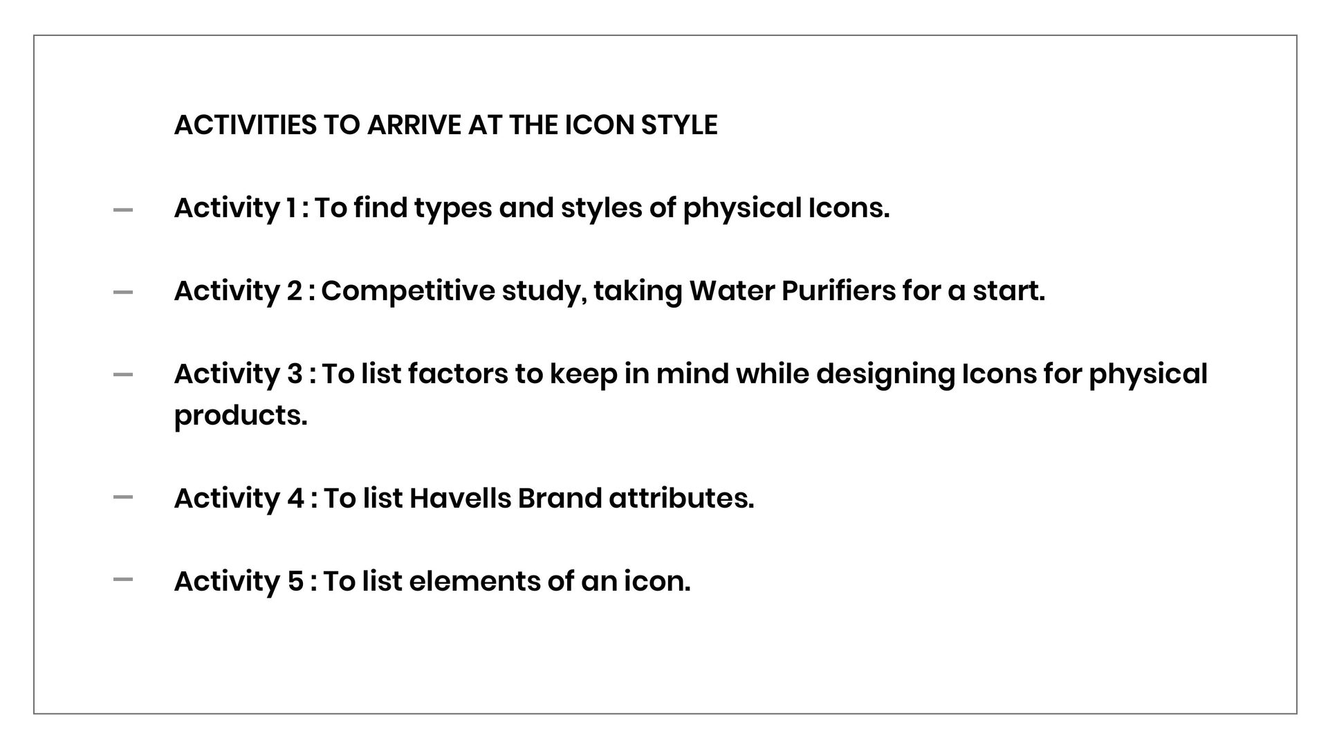
That meant an audit, a competitive study, and a proper framework — not just a new set of icons drawn in the same style.
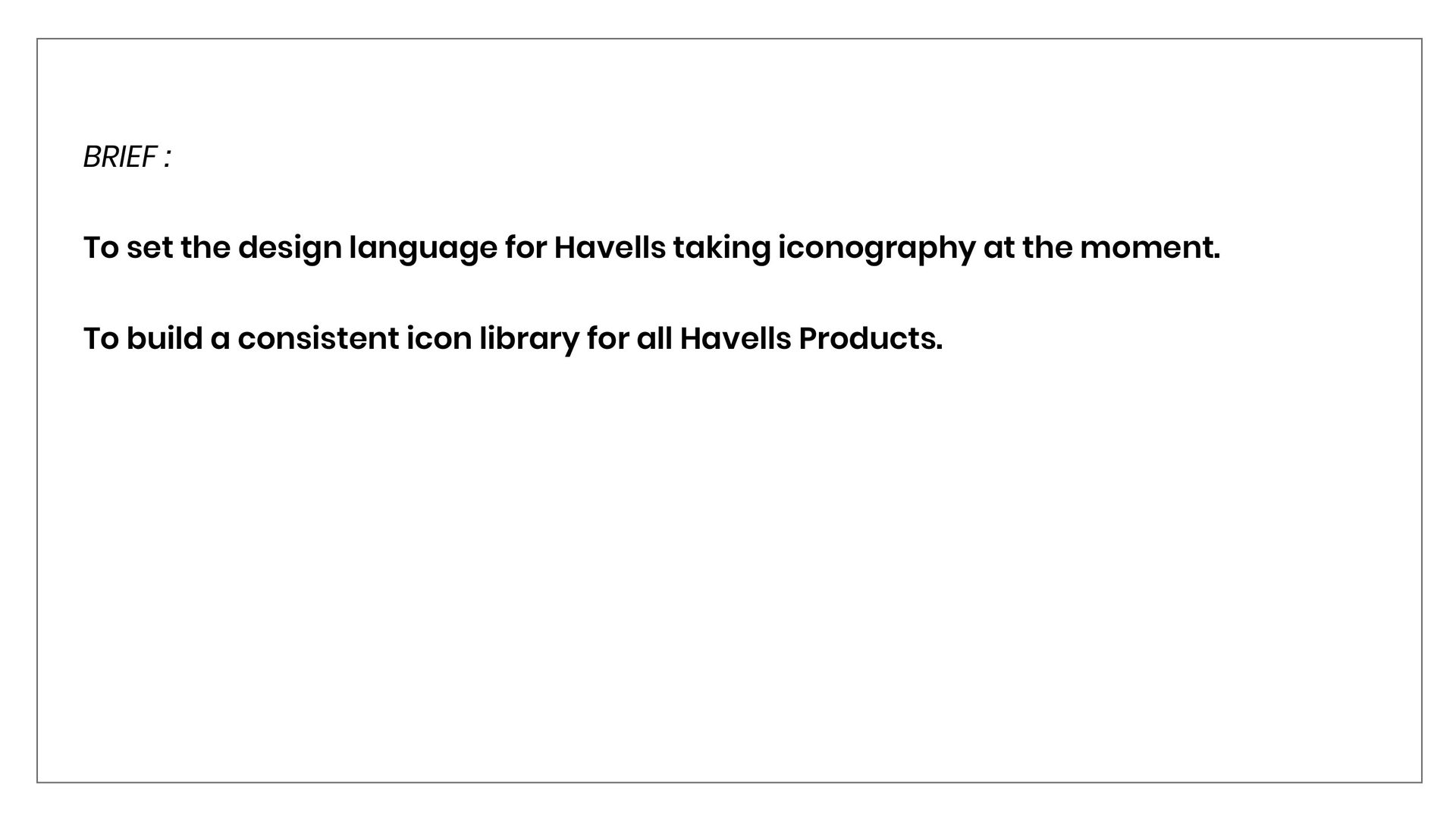
The Brief
Set the design language for Havells through iconography.
Build a consistent icon library for all Havells products.
Research Approach
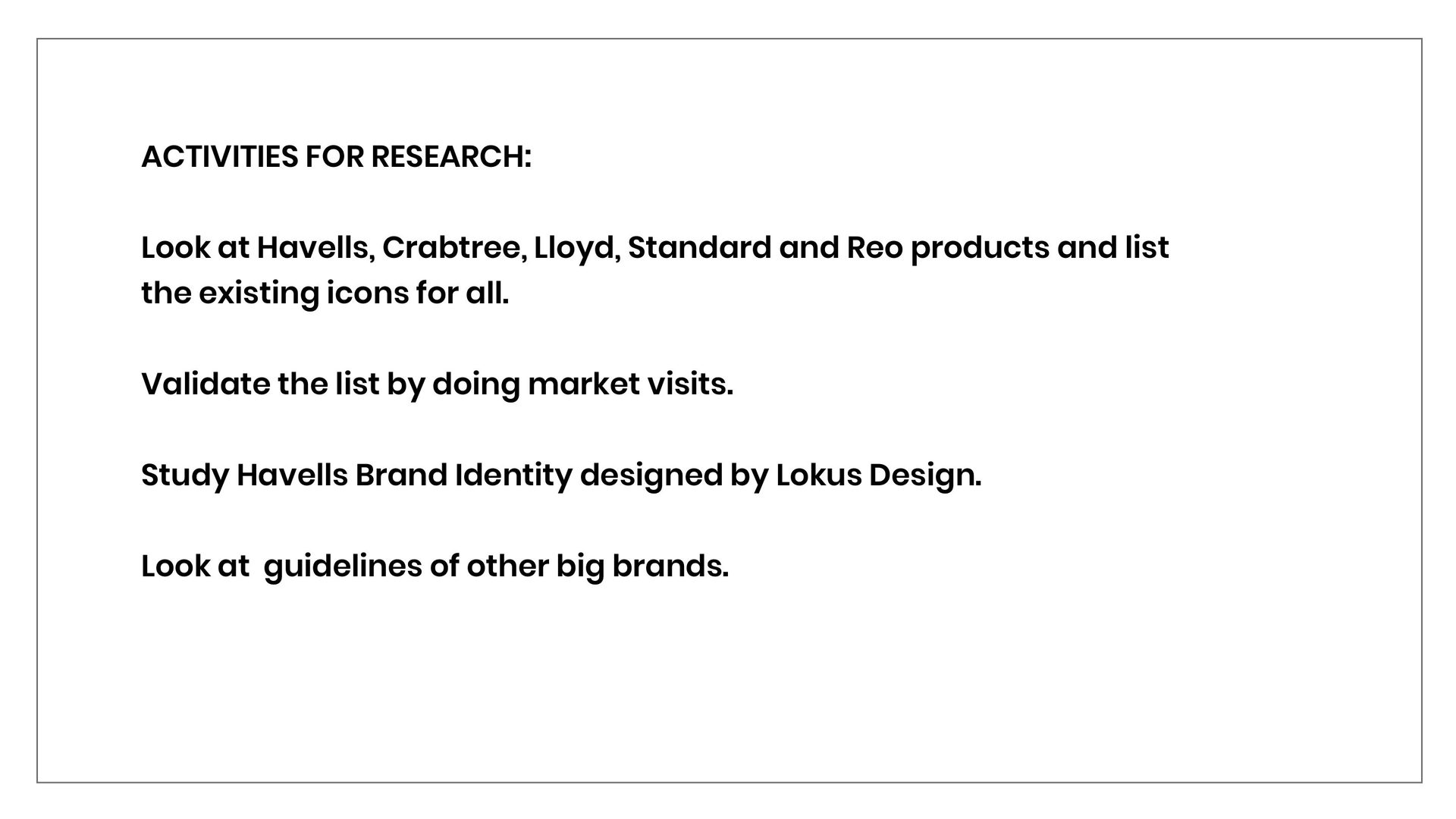
Audit existing icons across Havells, Crabtree, Lloyd, Standard, Reo
Validate through market visits
Study Havells Brand Identity (Lokus Design)
Benchmark against Walmart & Electrolux brand guidelines
02 — Key Decisions
Three decisions that shaped the icon language.
A 54-icon library could have been arbitrary. These were the decisions that made it a language — not a collection.
Decision 01
Anatomy framework before library
Six guiding principles — stroke, shape, form, space, colour, value — established before a single icon was drawn. Rules at this level mean every future addition feels like the same family, regardless of which designer made it.
Impact: 54 icons feel like one family — not a collection from multiple hands.
Decision 02
Brand attributes as design constraints
Havells' brand values translated into specific corner radius, stroke weight, and terminal decisions. Subjective brand identity became objective, manufacturing-grade specifications. The icon anatomy is Havells — not generic.
Impact: icons work across all 5 sub-brands without visual conflict.
Decision 03
Audit across 9 competitors before drawing anything
Mapping inconsistency across 5 sub-brands and benchmarking against Walmart, Electrolux, LG, and Aquaguard before creating a single icon. Diagnosis before prescription. A library without a diagnosis is just decoration.
Impact: every icon decision grounded in evidence, not instinct.
✦ 03 — The Work
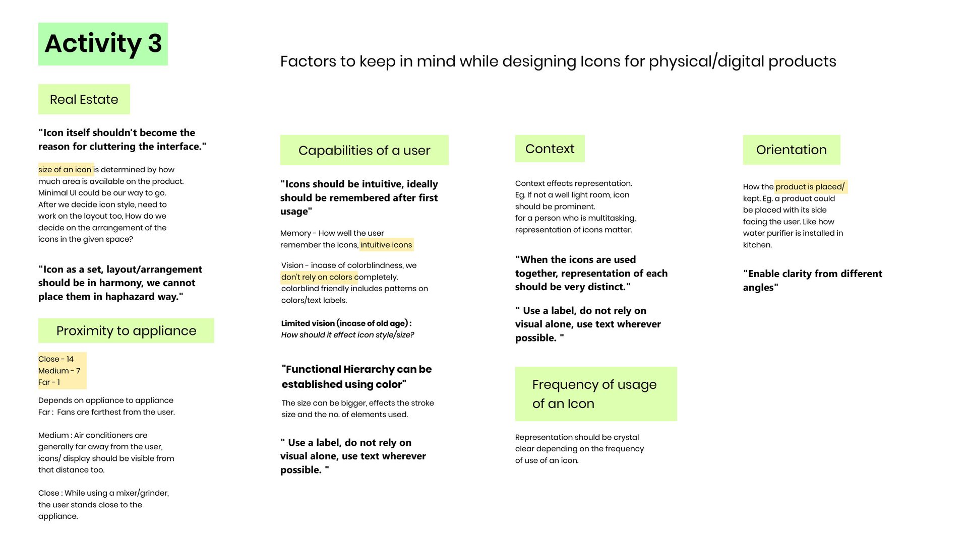
Starting with the problem: inconsistency in icon style, shape, size, form, and colour across all Havells products and sub-brands — evidenced through the water purifier line.
✦ The Work — Icon Inventory
A comprehensive audit of all existing icons across Havells, Crabtree, Lloyd, Standard, and Reo — catalogued by product type and context. Followed by a study of Walmart and Electrolux brand guidelines for learning and inspiration.
✦ The Work — Icon Types & Styles
Classifying icons by function (function, resemblance, arbitrary) and style (coloured, outline, filled) — with rounded vs. sharp corner variations. The foundation for making a principled style decision.
✦ The Work — Competitor Study
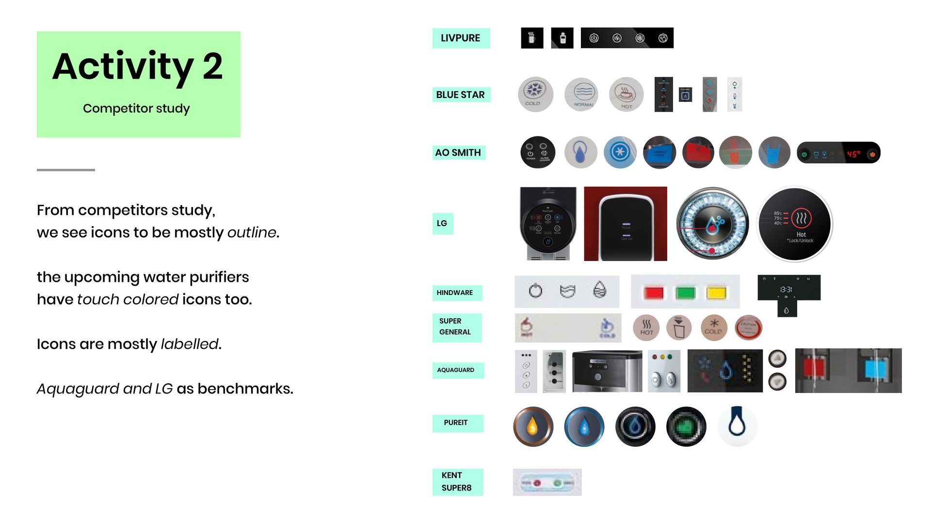
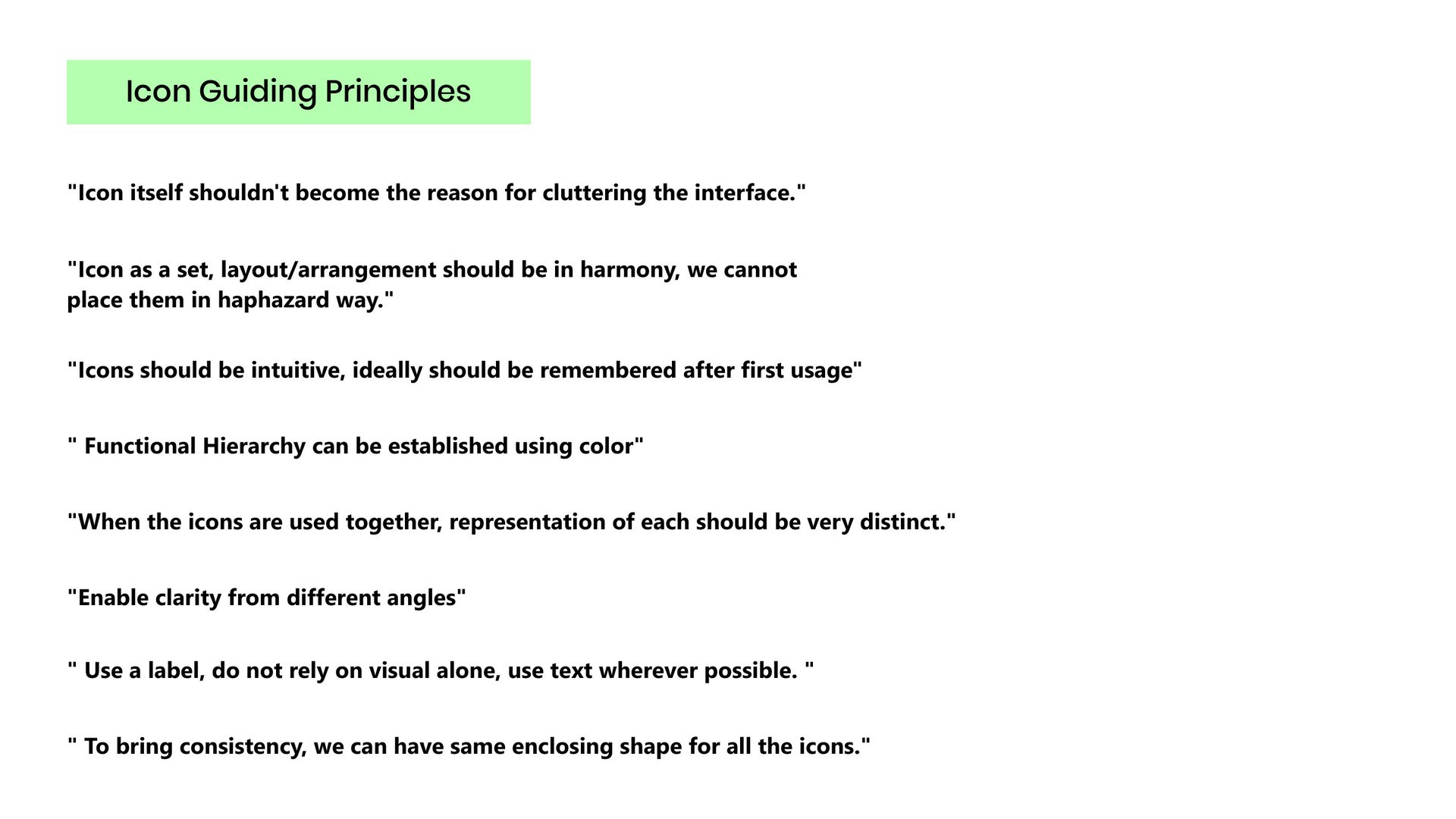
Benchmarking Livpure, Blue Star, AO Smith, LG, Aquaguard, Hindware, Pureit, and Kent — revealing a clear market direction toward outline icons, with coloured icons emerging in newer products. Followed by six icon design principles grounded in the Havells context.
✦ 04 — Outcome: Brand Attributes, Icon Elements & Anatomy
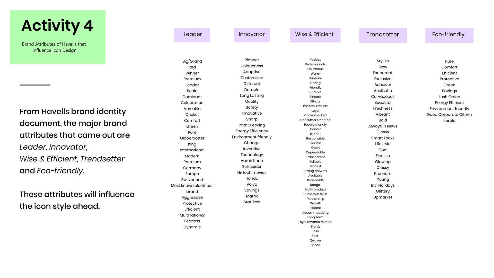
Translating Havells brand attributes — premium, modern, international, dominant — into icon design decisions. Defining the six building blocks of every icon: stroke, shape, form, space, colour, and value. Then establishing the icon anatomy using the water purifier cartridge life icon as the defining example.
A complete illustration and animation system for four Crabtree and Havells smart home products — the 4-channel switch, curtain controller, Adonia smart geyser, and AQI monitor — designed to make every device feel native to the same app.
Een compleet illustratie- en animatiesysteem voor vier Crabtree en Havells smart home producten — de 4-kanaals schakelaar, gordijnregelaar, Adonia slimme geiser en AQI-monitor — ontworpen om elk apparaat aan te laten voelen als onderdeel van dezelfde app.
A complete illustration and animation system across four Crabtree and Havells smart home products — switch, curtain, geyser, and AQI monitor.
Designed product illustrations and animation sequences for the 4-channel switch, curtain controller, Adonia smart geyser, and AQI monitor — building a consistent visual language that makes every device feel native to the same app.
🔌
4-Channel Switch
Product illustration + SVG connectivity icon + 3 animations — switch interaction, fan control, and app onboarding.
🪟
Curtain Controller
Illustrated curtain states (closed → open) with a live position slider — making a physical action feel direct in the app.
🚿
Adonia Smart Geyser
Product illustration + onboarding animation in 3 iterated versions — proximity pairing with temperature calibration.
🌫️
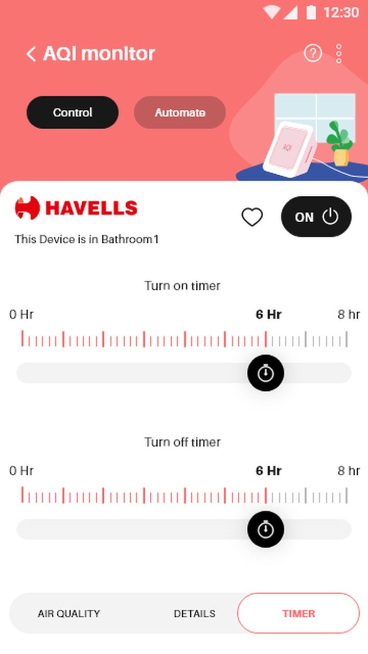
AQI Monitor
App banner illustration for the AQI monitor device — product visual placed in a room context within the Havells app header.
Full-time Visual Designer · Havells India · Crabtree Smart Home
✦ The Work
Every Crabtree device needed to feel like it belonged to the same world inside the app.
Three Crabtree products. Three very different physical interactions. All needing to feel consistent, tactile, and intelligible within the same app — without relying on text to explain them.
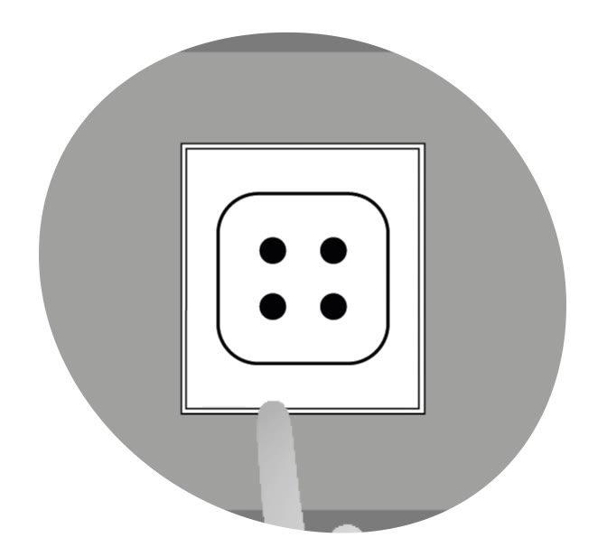
4-channel switch: representing a multi-load panel clearly — four channels, one illustration, one icon for connectivity state.
Curtain controller: making position feel continuous and physical — the illustration moves with the slider.
Adonia geyser: solving onboarding anxiety. Proximity pairing is a step users abandon, so the animation needed to feel calm, sequential, confidence-building.
All three share the same illustration style — greyscale product renders, circular framing, minimal shadows — so they read as a family inside the Crabtree app.
Four channels, one panel. The illustration had to show which channel is which at a glance — and the SVG connectivity icon had to abstract the four-node structure into a symbol recognisable at 24px.
Product Illustration
Connectivity Icon — SVG
Four-node dashed-circle — represents 4-channel connectivity. Used in pairing UI and device control screen.
Animations
Switch Interaction
Four-button press interaction — shows individual channel selection and the switch face responding.
Device Control — Fan
Live state feedback: the switch controlling a connected fan within the Crabtree device screen.
App Onboarding Flow
In-app setup sequence — long press, LED glow, reset complete. Designed to feel immediate and clear.
✦ 02 — Curtain Controller
A curtain position is continuous — not binary. The illustration had to reflect every state between fully closed and fully open, with the curtain moving visually in sync with the position slider.
Fully Closed
Curtain illustration drawn across the full window — warm amber fabric, opaque. Position slider at 0%.
Partially Open
Curtain pulled to one side, window partially visible. Sky and daylight become visible — communicating the open state clearly.
Fully Open
Curtains drawn fully to the sides — full window visible. The illustration reinforces the ON state beyond just the toggle.
App Context
The Crabtree app shows the curtain illustration as the central device representation on the control screen, with Control and Automate tabs for manual control and scheduled automation. The ON/OFF toggle and heart (favourites) sit above the illustration. The position slider sits below it.
✦ 03 — Adonia Smart Geyser
The Adonia onboarding sequence uses a 5-second proximity countdown with a temperature calibration step. Three animation versions were produced — the original and two iterations refining the interaction affordance cues.
Original Animation
The first version — geyser product illustration, 5-second countdown, +/– temperature adjustment.
Iteration 1 — App Context
Full app context added. Red highlight rings on +/– buttons emphasise the interaction affordance. "We Are Setting Up Your Smart Geyser."
Iteration 2 — Refined
Updated highlight treatment, cleaner countdown timing, and refined visual hierarchy on the control buttons.
✦ 04 — AQI Monitor
Banner illustration for the Havells AQI monitor — a product visual placed in a room context within the app header, part of the broader Havells smart home illustration language.
Screen Details
Banner Illustration
The coral header features a product illustration of the AQI monitor — placed in a domestic room setting with a potted plant, making the device feel approachable and contextual within the app.
Illustration Language
Consistent with the Crabtree and Havells product illustration style — isometric-leaning device rendered in warm tones, placed against a lifestyle background rather than a plain colour field.
Real-World Impact
What the switches actually do in a real home.
An independent reviewer tested the Crabtree iSense system in a live studio setup — replacing existing switches with zero rewiring and documenting the full experience. Here's what the product delivered.
The core claim — verified
Zero rewiring. Retrofits into your existing switchboard slot.
No breakage, no new wiring, no contractor chaos. The entire studio switchboard was replaced in a matter of minutes — and the transformation was immediately visible.
0
minutes of rewiring required
4kVA
inbuilt surge protection for Indian power conditions
~₹50,000
to fully automate a 2BHK home end-to-end
Three ways to control everything.
🔲
The switchboard itself
Capacitive, backlit, glass-faced modules that look premium and feel immediate. Always works — even if WiFi is down. Available in white and graphite grey.
📱
Havells Top app
Available on iOS and Android. Create scenes and automations — lights and fans configured for guests, for work, for night. The reviewer's preferred method for full control.
🎙
Remote + Voice
Physical remote controls lights and fans. Voice control works through supported apps and devices, set up directly from the Havells Top app — "lights on" and it's done.
What's inside the 8-module iSense.
💨
2 Fan controls
Speed regulation via app or switch
💡
4 On/off switches
For standard lights and appliances
🔆
4 Dimmers
Full light dimming for ambience control
🎬
2 Scenes
One-tap preset configurations
⚠️
One thing to plan for
The receiver must stay plugged in and connected to WiFi at all times for automation to function. Physical switches always work — but smart features pause if power or internet drops. For multi-storey homes, two receivers are recommended to keep everything reliably connected.
DSB
UX Research · Product Design · Digital Sustainability
Digital doesn't mean invisible. Digital leaves a footprint too — a tool that helps design agencies measure and improve their impact, one project at a time.
Digitaal betekent niet onzichtbaar. Digitaal laat ook een footprint achter — een tool die designbureaus helpt hun impact te meten en verbeteren, project voor project.
Role
UX Researcher · Workshop Facilitator · Designer
Partner
Faraday Digital Agency · Amsterdam
Team
4-person multidisciplinary team
Stakeholders
13–20 across agency, academia & industry
Duration
8 weeks · Mar – Apr 2025
00 — Falling in Love with the Problem
The footprint nobody talks about — and nobody can see.
I had never thought of a website as having weight. Digital feels intangible — no packaging, no exhaust fumes, no landfill.
Then I found the data: a single website visit generates roughly 1.76 grams of CO₂, and the internet as a whole produces as much carbon as the aviation industry. I felt unsettled — I'd been building invisible polluters, and had no idea.
The problem isn't denial — designers and agencies generally care about doing the right thing. The problem is invisibility: you cannot improve what you cannot measure.
When our team at HvA's Beyond Human Design Playgrounds asked Faraday Digital Agency how they assess sustainability, the answer was almost universal: we don't. Not for lack of will — for lack of an accessible standard, a workable tool, a shared language.
That gap became the problem I fell in love with. Not "how do we make designers feel guilty" — that's the wrong lever entirely.
But: how do we make the invisible visible in a way that fits how agencies already work — something a team can act on before decisions are made, when the cost of changing direction is still low?
Eight weeks in, I came to understand that sustainability benchmarking for design agencies isn't just an environmental project. It's a product design problem at its core — a challenge of relevance, adoption, and workflow integration. The tool needed to be as frictionless as a good design brief template. That's what we set out to build.
You cannot improve what you cannot measure. The problem wasn't apathy — it was the total absence of tools that made measurement possible.
1.76g
CO₂ per average website pageview (WebsiteCarbon, 2023)
80%
of a digital product's environmental impact is shaped by design decisions (Flying Bisons, 2024)
0
accessible benchmarking tools for digital design agencies at project level — before we built this
0A — Stakeholder Map
The ecosystem around a sustainable design decision.
Digital sustainability doesn't live in one person's responsibility — it's a chain that runs from hosting infrastructure to the client brief to the end user's device. Mapping who holds power in that chain helped us understand where a benchmarking tool could create the most leverage.
Direct Users of the Benchmark Tool
🎨
Creative Director / Design Lead
Owns project quality standards
👩💻
UX/UI Designer
Makes day-to-day decisions that compound
🏗️
Frontend Developer
Implements images, scripts, rendering patterns
📋
Project Manager
Controls timelines and scope trade-offs
Clients & Commissioners
🏢
Client Organisation
Sets project briefs and ESG ambitions
📣
Marketing Lead
Drives content weight and asset decisions
Structural Enablers & Validators
🌿
Environmental Researcher
Provides scientific grounding for metrics
🏛️
Policy / Regulatory Bodies
Sets future compliance requirements
🎓
HvA / Academic Mentors
Guides the research methodology
🤝
Faraday Digital Agency
Validates real-world feasibility
0B — User Personas
Niels
Creative Director
"Sustainability needs to fit kickoff — not become a second project."
Needs actionable scores under 30 min. Frustrated by vague guidelines with no way to track progress.
Joss
Junior UX Designer
"I care about climate but don't know what my design decisions actually cost."
Needs concrete, jargon-free guidance. Frustrated by no feedback loop — no way to know if she improved.
Marta
Marketing Director (Client)
"Our board wants ESG credentials. I don't know what our agency is doing about it."
Needs a plain-language score for reports. Frustrated by agencies that can't quantify their sustainability claims.
01 — The Problem
How do you make the invisible visible?
Digital products feel weightless — no packaging, no physical waste. But they're not. Every click, render, and API call consumes energy. Every design decision shapes that footprint. Yet most design agencies have no way to measure it.
Developed as part of the MDD Beyond Human Design Playgrounds programme at Amsterdam University of Applied Sciences, our design challenge was clear: How can we help digital design agencies understand and improve their digital sustainability impact on a project level — through a benchmarking tool?
We partnered with Faraday Digital Agency, guided by mentor Niels de Keizer — a 15-year veteran of building digital products and experiences who understood both the commercial and ethical dimensions of the problem.
02 — Why It Matters
Design shapes 80% of a digital product's carbon footprint.
Designer's Responsibility
"Design shapes 80% of a digital product's carbon footprint." — Flying Bisons, 2024. It's our responsibility as designers to address this.
The Ethical Question
"Does what we create justify what we destroy?" — Fry, 2011. Agencies influence clients and users to adopt energy-efficient or wasteful digital habits.
Business Case
"Sustainable design = cost-efficiency + profitability." — Komodo Digital, 2024. Sustainability isn't just ethics — it's also reduced technical debt and regulatory readiness.
03 — Key Decisions
Three decisions that shaped the final tool.
Decision 01
Pivot from value-mapping to a predefined benchmark
In Week 3, Faraday challenged our initial concept: "Company values are always set — who is this actually for?" That feedback forced a sharper scope. Instead of asking agencies to define their own sustainability values from scratch, we gave them a framework to assess against — predefined, grounded in research, and usable in under 30 minutes.
Trigger: Agency workshop feedback
Decision 02
Narrow to exactly 5 assessment dimensions
A broad audit covering everything would be abandoned in a project kickoff. So we distilled the research to 5 dimensions that together account for 80% of a digital product's environmental impact:
Clean energy, stewardship, avoiding dark patterns, product lifecycle, and operational efficiency — narrow enough to be actionable, broad enough to be meaningful.
Trigger: Research synthesis + adoption barrier
Decision 03
Build an interactive tool, not a PDF
A static checklist would be filed and forgotten. So we built the benchmark as a live tool instead — a Framer one-pager with a scoring interface, deployed on Vercel.
Agencies score a project, see their radar chart instantly, and get specific recommendations. The format mattered as much as the content: friction-free, shareable, built to fit into a project kickoff.
Trigger: Adoption + usability goal
04 — What We Built
A benchmark that fits into how agencies already work.
The Digital Sustainability Benchmarking Tool helps design agencies with 10+ team members assess their sustainability performance across five foundational values — at the start of each new project.
🌱 Clean
Energy-efficient hosting, minimal data usage, lightweight code and assets.
🤝 Stewardship Principles
Diversity, equity, accessibility, and responsible community impact.
🛡 Avoiding Manipulative Design
No dark patterns, transparent data practices, honest interfaces.
⏱ Product Lifecycle
Planning for longevity — updates, maintenance, and eventual retirement.
📊 Operational Digital Efficiency
Reducing unnecessary processing, storage, and digital waste in workflows.
The tool asks targeted questions, generates a sustainability score via a radar/spider chart, and surfaces actionable recommendations. Built as a Framer one-pager website and a v0 Vercel interactive app.
8 weeks. From brief to delivery — with a real client.
Week 1–2 · Debrief & Expert Interview
I led our team's initial engagement with Faraday Digital — including introductions, formal communication, and our first stakeholder meeting. Research phase: competitor analysis, stakeholder mapping, initial ideation. We studied Faraday's spider-web matrix framework for evaluating projects.
Week 3 · Workshop 1.0 — Design Agency Simulation
I volunteered to facilitate our "Design Agency Simulation" workshop at MDD studios, inviting participants from outside the university to simulate real agency decision-making.
Participants took on role cards — Designer, CEO/Founder, Software Developer, Sales Lead — and worked through client challenge cards across healthcare, fintech, e-commerce, and education.
Week 4 · Expert Review & Pivot
Presented our Value Assessment concept to Faraday. Key feedback: "Who is the target audience?" and "Company values are always set." We pivoted from a value-mapping tool to a sustainability benchmarking tool with predefined assessment criteria — a sharper, more actionable scope.
Week 5–6 · Workshop 2.0 & Digital Tool Design
Ran a second iteration with 9 role cards and 6 challenge cards — expanded based on Faraday's actual team structure. Simultaneously, we translated the physical workshop into a digital interface: sketching wireframes through 3 iterations from onboarding → value input → recommendations.
Week 7–8 · Usability Testing & Final Delivery
Validated through usability tests and a live demo with Faraday Digital. Final deliverable: a complete workshop session run with Faraday + the benchmarking tool live on the web.
05 — Evidence & Frameworks
Grounded in established sustainability science.
The benchmarking tool wasn't designed from intuition alone. It was built on a foundation of established frameworks, validated through real agency feedback.
W3C Web Sustainability Guidelines
Core technical and design standards for sustainable web development.
Sustainable Web Manifesto
Clean, efficient, open, honest, regenerative, and resilient principles.
Wholegrain Digital
Comprehensive sustainable web design methodologies (Tom Greenwood, 2024).
UN Sustainable Development Goals
SDGs 9, 12, 13, and 17 — industry innovation, responsible production, climate action, partnerships.
07 — Key Insights
What the research revealed.
01
Predefined values, not open mapping
Workshop 1.0 revealed that participants want predefined sustainability values to guide them — not blank-slate value mapping. The benchmark needed to lead, not just listen.
02
Role clarity is critical
The purpose of role cards was initially unclear. We redesigned them with explicit behavioural guidance and perspective-specific tips — making the simulation more realistic and productive.
03
Whose values? Agency or client?
A key ambiguity emerged: should sustainability values be assessed from the client's perspective or the agency's? We resolved this by making the tool agency-first — the agency benchmarks its own project practices.
08 — Reflection
What I took away.
This project pushed me into genuinely unfamiliar territory. I wasn't just designing interfaces — I was facilitating workshops, leading stakeholder meetings, and helping a team of four find consensus under time pressure.
The "Design Agency Simulation" workshop was the moment I'm proudest of. Volunteering to facilitate, recruiting participants from outside the university, and running a session that generated real, actionable insights — that took initiative I had to build deliberately.
I also learned what it means to pivot with purpose. When Faraday challenged our concept in week four, we didn't just adjust — we used the feedback to sharpen our scope and build something more genuinely useful. That shift from "value assessment" to "sustainability benchmark" made the tool better in every way.
"Digital doesn't mean invisible. Out of sight — but not impact-free."
A benchmarking framework that makes digital sustainability measurable at project start.
Built and validated a scoring tool for digital design agencies — covering image weight, hosting choices, font loading, interaction efficiency, and render strategy. Validated with Faraday Digital Agency in Amsterdam. The framework was delivered as a usable assessment tool, not an abstract checklist.
🌿
Benchmarking Framework
Five-dimension assessment model covering the design decisions that account for 80% of a product's carbon footprint.
🏢
Agency Validation
Co-developed and stress-tested with Faraday Digital Agency — real briefs, real timelines, real constraints.
🎓
Academic Recognition
Produced at HvA Beyond Human Design Playgrounds — positioned as a contribution to emerging digital sustainability practice.
8 weeks · HvA Beyond Human Design Playgrounds · Faraday Digital Agency, Amsterdam
09 — Learnings
What the final testing and discussions taught us.
Presenting the tool to stakeholders, mentors, and students surfaced real tensions — not flaws in the tool, but in the space itself. These are the questions and conflicts we're still sitting with.
Core question from discussion
Is making a digital tool to help companies become more sustainable itself an ethical act?
Yes — if the tool drives real systemic change. The risk is tokenism: a company using the tool to say "we're sustainable" without changing any harmful practice. A score that becomes a checkbox rather than a catalyst.
If the tool is grounded in real values, invites reflection and iteration, and puts pressure on the system — not just the individual — it avoids tokenism and becomes a tool for actual change.
Six questions every digital sustainability tool should answer.
01 · Intent
Are we building this to drive real change — or to meet a compliance or marketing goal? Make the purpose public. Declare values up front in the tool's onboarding.
02 · Transparency
Is the scoring logic visible? Can teams understand how their score is calculated? Avoid black-box algorithms — explain the process, even if it's imperfect.
03 · Inclusivity
Are the benchmarks culturally biased or Western-centric? Include feedback from designers in underrepresented regions and people with different lived experiences.
04 · Data Ethics
What data does the tool collect? Can users opt out? Default to privacy-first — don't store more than you need.
05 · Power
Who controls the benchmarks? Who decides what "good" looks like? Co-design with the community — make the tool a living thing that evolves.
06 · Self-Consistency
Is the tool itself energy-efficient? Are we modelling the practices we preach — clean code, lightweight design, sustainable hosting? Practice what you benchmark.
What people said in the final session.
Four challenges from stakeholders — and how we'd respond.
Sander — "The tool looks a bit AI-created"
The interface or copy felt generic — too polished or templated, missing human tone and storytelling cues.
→ Add human warmth through examples and emotional hooks. Visually personalise with illustrations. Be transparent where AI assisted — and humanise the collaboration.
Ander — "Why not build it in Figma with Variables?"
If it's a conceptual tool or survey, couldn't lower-tech prototyping suffice? Why invest in Vercel infrastructure?
→ Figma can show flow, but can't track answers, compare scores, or adapt content dynamically. We wanted this to feel like a real tool teams could use today — not a prototype for workshops. And the future plan is to expand it into a real-time assessment platform.
Irene — "Awareness: is that enough?"
If a team is just made "aware," what does that actually change? Awareness without agency is hollow.
→ The tool is a conversation starter, not just a scorecard. We'd reframe from "Are you aware of…" to "How do you currently approach…" — and add a "what can I do about it?" tip next to each question, plus a resources section per dimension.
General — "Beginning or end of project?"
When in the project lifecycle does the tool actually belong? Kickoff felt obvious, but retrospective use surfaced as equally valuable.
→ Two modes: 🟢 Kickoff mode ("use this to plan a more sustainable approach") and 📘 Retrospective mode ("reflect on decisions made and what to improve next time"). The same framework serves both if the framing shifts.
What we'd do next
→
Update the tool's language for warmth and clarity — shift from awareness to action framing
→
Add Kickoff vs Retrospective usage modes
→
Embed examples and stories inside each dimension to humanise the metrics
→
Create a lightweight Figma version to validate the flow concept before rebuilding
→
Include a feedback prompt inside the live tool: "Did this feel relevant to your project?"
→
Seek input from designers outside the Western European context to test benchmark inclusivity
Persona photos via Pexels — Moisés Sánchez, Oliver Dohrn, Speak Media Uganda.
SYN
Game Design · UX Research · Media Literacy
Game design · UX-onderzoek · Medialezen
Synthetive
What if a card game could teach media makers to co-create responsibly with AI? — Designing an award-winning boardgame at the intersection of media literacy and responsible technology.
Wat als een kaartspel mediamakers kon leren om verantwoord samen te creëren met AI? — Het ontwerpen van een bekroond bordspel op het snijvlak van medialezen en verantwoorde technologie.
RoleRol
Visual & Motion Designer
Partners
VPRO Medialab · NPO · Beeld & Geluid · Digital Society School
Deliverable
Physical boardgame · Brand identity · Social media launch
AwardPrijs
Go HvA Game Changers Public Choice 2024
✦ Final Outcome
A fully shipped game experience — and a Public Choice award at Go HvA.
Synthetive launched as a complete, playable game exploring synthetic identity, digital surveillance, and the boundary between authentic self and algorithmic persona. It won the Go HvA Game Changers Public Choice Award 2024 and was shown in multiple public venues.
🎮
Full Game Shipped
End-to-end game design, mechanics, narrative arc, and visual system — from concept to playable build.
🏆
Public Choice 2024
Won the Go HvA Game Changers Public Choice Award — selected by public vote across all graduating projects.
🌍
Shown in the Wild
Exhibited at IMPAKT Festival Utrecht, ZERO Medialab, and MozFest — reaching audiences beyond the academic context.
KABK Graduation Project · Go HvA Game Changers Public Choice Award 2024
00 — Falling in Love with the Problem
AI literacy isn't a training problem. It's a felt experience problem.
In 2023 I watched a documentary about AI-generated newsrooms and felt something I hadn't expected: not fascination, but dread — the dread of a media professional handed a tool they hadn't asked for, with no framework to use it responsibly.
I started paying attention to how colleagues and students in media talked about generative AI: mostly in avoidance or uncritical enthusiasm, rarely in anything resembling ethical literacy.
When NPO, VPRO Medialab, and Beeld & Geluid brought the brief — help media makers co-create with AI responsibly — I noticed the framing was already wrong. The usual response is a training module, a policy document, a slide deck.
But you don't build moral intuition by reading slides. You build it by making decisions under pressure — by feeling the weight of a choice between what's strategically smart and what's editorially right.
That's the problem I fell in love with: how do you teach someone to feel the tension before they face it in real life? Roleplay and simulation are ancient tools — but nobody had applied them with this rigour to the pressures of AI-assisted media making.
The card game format wasn't a gimmick, it was the solution: the physical deck forces presence, the scenario cards force choice, the challenge cards force justification.
The deeper I researched, the more I found Dutch media organisations living in a paradox — audiences increasingly sceptical of AI-generated content, while organisations felt pressure to use AI to cut costs.
Nobody was talking openly about the ethics. Synthetive needed to create a safe space for that conversation — playfully, seriously, and without judgment.
Moral intuition is not built by reading guidelines. It's built by making decisions under pressure — and Synthetive was designed to create that pressure in a room full of people who needed to have this conversation.
🏆
Go HvA Game Changers Public Choice Award 2024
3
partner organisations shaping the Dutch media landscape
1st
physical card game for ethical AI co-creation in Dutch media
0A — Stakeholder Map
A media ecosystem at an inflection point.
The game needed to serve a wide ecology — from the junior journalist uncertain about AI to the broadcaster executive setting editorial policy. Mapping these relationships helped us write scenario cards that felt credible to every level of the room.
Players — Primary Experience
📡
Broadcast Journalist
Makes editorial AI decisions daily
🎬
Content Producer
Faces AI tools in content workflows
✍️
Script Writer / Editor
Navigating AI-assisted narrative creation
📸
Visual Journalist
Using generative image tools
Commissioning Partners
📺
NPO (Dutch Public Broadcasting)
Sets national editorial standards
🔬
VPRO Medialab
Experimental media innovation arm
🏛️
Beeld & Geluid
National archive — context for media history
Wider System
🎓
Media & Journalism Educators
Embed media literacy in curriculum
⚖️
Regulatory & Policy Bodies
Developing AI-in-media guidelines
👥
Audience & Citizens
Ultimate recipients of AI-shaped media
0B — User Personas
The media makers I wrote the WHAT IF cards for.
Every scenario card in Synthetive was tested against these three archetypes — not as abstractions, but as the voices I was trying to bring into the room. The game only works if it speaks to all three.
Roos
Broadcast Journalist, NPO
35 · Amsterdam
"I want to use AI to work faster — but I'm terrified of what my audience will think if they find out."
Needs
A framework for when AI use is editorially acceptable
Scenarios that reflect real pressures — deadlines, budget cuts, scoops
Peer conversation without judgment
Frustrations
Editorial guidelines that ignore practical realities
Pressure to use AI from above, no support from below
No shared language with colleagues about ethics
Motivation: Wants to remain a trusted journalist while adapting to the tools her industry is adopting.
Thomas
Head of Digital, VPRO
47 · Hilversum
"We need a policy. But policy documents don't change how people actually behave in the edit suite."
Needs
Team alignment on AI ethics without enforcing top-down mandates
A way to open conversations that feel too sensitive in formal settings
Evidence that his team has developed their own ethical compass
Frustrations
Training that doesn't land
The gap between policy intent and daily practice
Young colleagues making AI decisions without institutional context
Motivation: Wants VPRO to lead rather than react — and to build a culture of responsibility that outlasts any single policy document.
Lena
Recent Graduate, Media Studies
23 · Rotterdam
"AI is just a tool, right? I don't understand why everyone's so stressed about it."
Needs
A safe space to explore concerns without feeling naive
Concrete examples that make abstract ethics tangible
To understand what her media literacy responsibilities actually are
Frustrations
Abstract lectures about AI and ethics
Senior colleagues shutting down AI conversations entirely
Feeling caught between enthusiasm and unease without guidance
Motivation: Wants to use technology fearlessly and responsibly — and build an intuition for the difference.
01 — The Problem
How do you make AI literacy feel exciting, not intimidating?
The Dutch media landscape was grappling with generative AI — how to use it ethically, creatively, and without losing editorial integrity. Partners NPO, VPRO Medialab, and Beeld & Geluid commissioned a framework that would help media makers explore co-creation with AI in a hands-on, accessible way.
The challenge had two layers: develop a practical co-creation framework, and embed genuine media literacy and responsible AI use into the experience — making it something people would actually want to engage with, not just a training module.
02 — Key Decisions
Three decisions that shaped the work.
Not everything in this project was obvious. These were the calls that had real consequences — for the outcome, the team, and whether the work would actually hold.
Decision 01
Card game, not a training module
The usual response to 'build AI literacy' is a workshop deck. But moral intuition isn't built by reading slides — it's built by making decisions under pressure. The card game format is the pedagogy itself, not a vessel for it.
Impact: players left with a felt understanding, not a received framework.
Decision 02
Scenario cards based on real editorial incidents
Every scenario in the game reflects a documented real-world AI editorial decision made by a media organisation. The pressure players feel is borrowed from actual situations — which made the ethical weight authentic, not simulated.
Impact: post-play feedback showed players connecting game choices to their own professional contexts.
Decision 03
Public venues over closed classrooms
Showing at IMPAKT Festival, ZERO Medialab, and MozFest put the game in front of working media practitioners — not just students. Real audiences with real stakes stress-tested whether the concept held outside the academic context.
Impact: Public Choice Award 2024 — selected by public vote across all graduating projects.
03 — The Work
Synthetive: A boardgame for media makers
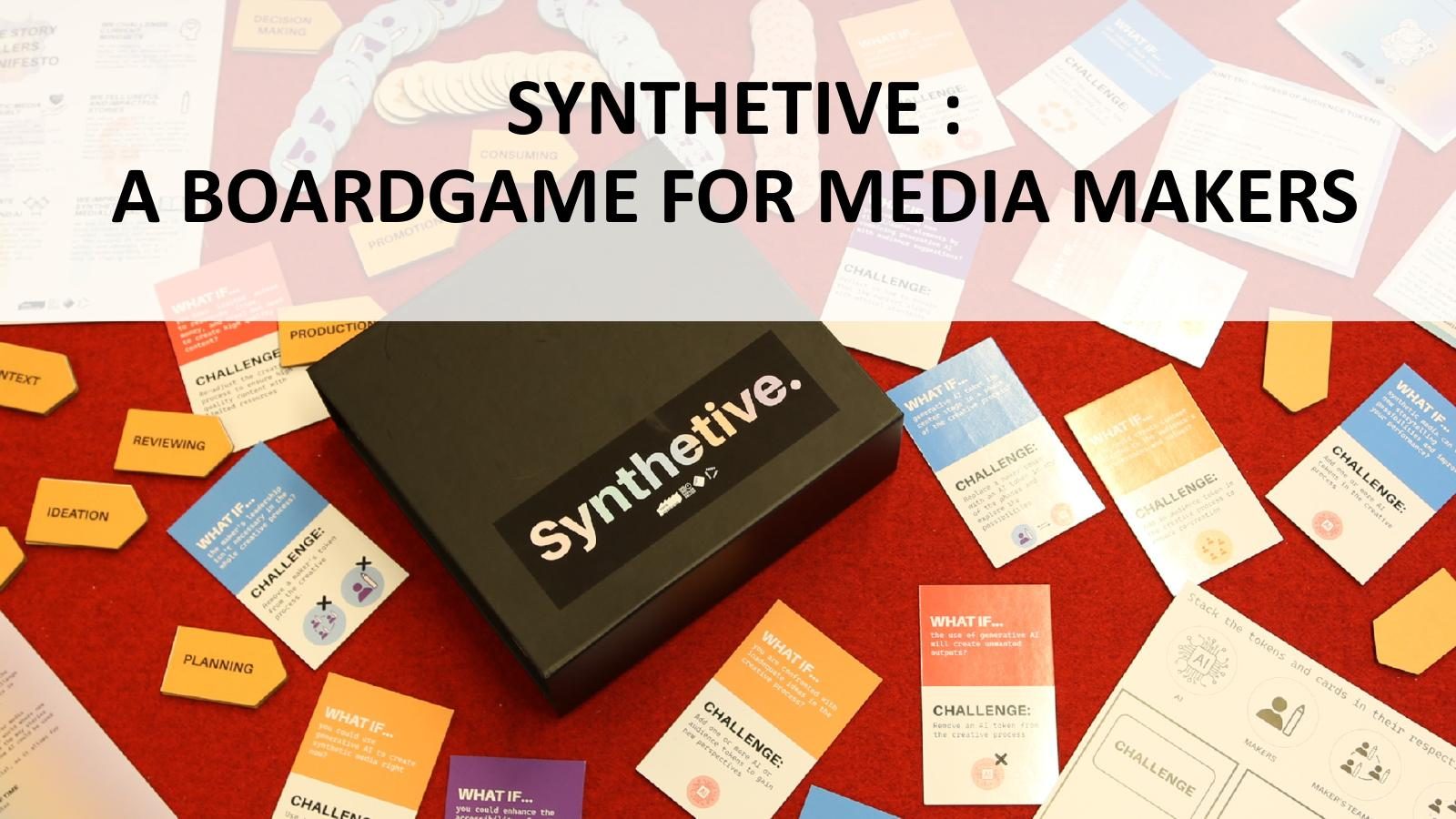
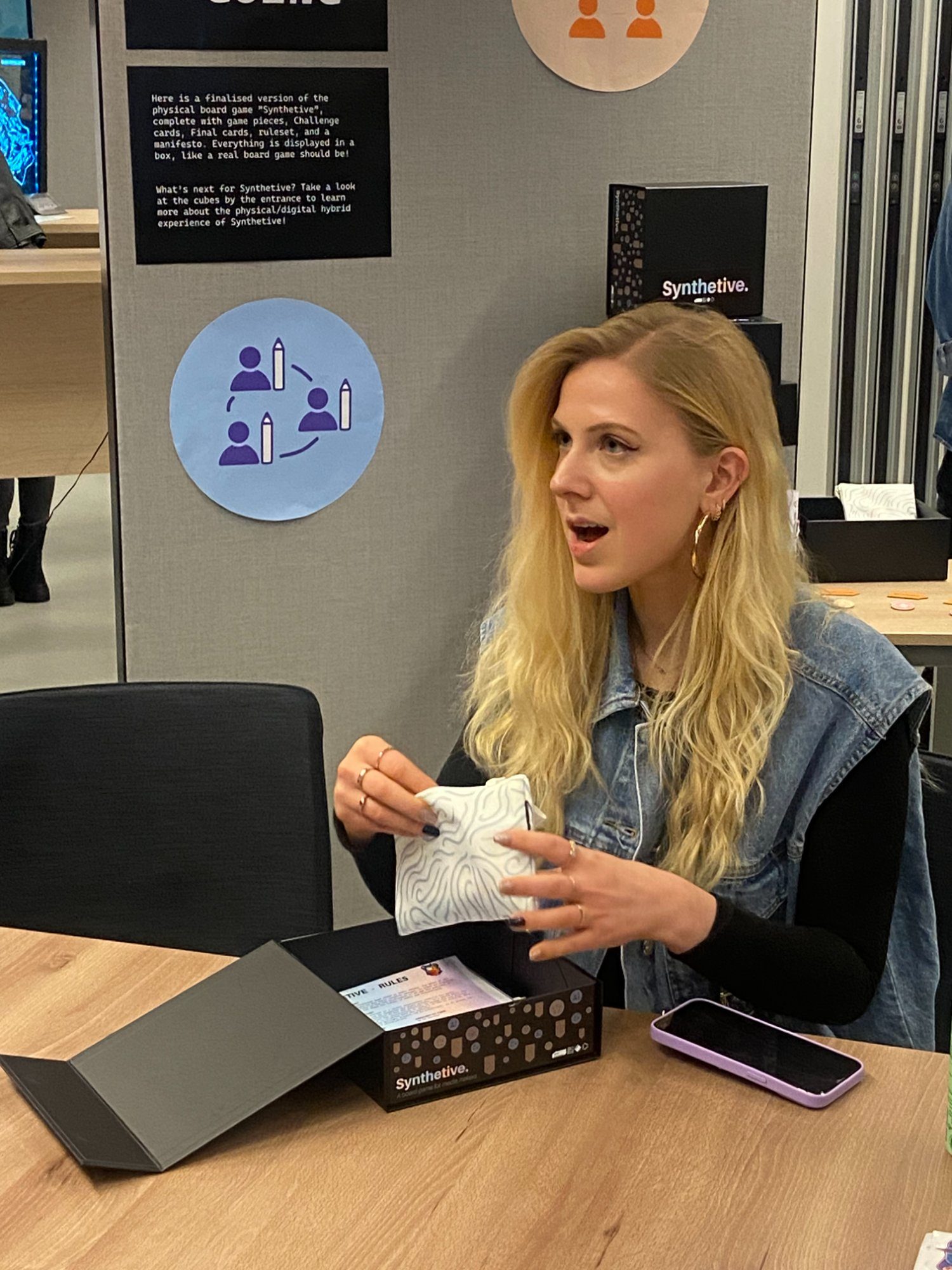
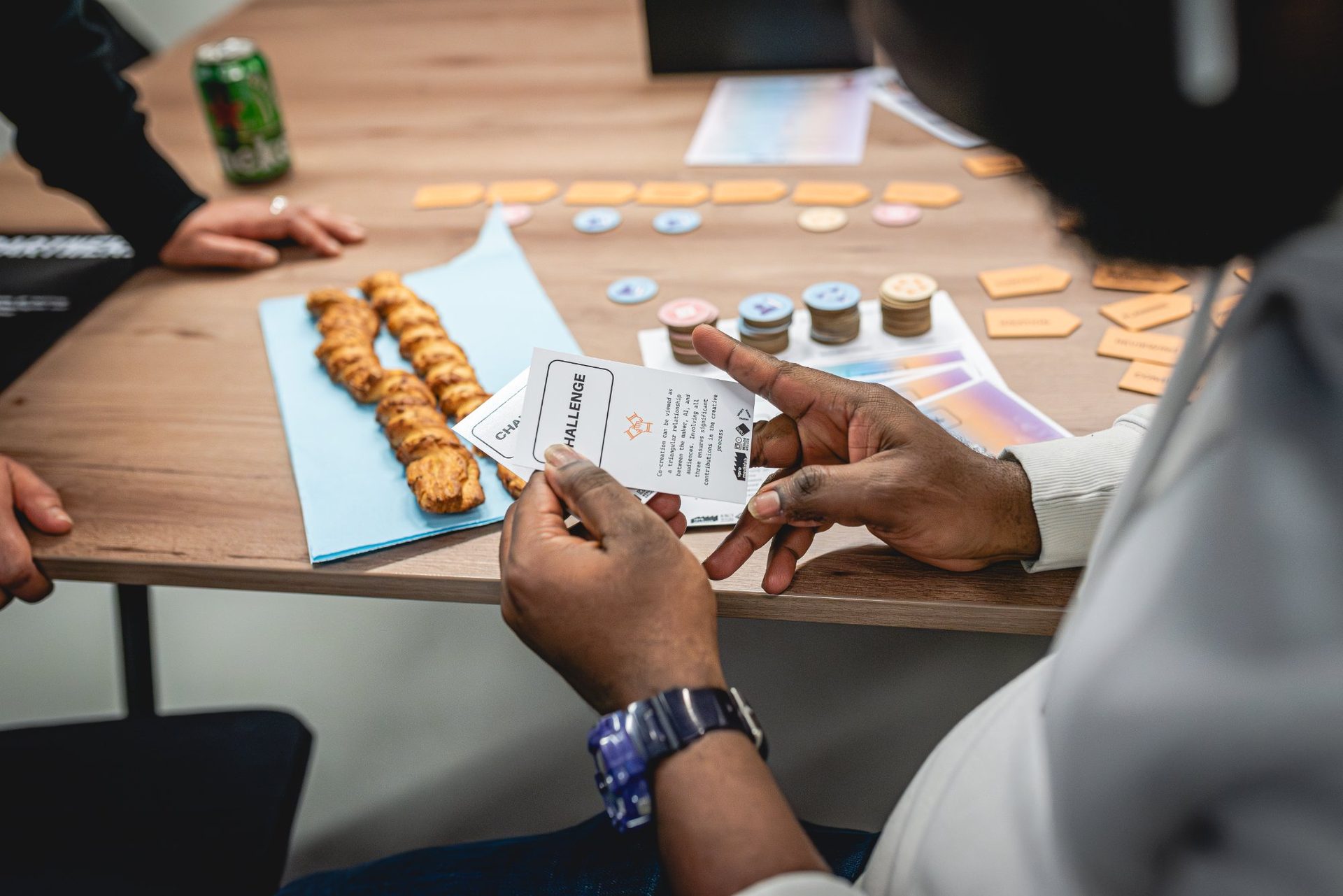
The output was Synthetive — a physical card game featuring "WHAT IF…" scenario cards and "CHALLENGE:" response cards. Players take on the role of media makers navigating real-world AI dilemmas, debating creative and ethical choices together.
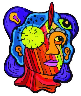
Synthetive's visual identity was designed to feel deliberately human and chaotic — a counterpoint to the clean sterility of generative AI. The psychedelic, layered face illustration became the project's signature mark, appearing on all game materials, social media, and launch communications.
WHAT IF… Cards
Scenario prompts designed to spark debate about AI co-creation — from deepfakes to algorithmic bias to creative authorship.
CHALLENGE: Cards
Practical response prompts that push players to think through real production decisions and editorial responsibilities.
15 Branded Game Boxes
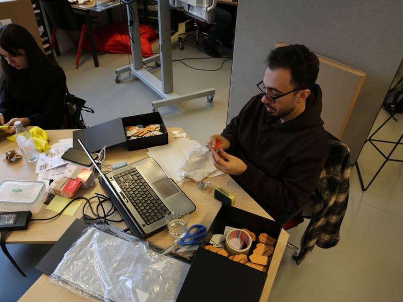
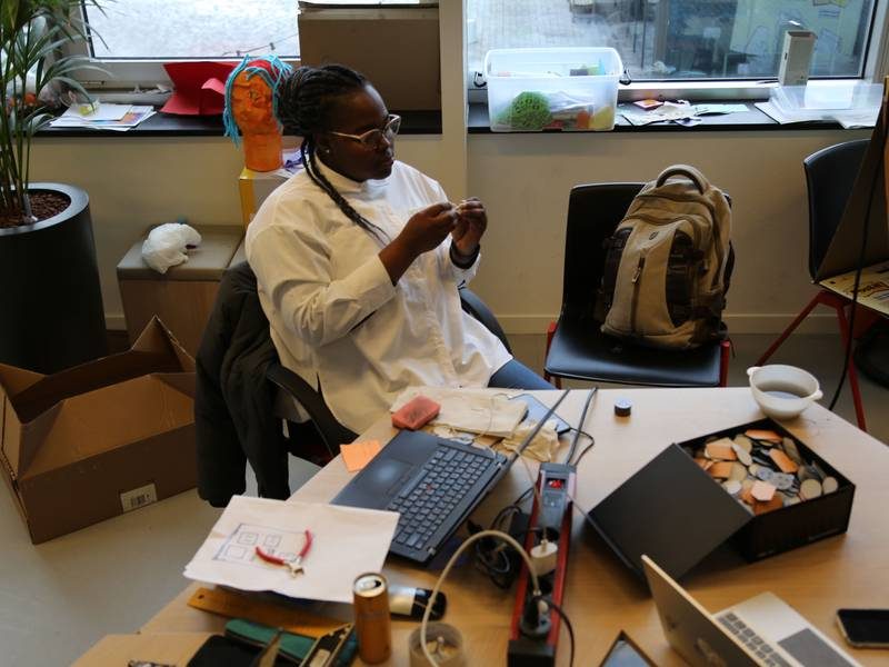
Custom-produced boxes distributed to industry partners including NPO Innovatie, VPRO MediaLab, and Beeld en Geluid.
In the wild
03 — Research & Design Process
Five sprints from research to launch
The project followed an intensive 5-sprint structure combining immersive field research with iterative game prototyping and real-world testing at public events and media industry conferences.
Sprint 1
Discovery
Stakeholder interviews · Empathy mapping · Persona development · How Might We framing
Sprint 2
Field Testing
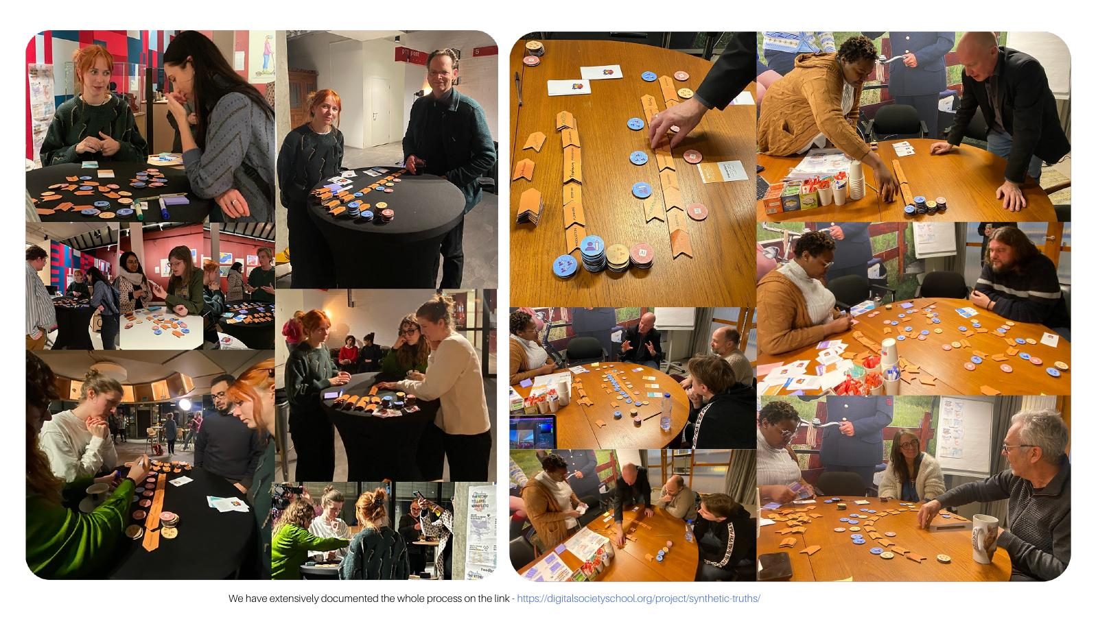
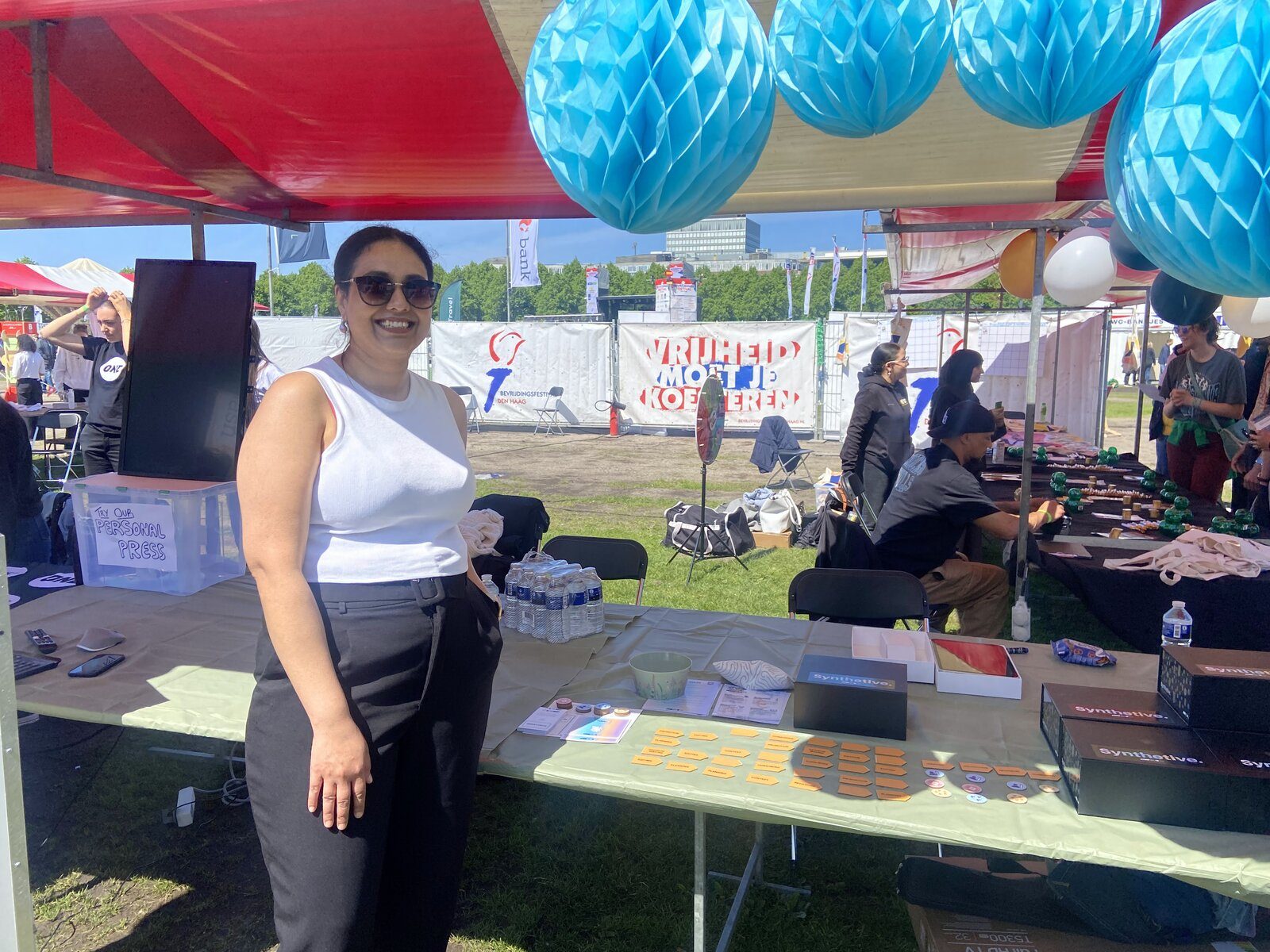
Society 5.0 Festival research booth · Board game + literacy quiz + survey + stickers + video
Sprint 3
Iteration
Prototype refinement based on 50+ participant sessions · Card wording & mechanic testing
Sprint 4
Brand System
Full visual identity · Game box design · Card typography · Social media campaign launch
Sprint 5
Launch
Distribution to 10+ media stakeholders · Presentation at NPO Innovatie, VPRO & Beeld en Geluid
The making of
Testing in the field
04 — Design Principles
Three principles that shaped every decision
Creating Inspiration
The game had to spark curiosity and creative confidence — not anxiety about AI. Every card prompt was designed to open possibility, not close it down.
Empowering Makers
The framework was built for media professionals who already know their craft. The design respected that expertise and gave them new tools to interrogate AI, not replace their judgment.
Designing for Joy
Media literacy doesn't have to be dry. The game's playfulness — bold colours, physical cards, competitive debate — made difficult conversations about AI feel engaging and memorable.
04 — Outcome & Recognition
From research booth to Dutch Parliament
50+
Research Participants
User interviews and field testing sessions conducted at public events and media industry festivals.
15
Game Boxes Distributed
To NPO Innovatie, VPRO MediaLab, and Beeld en Geluid — now actively used in media literacy workshops.
🏆
Go HvA Game Changers 2024
Public Choice Award — voted best project by the Go HvA community at the annual showcase.
🏛️
Dutch Parliament Presentation
Presented to the Digital Affairs Committee (Jun. 2024) — audience included Barbara Kathmann (Chair) and Ger Baron (CTO, Municipality of Amsterdam).
Persona photos via Pexels — Zoe Galarza, Murat IŞIK, Büşranur Aydın.
More Case Studies
Colour System · UI Design
TripGoGo
→
UX Research · Product Design
Digital Sustainability Benchmark
→
Motion Design · Storyboard · Brand Film
Ramco ERP
→
Product Design · HealthTech
Havells WellTech 🔒
→
Political Design · Media Literacy
Synthetive: Election Edition
→
Colour System · UI Design
Kleurensysteem · UI design
TripGoGo
Plan smarter. Travel better. — Building the visual language for a travel platform that lacked direction.
Slimmer plannen. Beter reizen. — De visuele taal opbouwen voor een reisplatform dat richting miste.
RoleRol
UI / Visual Designer
Type
Educational Internship · Amsterdam
Deliverables
Colour · UI
DurationDuur
Nov 2025 – Mar 2026
✦ Final Outcome
A complete design system that gave TripGoGo.ai a single voice.
End-to-end design system delivered — covering tokens, typography, spacing, grid, and a full component library in Figma. The product went from five conflicting blues to one coherent visual language, giving the team a shared source of truth they could build and ship from.
🎨
Design Tokens
Full colour, typography, and spacing token architecture replacing ad-hoc decisions across the codebase.
🧩
Component Library
Figma component set covering buttons, forms, cards, navigation, and states — with annotated prop tables for engineering.
📐
Design Principles
Five documented principles that now govern every future addition to the system — from accessibility contrast to motion hierarchy.
Delivered Nov 2025 – Mar 2026 · TripGoGo.ai · Full design system handoff
00 — Falling in Love with the Problem
A product that couldn't speak for itself.
I was handed a live travel-planning product — TripGoGo.ai — with real users, real ambition, and a design that said nothing consistent.
The first time I opened it, I counted five shades of the same blue across four screens, three different button radii, and three font stacks with no apparent logic. The visual language was shouting different things in every room.
I didn't want to just audit and document what was broken — I wanted to understand why the inconsistency had accumulated. So I spent the first three days not in Figma but in the product, using it as a traveller would.
The friction I felt wasn't just aesthetic — it was cognitive. Every screen created a small moment of doubt: am I still in the same product?
That's when the problem became personal. Design inconsistency isn't just about brand polish — it erodes trust. A traveller trusting a platform with a trip to Lisbon needs the interface to feel as reliable as the service promise.
The visual chaos was quietly undermining the product's credibility. I fell in love with this problem because fixing it wasn't about decoration — it was about restoring confidence in every pixel.
The deeper I went, the more I saw: no shared tokens, no spacing scale, no documented decisions. Every component had been rebuilt from scratch in isolation — developers guessing what designers intended, designers guessing what developers had shipped.
The system had no memory. What was needed wasn't a visual refresh — it was a single source of truth the whole team could speak from.
Design inconsistency is not a cosmetic problem — it is a trust problem. Every mismatched component quietly signals: we don't have this together.
5
conflicting blue shades across screens at audit start
3
separate font stacks with no documented hierarchy
0
shared design tokens or spacing scale before the system
0A — Stakeholder Map
Who lives inside a design system decision.
A design system touches every person in a product organisation — from the founders who set vision to the engineers who implement it and the travellers who ultimately feel it. Mapping this web early shaped every decision about what to standardise and what to leave flexible.
Primary Users — People who experience the inconsistency daily
✈️
The Digital Traveller
Plans trips via TripGoGo.ai
🔁
The Returning User
Expects consistency across sessions
Internal Stakeholders — Product & Engineering
🎯
Product Manager
Owns the roadmap & priorities
👩💻
Frontend Developer
Implements components, needs specs
🏗️
Backend Engineer
Needs stable component contracts
📐
Product Designer
Maintains & extends the system
Decision Makers & Enablers
🚀
Founder / CEO
Drives brand vision & growth
📊
Growth Lead
Needs consistent conversion-focused UI
📱
QA Engineer
Tests against a defined standard
0B — User Personas
Three people I kept in the room.
Every token value, every component variant, every documented decision was filtered through the lens of these three people. When I wasn't sure whether to standardise or leave flexibility, I asked: what does this mean for each of them?
Aarav
Frontend Developer
26 · Amsterdam
"I just want to know what blue to use. Every sprint I'm making up spacing from scratch."
Needs
A single source of truth for colours & spacing
Components that are documented with prop tables
Clear accessibility guidance baked in
Frustrations
Rebuilding the same button for the third time
Conflicting specs between Figma and production
No versioning — things change with no announcement
Motivation: Wants to ship fast and confidently, without wondering if his implementation looks "right".
Sara
Product Manager
31 · Amsterdam
"I keep hearing "we'll fix the design stuff later" — but later never comes and users keep asking why the app feels off."
Needs
Stakeholder-ready rationale for investing in a design system
Visible progress on design debt
A product that feels as premium as the travel experience it sells
Frustrations
Explaining branding inconsistency to investors
Feature requests that break existing patterns
No shared language between design and engineering
Motivation: Wants a product that reflects the ambition of the vision — and a team that can move fast without breaking things.
Nadia
Digital Traveller
34 · Berlin
"I almost didn't trust the payment screen — it looked different from every other screen. I wasn't sure I was still on the same site."
Needs
A visually coherent experience from landing to checkout
Clear feedback when actions succeed or fail
Accessible contrast on all interactive elements
Frustrations
UI that looks unfinished or inconsistent
Unclear primary actions — which button do I press?
Spending cognitive energy on interface rather than trip planning
Motivation: Just wants to plan the perfect trip without friction, confusion, or visual noise.
01 — The Problem
A brand with ambition but no visual system.
TripGoGo is a travel-planning platform with a strong product vision but an inconsistent, underdeveloped visual identity — an arbitrary colour system, mismatched UI components, no documented specs for developers.
The task: build a coherent, accessible design system from scratch — colour, typography, spacing, and a full component library, all working together.
02 — Key Decisions
Three decisions that shaped the work.
Not everything in this project was obvious. These were the calls that had real consequences — for the outcome, the team, and whether the work would actually hold.
Decision 01
Token-first architecture, not screen-first
Build the shared foundation — colour, type, and spacing tokens — before touching any component. Systems that retrofit tokens to existing work never actually hold. Starting with the architecture meant every downstream decision was made once.
Impact: every component derived from tokens — zero redesign cycles when brand evolved.
Decision 02
Constrain the colour system by principle, not taste
Moving from 5 conflicting blues to 1 coherent system meant defining a governing rule for colour decisions, not just picking a favourite. The colour principle — one primary, one semantic, one neutral — replaced opinion with structure.
Impact: developers stopped asking 'which blue?' — the system answered it.
Decision 03
Design principles as living gatekeepers
Five documented principles mean every future designer adds to the system rather than alongside it. Principles defined at the start of the work outlive the sprint, the project, and the individual contributor.
Impact: onboarding a new designer takes one document read, not a knowledge transfer session.
03 — The Work: UX Audit
Evaluating the live product to inform design decisions.
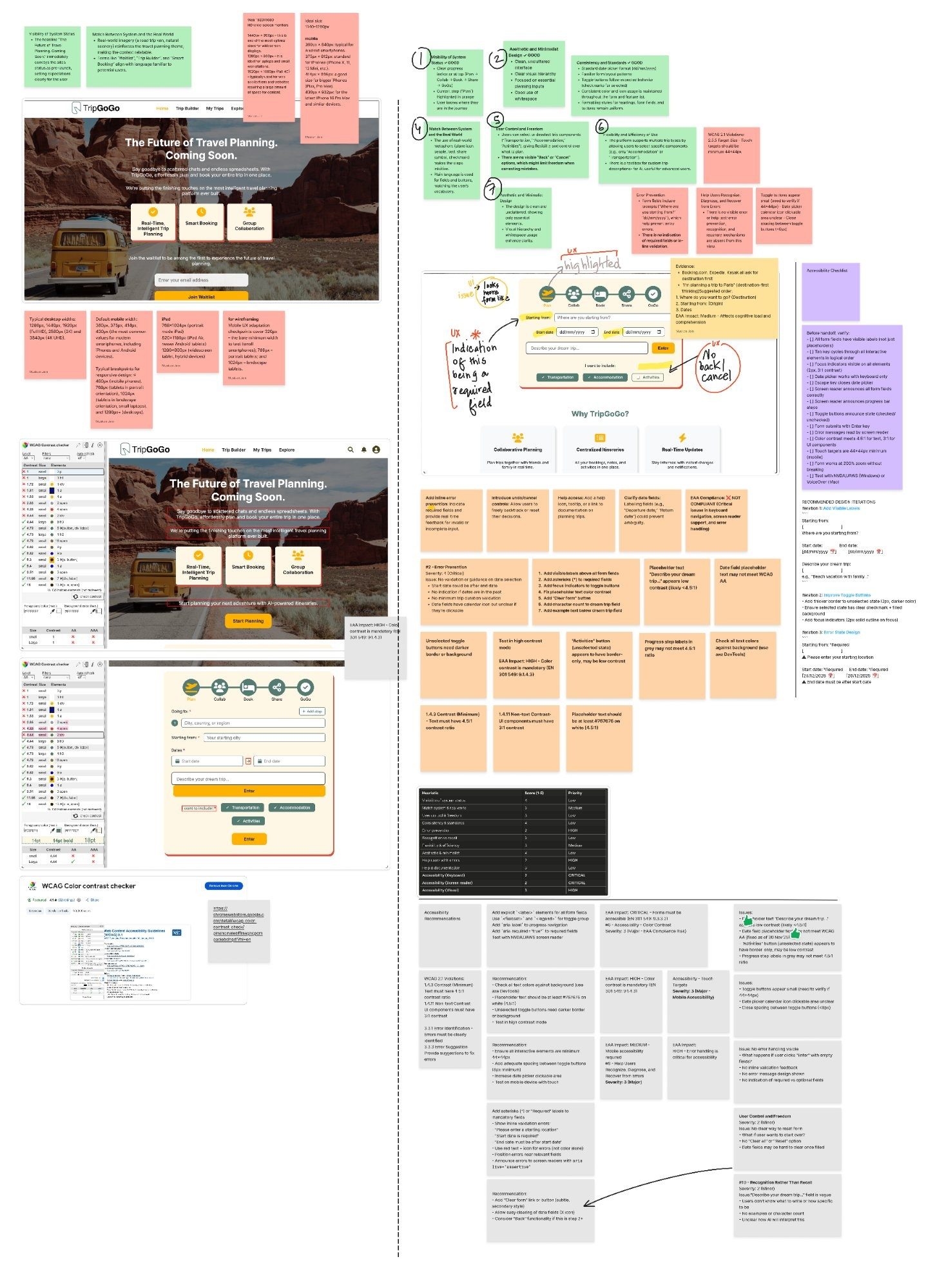
Alongside the design system work, I ran a comprehensive UX audit of the TripGoGo.ai homepage to surface usability and accessibility gaps.
It covered heuristic evaluation, responsive behaviour, WCAG contrast compliance, keyboard navigation, form validation, and screen reader support — producing a prioritised list of recommendations fed straight into the product roadmap.
The audit surfaced EAA and WCAG 2.1 compliance gaps — missing form labels, contrast failures, absent keyboard/screen-reader support, small touch targets, and no error validation.
The visual foundation is strong: hierarchy, progress signposting, and metaphor-driven navigation all hold up. Priority fix: explicit labelling and ARIA attributes, then contrast and error-handling.
The live product has been updated based on these findings —Visit tripgogo.ai →
03 — UI Changes
Design improvements informed by the audit.
Audit Outcomes — Changes Implemented
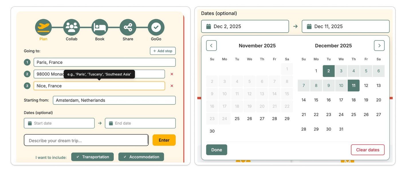
Multi-stop trip planner
Numbered destination fields with inline tooltips replacing a single ambiguous input
Progress indicator
5-step flow (Plan → Collab → Book → Share → GoGo) making the user journey transparent
Accessible date picker
Dual-month calendar with clear selection range, "Done" and "Clear dates" actions
Validated form fields
Real-time error states (red border), required field indicators, and clear error recovery
The updated trip planner (left) and accessible date picker (right) — key UI changes informed by the audit findings.
The bigger finding
The quick UI fixes worked — but the audit made something else clear: TripGoGo had no design system at all.
Every contrast failure, every inconsistent touch target, every unlabelled form field traced back to the same root cause: decisions made in isolation, with no shared visual language. Fixing individual screens was just a patch.
What the product needed was a foundation — a moodboard to align on brand direction, a colour system built to pass accessibility, and a component library that encoded the right decisions by default.
04 — Brand Moodboard
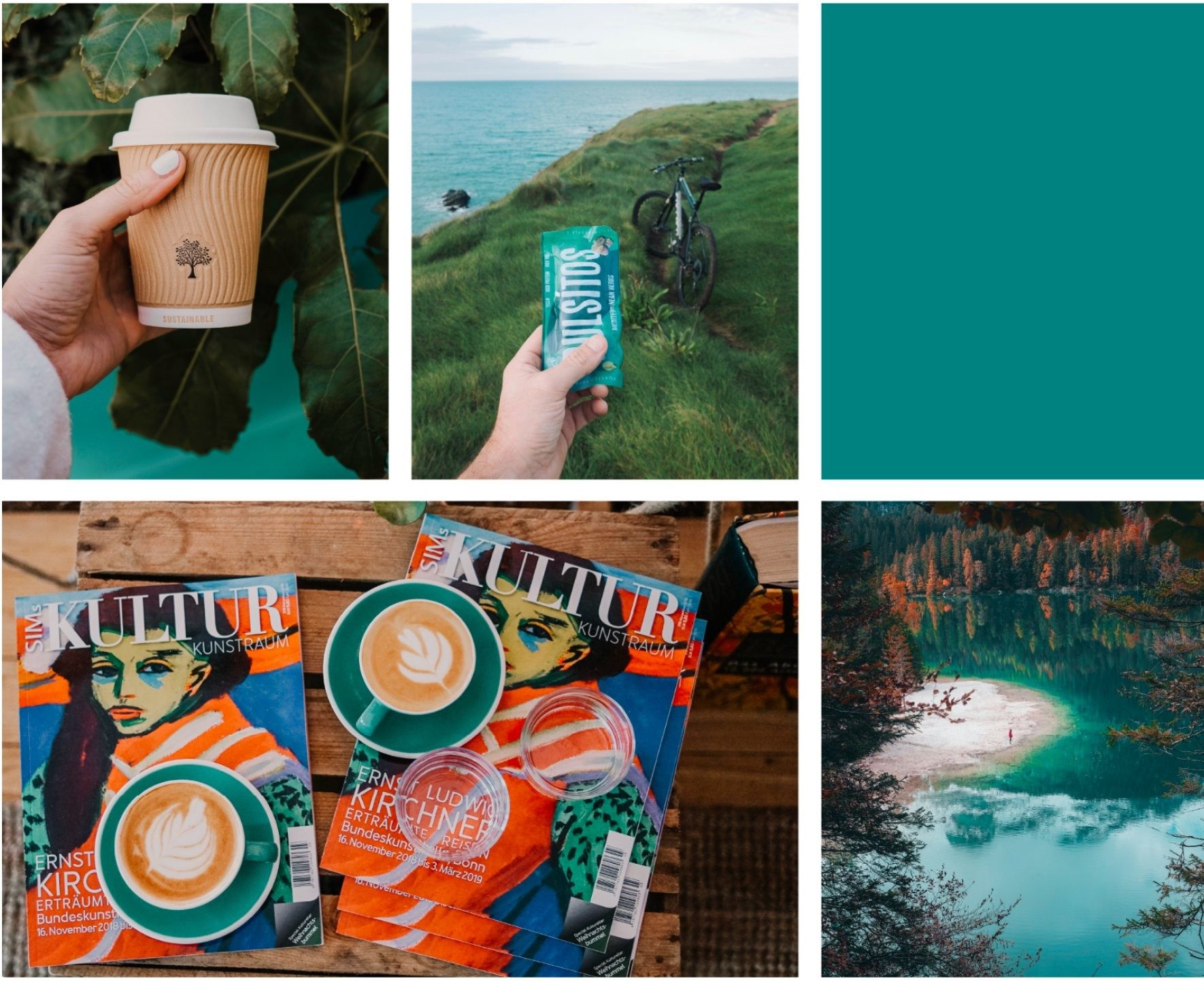
The visual mood, approved by the founder.
Before any colour swatches or component specs, the team aligned on a brand feeling. This moodboard — signed off by the founder — captured the essence of TripGoGo: teal as a grounding tone, the pleasure of slowing down.
Coffee culture, coastal cycling, natural materials, vivid local experiences. The design system had to feel this, not just match it.
Moodboard approved by the creative lead — informing the teal palette, warm textures, and lifestyle-first visual direction.
05 — Colour System
A palette built for travel and trust.
The primary colour is Teal — grounding the interface in calm confidence. A complementary Terracotta secondary adds warmth for highlights and accents. Each colour was developed into a 10-step scale, with every tone assigned a semantic purpose from headers to backgrounds. All combinations meet WCAG accessibility standards.
Primary — Teal
1009080706050★40302010
Secondary — Terracotta
Accent & Utility
Warning #FFB520
Success #4ADED1
Error #EF5350
White #FFFFFF
Black #000000
06 — Typography
A scale designed for clarity at every size.
The system uses Inter as the primary typeface (fallback: Arial, sans-serif), chosen for excellent legibility at both display and body sizes. All sizes are defined in rem for responsive scaling. The minimum body text is 16px with an 11.7:1 contrast ratio — exceeding WCAG AAA.
H1 — Hero Heading
48px / 3rem · Bold · lh 1.2
H2 — Section Heading
36px / 2.25rem · Bold · lh 1.3
H3 — Card Heading
24px / 1.5rem · Semi-bold · lh 1.4
Body Large — Lead text for important content
18px / 1.125rem · Regular · lh 1.6
Body — Default paragraph text for readability
16px / 1rem · Regular · lh 1.6
Small — Captions, labels, meta info
14px / 0.875rem · Regular · lh 1.5
Accessibility
Min 16px body · 11.7:1 contrast (WCAG AAA) · Max 75 chars/line
Responsive
Mobile: −12.5% (H1 → 42px) · Use rem units throughout
07 — Spacing & Grid
An 8-point system on a 12-column grid.
All spacing follows an 8-point scale for consistency and predictability. Layouts use a 12-column grid at desktop (1440px), collapsing to 8 columns on tablet and 4 on mobile. Component rules ensure consistent rhythm across the entire product.
Every component was built with at least three states (default, hover, disabled), clear sizing tokens, and documented accessibility requirements. The library covers the full booking and browsing flow.
Button System
Primary
Default · Hover
Secondary
Default · Hover
Sizing: 48px (L) · 40px (M) · 32px (S) · Min width 120px · Border-radius: 8px · Min touch target: 44px
09 — Design Principles
Principles that keep the system coherent at scale.
Four guiding principles — covering layout, interaction, mobile-first thinking, and dark mode — are documented to help any designer or developer extend the system without breaking its visual language.
Layout
White space min 48px · Hierarchy via size, weight & colour · Left-align text; center only titles/CTAs
Interactions
Skeleton screens for loading · Empty states always include a next action · Micro-interactions 200–300ms
Mobile-First
44×44px touch targets · Primary actions in bottom third · Lazy load & minimal animations on mobile
Dark Mode
#0A3D3D main bg · #1B9999 cards · White headings · WCAG AAA (7:1) contrast
04 — Outcome & Learnings
What this project taught me.
Audit before design
Starting with a UX audit on the live product gave the design system real grounding. Every colour, spacing, and component decision had a reason tied to something broken or missing in the existing interface.
Accessibility is a design decision
The EAA and WCAG gaps found in the audit shaped the colour system from the start — contrast ratios, touch targets, and label structures were baked into the design tokens rather than retrofitted later.
Brand moodboards anchor systems
Having a founder-approved moodboard before building out the component library kept the design system cohesive. Without that reference, UI decisions tend to drift — especially across colour and type pairing.
Systems need stories
The design principles weren't written at the end — they emerged from the moodboard, the audit findings, and the component decisions. Naming them gave the team a shared language for on-brand decisions.
Persona photos via Pexels — hartono subagio, Eric Moura, ds rexy.
More Case Studies
UX Research · Product Design
Digital Sustainability Benchmark
→
Game Design · UX Research · Media Literacy
Synthetive
→
Motion Design · Storyboard · Brand Film
Ramco ERP
→
Product Design · HealthTech
Havells WellTech 🔒
→
Political Design · Media Literacy
Synthetive: Election Edition
→
ERP
Motion Design · Storyboard · Brand Film
Motion design · Storyboard · Merkfilm
Ramco ERP
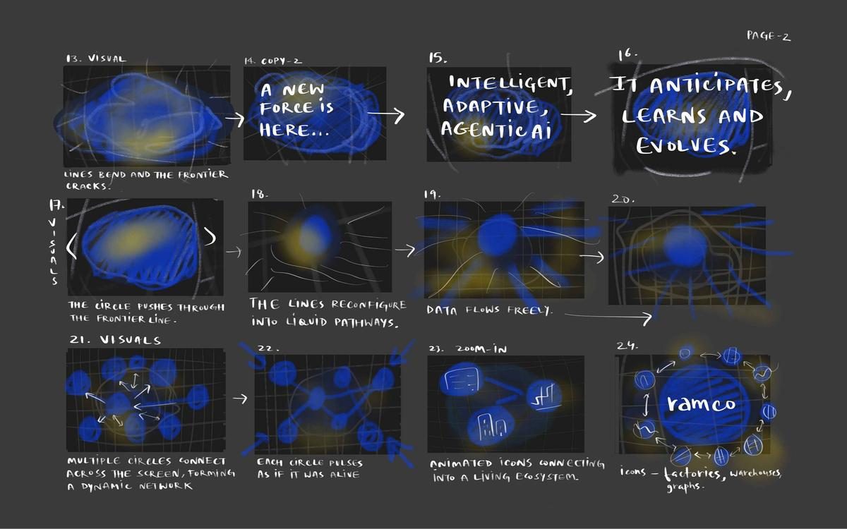
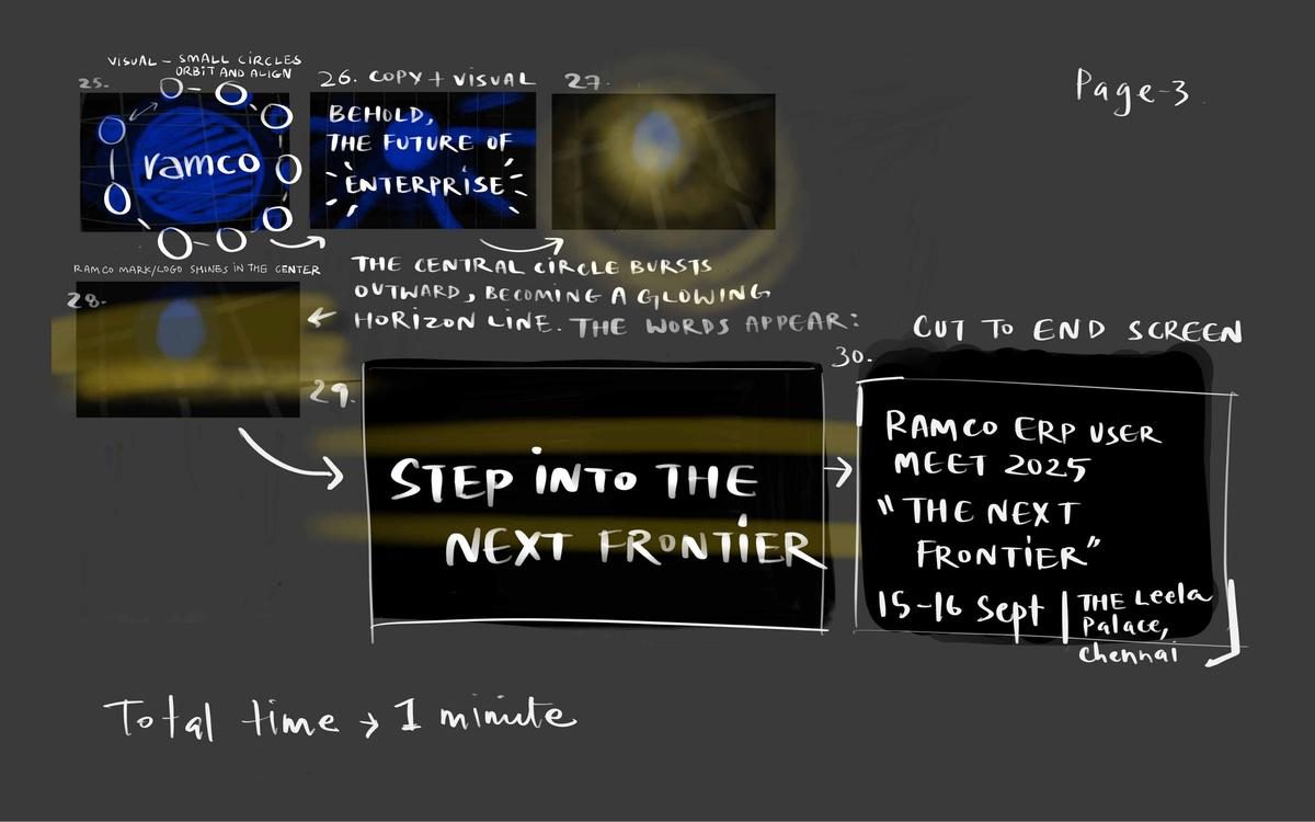
Step into the next frontier. — A 60-second LED screen animation for Ramco's flagship enterprise event, built from a 30-scene hand-drawn storyboard to final motion render.
Stap de volgende grens over. — Een LED-schermanimatie van 60 seconden voor Ramco's belangrijkste zakelijke evenement, opgebouwd van een handgetekend storyboard met 30 scènes tot de uiteindelijke motion render.
RoleRol
Motion Designer · Storyboard Artist
ClientKlant
Ramco Systems
Deliverable
LED screen animation · Storyboard (30 scenes)
Event
Ramco ERP User Meet 2025 · The Leela Palace, Chennai
✦ Final Outcome
A 90-second motion film screened live at The Leela Palace, Chennai.
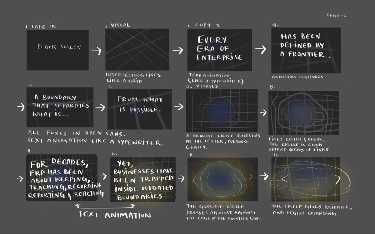
Designed and animated a full motion identity piece for Ramco ERP's annual user conference — rendered at 4608×768px for their ultra-wide LED stage screen. Storyboarded across 30 scenes, animated to a precise timing sheet, and screened in front of a live audience at The Leela Palace.
🎬
90-Second Film
4608×768px ultra-wide LED render · 25fps · 30-scene approved storyboard translated exactly into motion.
🏛️
Live Conference Screening
Screened at Ramco ERP User Meet 2025 at The Leela Palace, Chennai — in front of a live enterprise audience.
💡
Full Visual System
Grid-glitch aesthetic, organic orb meets geometric constraint, typewriter reveals — all established through iterative pre-production.
Ramco ERP User Meet 2025 · The Leela Palace, Chennai · 4608×768px LED · After Effects
00 — Falling in Love with the Problem
Enterprise events open in silence, or they open with intent. Nothing in between.
There's a particular quality to the opening moment of a major corporate conference. The room is full before it begins — 300 enterprise leaders, CIOs, operations directors, seated at The Leela Palace, Chennai, carrying the weight of every meeting they rescheduled to be there.
In that moment, the first visual they see either earns their attention or loses it. Most conferences lose it — a static logo, a presenter apologising for the microphone.
When Ramco Systems brought me the brief for their annual ERP User Meet — "The Next Frontier," centred on Agentic AI — I sat with the concept longer than usual. The theme asked a bold question: what does the frontier of enterprise intelligence actually look like?
Not metaphorically. Visually. In motion. In 60 seconds, on a wide-format LED screen, in front of the most rational, evidence-driven audience there is.
That tension became the problem I fell in love with: how do you make something deeply technical feel genuinely cinematic? ERP is about operational precision — supply chains, resource allocation, process intelligence.
The temptation in enterprise motion design is to render abstract data as abstract shapes and call it "futuristic." But the brief asked for something more honest: transformation an enterprise leader would find credible, not just impressive.
I spent two full days drawing storyboards before touching any software — thirty scenes, hand-sketched.
I needed to understand the emotional arc before I understood the visual vocabulary — what tone opens the room, what moment builds tension, what image makes 300 people feel they're about to step into something that matters.
An enterprise opening sequence is not decoration. It is a trust signal. In 60 seconds, it tells the room: the people who organised this understand what matters to you.
60s
to set the tone for a two-day conference shaping enterprise AI strategy
30
hand-drawn storyboard scenes before a single software frame was opened
300+
CIOs, operations directors, and enterprise leaders in the room
0A — Stakeholder Map
Everyone the 60-second film had to satisfy.
A motion piece for a flagship enterprise event is never just a creative brief — it sits at the intersection of brand reputation, conference production logistics, and the expectations of the most demanding professional audience. Understanding who held each veto shaped every storyboard revision.
Primary Audience — The Room
🏢
CIO / IT Director
Evaluating Agentic AI roadmap credibility
📊
Operations Director
Seeking intelligence for process optimisation
🎯
C-Suite Executive
Assessing Ramco's strategic positioning
Internal Stakeholders — Ramco
🚀
Ramco Marketing & Brand
Owns the "Next Frontier" narrative
👔
Senior Leadership
Sets the aspiration and approves the creative
🎪
Event Production Team
Responsible for technical delivery on LED
Production Chain
🎬
Motion Designer (MJ)
Concept, storyboard, animation, delivery
📽️
AV Production Partner
LED screen specs and render requirements
0B — User Personas
The three people in the room at 9:00 AM.
The animation needed to do different work for each person who would watch it. These personas shaped the emotional arc — what feeling the piece needed to create in the opening 10 seconds, and what it needed to have earned by second 55.
Prakash
CIO, Manufacturing Group
52 · Chennai
"I've seen fifty 'next frontier' presentations. I'll know in the first 20 seconds if this one is real."
Needs
Credibility — evidence that Ramco understands enterprise complexity
A visual metaphor that feels earned, not generic
To feel that attending this event was worth the schedule disruption
Frustrations
Corporate motion graphics that feel like stock footage
Grand claims without operational specificity
Events that treat CIOs as an audience to impress rather than a room to engage
Motivation: Wants to leave with a clear sense of where intelligent ERP is going — and whether Ramco is the right partner for that journey.
Deepa
VP Marketing, Ramco Systems
44 · Chennai
"The animation is the first thing they see. It needs to say 'Ramco' — confident, intelligent, not just technically capable."
Needs
A piece that elevates the event from 'conference' to 'experience'
Clear brand alignment — the Ramco visual language on a cinematic scale
An opening that makes her proud every time it plays
Frustrations
Creative that looks impressive in isolation but loses the brand
Last-minute revisions that compromise animation quality
Generic enterprise aesthetics that could belong to any tech company
Motivation: Wants the event to set a new standard for Ramco's conference identity — and for the opening film to become a reference point.
Muskan
Motion Designer — Me
· Amsterdam → Chennai
"How do you make 'Agentic AI in ERP' feel as cinematic as a space launch — without lying about what it is?"
Needs
A visual metaphor for transformation that enterprise leaders find credible
A 30-scene storyboard that functions as both creative bible and production plan
A render pipeline that delivers broadcast-quality output on time
Frustrations
The gap between 'futuristic' aesthetics and meaningful enterprise storytelling
Compression artefacts on wide-format LED rendering
The challenge of writing an emotional arc for a product category that resists emotion
Motivation: Wanted to prove that enterprise motion design can carry genuine narrative weight — that craft and commerce don't have to be opposites.
01 — The Problem
Opening a room full of enterprise leaders with motion
Ramco Systems needed a compelling opening animation for their annual ERP User Meet — "The Next Frontier" — held at The Leela Palace, Chennai (15–16 Sept 2025). The brief called for a 60-second film that could run on wide-format LED screens, setting the tone for a conference about Agentic AI, intelligent ERP, and the future of enterprise technology.
The animation needed to feel cinematic and bold — opening with restraint and building to a moment of transformation that introduced the Ramco brand and the "Step into the next frontier" tagline.
▶ Animation preview — LED screen render · 4608×768px · Ramco ERP User Meet 2025
Every era of enterprise...
The opening frame — blue wavy grid establishes a familiar, structured world.
Not anymore.
The disruption moment — a glowing burst shatters the grid. Energy pours in.
Step into the next frontier, where intelligence works for you.
The call to action — a kinetic landscape of possibility stretches to the edge of the screen.
Frame stills from final render · Intersection-2 · 4608×768px LED screen format
02 — Key Decisions
Three decisions that shaped the work.
Not everything in this project was obvious. These were the calls that had real consequences — for the outcome, the team, and whether the work would actually hold.
Decision 01
Storyboard before software
30 hand-drawn scenes before opening After Effects. Narrative logic first, motion grammar second. Animation without a story map produces impressive noise — technically skilled but emotionally empty. The board is where the film is actually made.
Impact: client sign-off on every scene before a single frame was animated — zero scope creep in production.
Decision 02
Grid-glitch as visual language, not aesthetic decoration
The decision to combine a precision data grid with an organic glitch aesthetic wasn't random. The grid references ERP's operational precision. The glitch references transformation. Both elements came from the same source — the brief — not from trend-following.
Impact: the visual system read as intentional and coherent to a technical enterprise audience, not arbitrary.
Decision 03
Three-act dramatic structure in 90 seconds
Act I: constraint (the current state). Act II: emergence (the shift). Act III: horizon (the future). Without a dramatic arc, even polished motion design reads as a showreel, not an argument. Enterprise audiences are evidence-driven — they need a narrative, not just spectacle.
Impact: screened without introduction — the film opened the room on its own terms.
03 — The Work: Storyboard
30 scenes, hand-drawn from concept to screen
Before a single frame was animated, the entire narrative was mapped across 30 storyboard panels — from "black screen fade-in" to the final end card for the Ramco User Meet 2025.
Page 1 — Scenes 1–12 · Constraint & Boundary
Page 2 — Scenes 13–24 · Breakthrough & Ecosystem
Page 3 — Scenes 25–30 · Ramco Reveal & Tagline
03 — Narrative Arc
Three acts in sixty seconds
ACT I — Constraint
A glowing blue orb pulses behind a rigid grid. Typewriter text: "Every era of enterprise has been defined by a frontier. A boundary that separates what is from what is possible."
ACT II — Breakthrough
The orb pushes through the frontier line. Grid lines reconfigure into liquid pathways. A living network forms. "Intelligent, Adaptive, Agentic AI. It anticipates, learns and evolves."
ACT III — Ramco Reveal
The circle bursts outward into a glowing horizon. The Ramco mark shines. "Behold, the future of enterprise. Step into the next frontier." End card: 15–16 Sept · The Leela Palace, Chennai.
04 — Discarded Iterations
What got cut — and why
Before arriving at the final visual language, two distinct directions were explored and ultimately rejected. Showing the discard pile is part of the process: each rejected version clarified what the final needed to be.
Shot 1a — Discarded
Dark vanishing-point grid with neon blue lines. Too cinematic — felt more sci-fi than enterprise. The perspective depth competed with the copy rather than supporting it.
Shot 1b — Discarded
Wavy intersecting white grid on Ramco blue. Closer to the final direction, but the grid felt too decorative — it needed to feel alive and under tension. The breakthrough moment wasn't landing.
Both iterations informed the final: the tension of the dark grid + the brand-aligned blue of Shot 1b = the glowing orb trapped behind lines that defined the final act structure.
04 — Outcome & Craft
Motion language built for LED at scale
Format
4608×768px ultra-wide LED screen · Rendered at 25fps · 90-second runtime including extended loop sections for venue playback
Typography
Open Sans throughout · Typewriter animation for all text reveals · Letter-spacing adjusted for wide-format legibility at distance
Visual System
Ramco brand blue · Intersecting grid lines that glitch, bend, and reconfigure · Glowing organic orbs against geometric grids — tension between constraint and freedom
Process
Full 30-scene storyboard approved before animation began · Hand-drawn narrative boards mapped to timing sheet · Final animation produced to exact storyboard specifications
06 — Iteration Reel
The direction that didn't make the stage — but made the final film.
This iteration of the Intersection motion piece wasn't used at the Ramco conference. It was an earlier explorative render — pushing the metaphor further with more aggressive geometric fragmentation and a different rhythm. The conference version pulled back from this intensity.
But this render was the turning point that locked in the visual language: the grid-glitch aesthetic, the orb-meets-geometry tension, the typewriter cadence that made it into the final cut. Every key decision in the approved film traces back here.
Iteration reel — not screened at conference · Guided the approved final output
Persona photos via Pexels — Vishal Kampani, Speak Media Uganda.
More Case Studies
Colour System · UI Design
TripGoGo
→
UX Research · Product Design
Digital Sustainability Benchmark
→
Game Design · UX Research · Media Literacy
Synthetive
→
Product Design · HealthTech
Havells WellTech 🔒
→
Political Design · Media Literacy
Synthetive: Election Edition
→
🔒
Confidential Project
This case study is protected. Enter the password to view, or request access.
🔒
Internal · Confidential · This project was completed under NDA. Client name, proprietary data, and strategic outputs have been partially redacted. Available in full during interviews upon request.
Product Research & Strategy · Havells India
Havells WellTech
A comprehensive consumer research and product strategy for Havells — defining a new home healthcare brand, WellTech, to capture India's fast-growing at-home diagnostics and wellness market.
Research → Synthesis → Persona development → Market sizing → Strategy framework → Board-ready deck
✦ Final Outcome
A board-ready strategic brief delivered to Havells stakeholders.
Led end-to-end strategic research and synthesised it into a classification-level internal brief — covering consumer behavior, physician and patient personas, market sizing, competitive landscape, and a phased go-to-market framework. Presented directly to Havells decision-makers.
📊
Strategic Research Brief
Consumer analysis, market sizing from BCG/FICCI data, persona construction, and competitive scan across Philips, Xiaomi, and Lapka.
🗺️
Go-to-Market Framework
Phased market entry strategy covering product positioning, distribution channels, and prioritisation logic for Havells's health-tech expansion.
🎯
Presented to Stakeholders
Delivered as a board-ready deck to Havells leadership — the output of a research sprint, not a design exercise.
Havells India · Classification-level internal strategy · Presented to senior stakeholders
00 — Falling in Love with the Problem
India's most intimate health decisions were happening without tools designed for them.
It was August 2020, the third month of a pandemic that had turned every home into an improvised clinic. I'd watched my mother manage her blood pressure with a device that showed numbers without context, beeping in a language of its own — watched friends photograph their grandmother's test strips and WhatsApp them to doctors three cities away.
Healthcare was moving into the home — but products built for clinical settings were migrating wholesale, without redesign, without reimagination.
When Havells India — one of India's most established consumer electronics brands — began exploring home healthcare, I was part of the product strategy team defining the market, the consumer, and the brand positioning.
What I found, quickly, was that the ₹27,500 crore opportunity wasn't primarily a technology gap. It was an empathy gap.
Existing home health devices were built on the mental model of a clinical encounter: the patient is passive, the reading is a number, the interpretation happens elsewhere.
But the people buying these products — a diabetic husband managing his insulin, a pregnant woman far from her parents' home, an elderly woman whose children live in another city — weren't patients seeking clinical precision. They were people seeking confidence in their own body's story.
I fell in love with this problem because it was a design problem disguised as a market research project. The data told us there were 55 million addressable households — but the real opportunity was only visible when you sat with the people living it.
The brand Havells needed wasn't "medical-grade home diagnostics." It was something warmer: a trusted companion for health at home.
The gap in India's home healthcare market was not a technology gap. It was an empathy gap — the space between clinical data and human confidence.
₹27,500 Cr
addressable market for home healthcare in India
67%
urban consumers expressing interest in at-home diagnostics monitoring
3 weeks
from research brief to board-ready strategy framework — August 2020
0A — Stakeholder Map
A market shaped by trust, not technology.
Home healthcare is unusual as a product category — the buying decision and the using decision often involve different people, and the moment of use is the most vulnerable moment in a person's day. This complexity made stakeholder mapping not just strategic but ethically necessary.
Constructed from primary research with patients and physicians across India — three patient types
(diabetic, pregnant, elderly) and two physician profiles (senior GP, young doctor).
Each persona came with a full day-in-life journey mapping their health device interactions.
Patient Persona 01 — Diabetic
Shekhar Sharma, 38
T1-D Patient · Sales Executive · Metros & Tier 1
Age Group
30–40
Income
₹1L+ per month
Location
Metros & Tier 1
Status
Married
Habits
Looks for personalised medical products before purchase
Purchases products that offer comfort
Keeps a record of his medical history
Pain Points / Needs
Diabetes test strips that are inexpensive and give accurate readings on the go
Mobile app that keeps a record of his medical history to share with doctor
Device with more storage capacity for continuous monitoring data
"I wish the health-care service that I receive responds as fast as possible when required to do so, through a relevant professional, along with readily available equipment for treatment."
A Day in the Life
Treatment & Devices: CGM device · Blood glucose monitor · Insulin pen · Medical history app
Patient Persona 02 — Pregnant
Rita, 29
1 Month Pregnant · Agile Transformation Lead · Bangalore
Occupation
Agile Transformation Leader, Target
Age
29
Location
Bangalore
Status
Married
Habits
Visits the doctor frequently
Monitors nutrition and fetal health daily
Pain Points / Needs
Unaware of tablets to be avoided
Worried about baby's health
Unsure of dietary restrictions
Unsure about activities to avoid
Doubts about changes in her body
Track growth and health of her child
Maintain regular appointments with gynaecologist
Assess nutritional deficiency at home
"I wish the health-care service that I receive helps me track the growth and health of my child."
Age 61 · New Delhi · Associate Professor, IHE Haus Khas
"In the coming times, Preventive Care will become most important. As doctors, we are encouraging our patients to live a healthy life to prevent diseases."
Hobbies
Travelling
Gardening
Embroidery
Sleeping late due to work stress
Specialisation
General Practitioner
MD Internal Medicine
Emergency Doctor
Devices Used
BP Monitor
Pulse Oximeter
Glucometer (if diabetic)
Thermometer
Steamer/Nebulizer (if asthmatic)
Physician Persona — Young Doctor
Dr. Archita Makharia
Age 25 · New Delhi · Mahatma Gandhi Hospital, Jodhpur
"Seek help at the earliest if you feel anything wrong instead of waiting till the very end."
Hobbies
Reading novels
Watching shows & movies
Learning new languages
Travelling
Specialisation
MBBS, AFMC
Pursuing MD (MG Hospital)
Both parents are doctors
Devices Used
Glucometer
Pulse Oximeter
BP Instrument
Thermometer
Frustrations
Too many working hours
Patient overload
Emotionally and physically tiring at times
Explaining poor prognosis to patients
★ The Havells Vision
Getting deeper into homes — from cables to health tech.
Havells' trajectory from industrial cable to 20 product verticals powering ~70% of India's electric sockets.
The brief was to visualise this expansion — artistic, bold, designer-vision-forward.
This image was part of the internal strategic orientation I developed for the WellTech opportunity.
Colour System · UI Design
TripGoGo
→
UX Research · Product Design
Digital Sustainability Benchmark
→
Game Design · UX Research · Media Literacy
Synthetive
→
Motion Design · Storyboard · Brand Film
Ramco ERP
→
Political Design · Media Literacy
Synthetive: Election Edition
→
Game Design · AI Literacy · Election Ethics
Synthetive:
Election Edition
A follow-up to Synthetive — reimagined for the political arena. An interactive boardgame that places participants inside an AI-powered election campaign, forcing them to confront real tradeoffs between strategy, ethics, and democratic responsibility.
Game DesignAI EthicsWorkshop FacilitationUX ResearchDigital LiteracyCommissioned · DSS
Partners & Collaborators
VPRO Medialab · CoECI · DSS · NPO · HvA · Sustainable Media Lab
Funded by
Centre Expertise Creative Innovation
Presented at
VPRO Medialab · Society 5.0 (Oct 2024) MozFest Workshop
✦ Final Outcome
A game where AI runs a political campaign — and players decide what’s real.
Election Edition extended Synthetive's core tension into the domain of democratic participation: AI-generated candidates, synthetic manifestos, and a player tasked with distinguishing persuasion from manipulation. Screened and played at three international venues across 2024.
🗳️
Playable Political Simulation
A complete game loop where players navigate an AI-run election — voting, questioning, and ultimately confronting what's authentic.
🌐
Three International Venues
Exhibited at IMPAKT Festival (Utrecht), ZERO Medialab (Society 5.0), and MozFest Workshop — each with live audience play.
🤖
AI Literacy Through Play
Designed to leave players with a concrete felt understanding of how AI can shape democratic information environments.
IMPAKT Festival Utrecht · ZERO Medialab Society 5.0 · MozFest Workshop · Oct 2024
00 — Falling in Love with the Problem
Democracy is being reshaped by tools that most voters can't name.
In the weeks after the 2023 Dutch elections, I found myself down a research rabbit hole. Post-election analyses kept repeating the same phrase: "AI-generated content influenced voter perception."
But none went deeper — they documented the fact without offering any way to understand it, let alone address it. The problem was framed as inevitable, like weather.
The statistic that stopped me cold: 46% of EU residents lack the basic digital skills needed to make informed political decisions — and the gap cut across demographics, not just older generations.
The 2023 Dutch elections had already surfaced deepfakes and AI-disinformation circulating at scale. I became preoccupied with one question: what does it actually feel like to run an AI-powered political campaign from the inside?
The original Synthetive game had taught me that experiential learning builds a different kind of understanding than information does. If you want someone to develop moral intuition around AI use, you put them in the decision-maker's seat, not the observer's.
The Election Edition emerged from a simple provocation: what if people could experience the seductive pull of AI campaign tools — then be forced to confront what they'd done?
This wasn't about scare tactics or moral lecturing — it was about making democratic responsibility felt. Political AI tools aren't intrinsically malicious; they're tools that amplify choices. The problem is most citizens don't understand what choices are being made.
Building this game felt like an act of civic design: creating a space where the mechanics of AI-enabled campaigns become legible, debatable, and human.
The problem wasn't that people were deceived. The problem was that they had no framework for even knowing when to be suspicious. We built the game to give them one.
46%
EU residents lack digital skills for informed political decisions (AlgorithmWatch)
2023
Dutch elections — documented AI misinformation & deepfake incidents
30
participants per session — each one leaves with a different intuition about AI
0A — Stakeholder Map
An ecosystem spanning civic life and digital power.
The Election Edition operates at the intersection of politics, media, education, and technology. The stakeholder map shaped which ethical dilemmas we wrote into the challenge cards — because each stakeholder experiences AI in elections from a radically different position.
Workshop Participants — Primary Players
🗳️
Engaged Voter / Citizen
Wants to make informed decisions
📢
Political Campaign Manager
Navigates efficiency vs. ethics
📰
Journalist / Fact-Checker
Defending information integrity
🎓
Digital Literacy Educator
Building tools for critical thinking
Commissioning & Partner Organisations
🏛️
Dutch Parliament / CoECI
Digital governance & responsible IT
📡
VPRO Medialab
Responsible synthetic media exploration
🏫
Digital Society School / HvA
Education & civic innovation
🌍
MozFest / Global Civil Society
Open internet advocacy
Structural Actors in the System
🤖
AI Platform Developers
Build the tools campaigns use
📊
Data Brokers / Analytics
Enable targeted voter profiling
⚖️
Electoral Oversight Bodies
Regulate campaign behaviour
👥
General Public
Subject to AI-shaped political information
0B — User Personas
The three archetypes every workshop session surfaces.
After five public workshops from the Dutch Parliament to MozFest, these three players emerge consistently — sometimes in different people, sometimes in the same person across different rounds of the game.
Koen
Campaign Strategist (game role)
38 · Den Haag
"If the other campaign is using AI voter profiling, we don't have a choice. We have to as well."
Needs
Justification for ethically ambiguous AI use under competitive pressure
A framework for what 'responsible' actually means in a real campaign
Permission to draw a line — and know where it should be
Frustrations
Ethical guidelines that ignore competitive reality
The sense that "doing the right thing" means losing
Colleagues who use AI tools without acknowledging the tradeoffs
Motivation: Wants to win — but also wants to be able to look at the outcome and feel it was earned honestly.
Amara
Digital Literacy Facilitator
29 · Amsterdam
"I can explain what a deepfake is. What I can't do is make students feel why it matters."
Needs
Experiential tools that create felt understanding, not just information
A game mechanic that provokes genuine ethical discomfort
Content that stays current with fast-moving AI developments
Frustrations
Students who know the theory but make the same unreflective choices anyway
Dry case studies that don't replicate real pressure
Resources that feel dated by the time they're published
Motivation: Wants her students to leave the room with an intuition they didn't have when they walked in.
Eva
Engaged Voter, First-Time Player
22 · Rotterdam
"I thought I was good at spotting fake news. Then I played and realised I'd been making it."
Needs
To understand how AI political content is constructed
A safe, low-stakes space to develop scepticism
Language to explain what she experienced to others
Frustrations
Feeling powerless in the face of algorithmic political influence
News coverage that explains effects without explaining mechanisms
No practical tools for navigating AI-shaped information
Motivation: Wants to be an informed democratic participant in a world that feels increasingly opaque.
01 — The Problem
What happens when AI runs a political campaign?
Building on the original Synthetive boardgame, this edition places players in the role of an election campaign team deploying AI across every stage — from voter profiling and content ideation to targeted promotion and real-time adaptation. The game asks: what are the tradeoffs? What do we gain, and what do we risk?
The project responds to a documented crisis: 46% of EU residents lack the basic digital skills needed to make informed political decisions, and the 2023 Dutch elections were marked by misinformation and deepfakes.
Developed through Sprint 5 at the Digital Society School with VPRO Medialab and Amsterdam University of Applied Sciences, funded by CoECI, and selected for Society 5.0's Transform track — the game translates this urgency into lived experience.
46%
EU residents lack basic digital literacy skills (AlgorithmWatch)
30
Participants per workshop session
60 min
Workshop format — gameplay + reflection
3+
Public stages across 2024
02 — Key Decisions
Three decisions that shaped the work.
Not everything in this project was obvious. These were the calls that had real consequences — for the outcome, the team, and whether the work would actually hold.
Decision 01
Player as campaign manager, not spectator
Role assignment creates accountability that observation never can. A participant watching an AI run a campaign thinks critically; a participant running one feels the ethical weight personally. The game only generates real learning if you're inside the campaign, making real choices.
Impact: every playthrough produced genuine ethical discomfort — not sympathy, but recognition.
Decision 02
AI-generated content inside the game, not abstracted away
Real synthetic media — generated candidate profiles, fabricated manifestos, AI-produced campaign messages — was used as in-game material. Abstraction would have softened the tension. Authentic AI output created the authentic felt experience the game needed.
Impact: players couldn't separate their response to the game from their response to the real-world phenomenon.
Decision 03
The Storytellers Manifesto emerges from play, not precedes it
The five ethical principles in the Manifesto are not handed to players as a pre-game briefing. They emerge from the table — from the decisions players make and reflect on. Principles arrived at through experience stick in a way that received rules never do.
Impact: exhibited at three international venues — IMPAKT, VPRO Medialab, MozFest — to audiences beyond academia.
03 — The Work: The Game
Navigate AI through every stage of a campaign.
Players take on roles within a fictional political campaign — Researcher, Promoter, Creator, Editor, Strategist — and use AI tokens to augment their work across six campaign stages: Ideating, Doing Research, Planning, Creating, Promoting, and Reviewing. Challenge cards introduce ethical dilemmas mid-game, forcing the team to adapt.
Left: The game board — "How can AI sustain us?" with role tokens and campaign stages · Right: Participants at Society 5.0
03 — In the Wild
From a sprint project to three public stages.
Commissioned by Digital Society School, the Election Edition was brought to life across two major events in 2024 — first at MozFest in June, then at Society 5.0 in October. Each session ran as a 60-minute facilitated workshop with live gameplay, reflection, and audience feedback.
MozFest — June 2024· Life-size floor game · Pink lanyards · With Fabricated
Printable Game Materials
Rules & Personas
Final Cards
DSS Demo — June/July 2024· Dutch Parliament & Government Officials
Notable Attendees
Barbara Kathmann Chairman, Digital Affairs Committee · House of Representatives
Ger Baron CTO, Municipality of Amsterdam · Amsterdam AI
Frank Kresin Responsible IT
Geert Wissink Centre of Expertise AI
Part of a presentation on Responsible IT by Pascal Wiggers (AUAS). Received feedback from Frank Van der Velde.
UXCamp Amsterdam — June 29, 2024· HvA Wibautstraat · Synthetive: The Election Edition
Society 5.0 — VPRO Medialab Stage· Keynote · October 2024 · "Co-Creating the Future of AI, Media & Sustainability"
Society 5.0 — Workshop· HvA · Table-based · Up to 30 participants
04 — The Storytellers Manifesto
Five principles for responsible AI media.
We Challenge Current Mindsets
We re-imagine the role of the maker and encourage collaboration with technology, working in ways that transcend individuality and linearity.
We Tell Useful and Impactful Stories
Our stories aren't just seen or heard — they're felt, provoking emotions that inspire action, entertain, enlighten, and make meaningful impact.
We Improve Synthetic Media Literacy
We embrace awareness of bias in AI-generated content and educate audiences on the nuances of synthetic media.
We Use Synthetic Media Responsibly
We navigate content creation with awareness, ensuring authenticity, transparency, and integrity — respecting diverse perspectives and promoting empathy.
05 — My Role & Timeline
Game designer, researcher, and workshop facilitator.
Lead Designer & Facilitator
MJ
Muskan Jain
UX Design Trainee · Digital Product Designer
Digital Society School
Contracted by Digital Society School to design, produce, and facilitate two public workshops (MozFest June 2024 · Society 5.0 October 2024). Responsible for game design, UX research, all physical materials production, and visual design of game components.
Sustainable design researcher focusing on solutions that balance environmental impact and human needs. Co-facilitated the Society 5.0 and MozFest workshops.
Timeline
Contract Signed — April 2024
Commissioned by Digital Society School
Workshop design, production & facilitation for MozFest + Society 5.0 · Contracted by Gijs Gootjes, Strategy Director
Sprint 5 — Digital Society School
Game design & development sprint
DSS · Amsterdam University of Applied Sciences · In collaboration with NPO & VPRO
VPRO Medialab Presentation
Public showcase of Synthetive research framework
Audience of media professionals, broadcasters, and researchers
MozFest Workshop — June 2024
DSS Demo — Dutch Parliament
Presented to government & civic tech leaders
Barbara Kathmann (Digital Affairs Committee) · Ger Baron (CTO Amsterdam) · Frank Kresin
60-min session with barometer exercise + live gameplay
In partnership with Andy & Susannah from Fabricated · Global digital rights audience
UXCamp Amsterdam — June 29, 2024
Pitched & ran Synthetive: Election Edition with UX community
HvA Wibautstraat · Life-size floor game · 9:30 AM pitch session
46% of EU residents lack the basic digital skills required to make informed political decisions (AlgorithmWatch / European Commission). The 2023 Dutch elections were marked by misinformation and deepfakes — making AI literacy in an election context not just an academic exercise, but an urgent civic need.
04 — Outcome & Next
The game is a starting point, not an endpoint.
Synthetive and its Election Edition have been prototyped, tested publicly, and documented. The roadmap ahead points toward broader reach and deeper impact.
🎮
Digital & Hybrid Expansion
Expand into a digital platform or app with AI-generated scenarios and real-time events. Add AR assistants to blend digital and physical gameplay for immersive learning.
🎓
Educational Integration
Collaborate with universities for AI, media ethics, and sustainability courses. Develop digital literacy programmes targeting youth on AI's role in elections and responsible media.
🏛️
Government & Policy Simulation
Use Synthetive to simulate AI's impact on elections and policy decisions — helping policymakers assess risks like misinformation before they become crises.
📰
Corporate & Newsroom Training
Adapt Synthetive for companies and newsrooms to explore AI's role in ethical content production, customer engagement, and sustainability — promoting responsible AI and CSR.
"Synthetive goes beyond being a game — it's a tool for reflection on responsible innovation, creative collaboration, and sustainability."
Persona photos via Pexels — Wasin Pirom, Speak Media Uganda, NILU'Z FrameScape.
Memories embedded in a place disappear when people leave. Memory Ball is a hand-crafted sphere containing Amsterdam's map — and a digital layer that makes those stories visible, shareable, and permanent.
RoleRol
Designer · Maker · Researcher
Mentor
Iskander Smit · MDD'24–25
Exhibited
ThingsCon Generative Things · HvA · 14–15 Apr
Type
Physical installation + Web app
✦ Final Outcome
A physical object that holds the memory of a place — and lets it speak.
Memory Ball is a speculative design artefact and digital companion — a palm-sized object that archives the sensory and social memory of HvA's buildings before they are demolished. The physical installation and web layer were shown in exhibition, inviting visitors to leave and retrieve memory fragments.
🔮
Physical Artefact
A cast glass-and-resin object embedding archived material — photographs, sounds, personal accounts — from within the building.
📱
Digital Companion
Web application layer allowing visitors to contribute and access memory fragments linked to specific spatial coordinates.
🏛️
Shown in Exhibition
Installed and exhibited at HvA — engaging students, faculty, and visitors in an act of collective memory-making before demolition.
HvA Speculative Design · Physical installation + Web application · Memory preservation
00 — Falling in Love with the Problem
We have more tools to record memories than ever, and no way to leave them for the people who come next.
I walked into the Theo Thijssenhuis on my first day at Amsterdam University of Applied Sciences and felt the weight of it — not physically, but temporally. Students had been designing in it for decades. Protests had happened in its corridors. Breakthroughs. Late nights. First drafts of work that ended up in galleries.
And none of that was visible. The building had no memory.
I started asking around. Do you know who designed this? What happened here in 1992? The story of this particular stairwell? Almost nobody knew anything — yet everyone I asked was visibly moved by the question itself.
The stories existed, somewhere — in the people who'd walked these halls. But there was no mechanism for them to become part of the building's living knowledge.
That's the problem I fell in love with: not the technology of memory, but its geometry. When you leave a place, where do your memories go? Not your digital archive — your relationship with a particular corner, at a particular time of day, in a particular phase of your life.
We're generating more digital traces than any previous generation, yet losing the most situated, most irreplaceable kind of memory: the memory of place.
The Memory Ball emerged from asking: what if the memory could stay? What if a physical object — beautiful, holdable, permanent — could anchor a digital layer of accumulated stories? Not a screen. Not a QR code.
A sphere that holds a city's map, glows when you hold it, and invites you into a world of deposited memories. The prototype became a meditation on legacy — on designing for the people who'll arrive after you.
Every building is full of stories that leave when people leave. Memory Ball was designed to give those stories a place to stay.
750+
years of Amsterdam history accumulating invisibly in its buildings
0
existing mechanisms to access the Theo Thijssenhuis's living history in-situ
∞
stories waiting to be deposited — by anyone who has ever walked through
0A — Stakeholder Map
Every person who has ever stood in this building.
A memory archive for a place touches an unusually wide set of stakeholders — from current students who deposit memories to future visitors who receive them, from institutional archivists who curate to community members who have never been inside. Mapping this helped define what the system needed to protect as much as what it needed to enable.
Memory Depositors — People who leave stories
🎓
Current & Former Students
Have located, personal memories of the space
👩🏫
Faculty & Staff
Carry institutional memory across decades
🏛️
Alumni Network
Connect present meaning to historical context
🏗️
Original Architects / Makers
Know the intent behind the design
Memory Receivers — People who discover
🚶
Visitor / Curious Passerby
Encounters the object, enters the layer
🔬
Researcher / Historian
Uses the archive to understand the building's past
🌍
ThingsCon / Design Community
Engages with the speculative design provocation
Institutional & Structural Stakeholders
🏫
HvA Institution
Owns the space and its identity
📚
Archives & Special Collections
Custodians of institutional record
🤖
AI / Platform Infrastructure
Powers the conversational memory layer
🛡️
Data & Ethics Board
Protects memory contributors' rights
0B — User Personas
Three relationships with memory and place.
These personas shaped the interaction design of both the physical object and the digital layer — specifically, the balance between discovery and contribution, between receiving stories and leaving them.
Zeynep
Final-Year Design Student
24 · Amsterdam
"I've spent four years here. In a few months I'll be gone and this building won't know I existed."
Needs
A simple, low-friction way to leave something behind
The sense that her memory will be findable by someone who cares
Privacy control — ability to leave anonymously or under her name
Frustrations
Digital archives that feel institutional and impersonal
Social media posts that disappear into algorithms, not places
The feeling that leaving means disappearing completely
Motivation: Wants to contribute to the building's story — and feel that four years of work and growth meant something beyond her own portfolio.
Henk
Visiting Professional, ThingsCon
51 · Utrecht
"I've been in hundreds of interesting spaces. I almost never know what they meant to the people who made them."
Needs
An entry point into a building's human story, not just its function
Something tactile and beautiful that invites curiosity
A way to access depth without requiring prior knowledge
Frustrations
Spaces that are clearly full of meaning but give no access to it
Digital experiences that require account creation to engage
Speculative design that is conceptually interesting but experientially cold
Motivation: Wants to leave a building knowing more about it than when he entered — and to take a story home with him.
Iris
Institutional Archivist, HvA
46 · Amsterdam
"We have records of every building project. We have almost nothing of what happened inside them after they were built."
Needs
A community-powered archive that grows without centralised curation
Clear provenance and metadata on deposited memories
Ethical frameworks for memory ownership, consent, and deletion
Frustrations
The gap between institutional record and lived experience
Archives that are technically complete but humanly empty
Digital tools that capture data but not meaning
Motivation: Wants the HvA's buildings to accumulate not just history but humanity — a record that future students will want to access, not just scholars.
01 — The Problem
Buildings hold decades of stories. Nobody can access them.
Walking through Amsterdam, I kept thinking: every building, every corner holds countless stories — from the people who designed it, studied in it, worked in it, protested in it.
The Theo Thijssenhuis at Amsterdam University of Applied Sciences is buzzing with design innovation, yet the personal stories of everyone who walked these halls remained completely invisible.
In our hyperconnected world we're creating more digital memories than ever — yet so many slip away into forgotten hard drives and abandoned social media accounts. The central design question: "What if generative AI could transform spaces into interactive memory archives that preserve our digital legacy through conversation?"
750
Years of Amsterdam stories — invisible without a vessel
0
Existing mechanism to access TTH's living history on-site
A clear sphere. Amsterdam inside. Lit from within.
The Memory Ball is a handmade object — not a screen or a sensor. A clear acrylic sphere holds laser-cut discs etched with Amsterdam's canal map and the TTH building's footprint. Lit from beneath, it glows like a lantern. It's something you stop and pick up.
Left to right: Amber-lit prototype · Looking through the sphere · Two iterations · Components disassembled · Etched memory-network disc
03 — Key Decisions
Why physical? Why a sphere? Why Amsterdam inside?
Decision 01
Physical object — not a QR sticker.
A pure digital app would be invisible and ignored. The sphere earns attention through its presence alone — it's tactile, warm, and beautiful. The interaction begins before anyone opens their phone.
Decision 02
Amsterdam's map as the inner structure.
The laser-cut discs inside aren't decoration — they're the city's actual street grid and TTH's building footprint, made tangible. The sphere is a lens for the place itself. Different discs can represent different locations or memory layers.
Decision 03
AI assists — it never replaces.
The tool stores and shares stories with or without AI assistance, and always respects privacy. The AI prompts you to articulate what you feel; an anonymity toggle means you decide what's public and what stays yours.
04 — The Digital Layer
A web app as warm as the object it's paired with.
The visual language — cream backgrounds, rust-orange accents, serif headings — was chosen deliberately. It feels like a memory: warm, personal, slightly worn. Not clinical. Not a database.
Left: Homepage — "Preserving Digital Heritage at Theo Thijssenhuis" · Right: About Memory Ball — how it works
Left: Memory Timeline grouped by decade · Right: Share Your Memory form — needs a more conversational redesign (noted)
Exhibited at ThingsCon Generative Things — HvA, April 2025.
Memory Ball installed at Amsterdam University of Applied Sciences, Master Digital Design · 14–15 April · ThingsCon Generative Things
The working prototype — sphere, plinth with QR code, and web app — was exhibited at ThingsCon Generative Things alongside the MDD Master Digital Design graduation show at HvA. Visitors picked up the sphere, scanned the QR code, explored the Memory Timeline, and contributed their own stories.
The broader vision: wherever a Memory Ball is installed, each location becomes a node in a larger network of human experience. Walking through the Jordaan and hearing stories from residents across decades. Exploring any Amsterdam neighbourhood through the eyes of the people who shaped it.
"Memory Ball merges physical installation with a mobile app to reveal personal stories from the TTH building. Users explore interconnected memories through a map-based interface, fostering connection across time and place."
— Exhibition label, ThingsCon 2025
04 — Outcome & Next
The form needs to feel like a conversation. That's the next sprint.
The current memory submission form is functional but not conversational — it feels like a form, not a dialogue. The next design sprint will redesign this screen starting with "Why does this place matter to you?" rather than a structured title field. The goal: make adding a memory feel as natural as telling a story to a friend.
The city-scale ambition — multiple Memory Balls across Amsterdam's iconic locations for Amsterdam750 — remains the long-term vision. Each new location adds a node. Each node makes the network richer.
Redesign "Share Your Memory" — conversational
Prompt-first, form-second. Start with the question, not the field.
Scale to Amsterdam750
Deploy across iconic city locations — each ball a node in a city-wide memory network.
Build the interactive Memory Web
Turn the etched constellation disc into a live digital layer — tap a node, hear its story.
Persona photos via Pexels — DΛVΞ GΛRCIΛ, Daniel Hoffman Jackson, AI25.Studio AI GENERATIVE.
Story board
Writing · Published on Medium
Why storyboarding matters in B2B product development.
Role
Visual Designer
Company
Havells, Noida
Period
2019 – 2022
Deliverables
Storyboards · Published article · UX process documentation
01 — The Problem
"Everyone sees the same thing" is a dangerous assumption in B2B product teams.
At Havells' customer experience design studio, I was embedded in product teams building smart home and consumer electronics. Each project brought together engineers, product managers, and business stakeholders — all working from specs, briefs, and jargon-heavy documentation.
The gap? Nobody was visualising the user. Products were being scoped without a shared picture of who they were for, how they'd be discovered, or what the first interaction would feel like.
Over three years and dozens of products, storyboarding became my primary tool for collapsing that gap — turning user stories into frames that any stakeholder could read, challenge, and build on.
"I do all my work by storyboard, so as I draw the storyboard, the world gets more and more complex… it seems like my staff as well as the audience does not quite realise that this has happened. Do not tell them about it."
— Hayao Miyazaki
02 — Key Decisions
Three principles that shaped how I storyboarded.
Decision 01
The user is the hero — not the product.
Every storyboard started with a person — their context, motivation, and goal — before a single product feature was drawn. This kept product discussions from drifting into feature lists.
↳ Impact: Stakeholders empathised with users faster, shortening alignment sessions.
Decision 02
Keep it rough enough to invite edits.
Polished boards signal "done." Sketchy boards signal "discuss." I deliberately kept storyboards loose — pencil lines, handwritten captions — so cross-functional teams felt safe disagreeing with them.
Storyboards weren't handed off — they evolved. Updated after each sprint review, they became a shared record of why decisions were made, not just what was built.
↳ Impact: Onboarding new team members took hours instead of weeks.
03 — The Work
Five functions storyboarding served across Havells product work.
Each storyboard answered a different question — from "what does this product do?" to "who is this for?" to "how does it feel to use?"
The Work — 01
Visualising the product development process
For a Havells kitchen appliance, I drew a 9-frame board showing the product sitting idle, a user approaching, filling it, using it, and plugging it in. Product vision and experience defined — before engineering wrote a single line of code.
Storyboard for a Havells product concept — 9 frames, pencil on paper
The Work — 02
Adding emotion to product development
For a Havells TV app concept, I moved beyond function to feeling. The final frame shows a user elated as his medicine arrives at the door — the product's promise made tangible. That last frame became the team's north star for the entire feature set.
TV App storyboard — user discovers a doctor's recommendation and receives home delivery
The Work — 03
Building stories around new product concepts
For a smart home product requiring app-guided installation, I showed multiple use scenarios — online purchase, AR placement on a phone, and device monitoring at the office. Each scenario answered a different "how would a real person encounter this?" question for the stakeholder review.
Three scenario frames — purchase, AR setup, and device monitoring
The Work — 04
Describing user personas
Storyboards put a face to the user. This frame shows a persona at her office desk, receiving a device malfunction alert — specific enough to spark a conversation about notification design, edge cases, and user state that a written persona sheet never could.
"At Office" persona frame — a specific user moment surfaces real product questions
The Work — 05
Documenting existing user experience
Before designing a new product, I storyboarded the existing behaviour it would replace — like office colleagues ordering tea together. And for the Havells Sync App, I mapped how a user discovers the app, explores new product launches, and submits feature suggestions. This grounded the team in real behaviour before designing solutions.
Office tea break — existing user behaviour
Havells Sync App — discovery to feature submission
04 — Outcome
A 3-year practice that became a published methodology.
Storyboarding at Havells wasn't a one-off deliverable — it was the connective tissue between user research, product strategy, and engineering. Over three years, it was applied across smart home devices, mobile apps, and consumer electronics — each time reducing misalignment and surfacing user needs that wouldn't have appeared in a spec document.
I wrote this up as an article to capture what we learned — five reasons why visual storytelling is indispensable in product development. It was published on Medium and references work across multiple Havells product teams.
Havells Enviro Konnect Splash Illustration & Icon System
Designed the app icon, splash screen illustration, and the full UI icon set for Havells' solar panel
registration and monitoring app — from initial pencil sketches to Play Store launch.
Role
Product Designer
Client
Havells India
Year
2019–20
Deliverables
App icon · Splash illustration · UI icon set
✦ 01 — The Problem
Design an icon and illustration system for a solar monitoring app — making energy feel approachable.
Havells was launching Enviro Konnect — a B2C app for homeowners and field technicians to register and monitor solar panels. It needed a visual identity that felt modern and optimistic, not industrial.
The PM brief was clear: Havells brand red, a solar energy theme, and imagery that would look good on the Play Store listing.
I was responsible for the app icon, the splash screen illustration, and the full UI icon set — working
directly with the Product Manager to align on user scenarios and visual hierarchy decisions.
02 — Key Decisions
Three decisions that shaped the visual identity.
From icon to illustration, these were the calls that gave Enviro Konnect a coherent, launch-ready visual identity.
Decision 01
Pencil before vector
Three composition sketches before opening Illustrator. Getting the structural logic right — building density, solar panel placement, foreground depth — is faster in pencil than iterating in software. The sketch is where the illustration is actually designed.
Impact: first vector iteration was client-ready — no structural revisions needed.
Decision 02
H logoform as the anchor — not decoration
The icon is unmistakably Havells because the brand mark is the starting point, not an afterthought. Recognition first, solar theme second. An icon that leads with a solar illustration could belong to any energy brand — anchoring to the H made it unmistakably Havells.
Impact: icon shipped to Play Store instantly recognisable on any home screen grid.
Decision 03
PM collaboration as design input, not sign-off step
Every visual hierarchy decision — what appears on the splash screen, what appears at the top of the listing screens — aligned to user scenarios the PM had already mapped. Design informed by the product flow, not running parallel to it.
Impact: zero revision cycles on information hierarchy — PM and designer shared the same mental model.
✦ 03 — The Work
From logoform to launchable icon.
The brief anchored the icon in the Havells H logoform and the solar energy idea. I explored different
backgrounds, sun placements, cityscape elements, and gradient treatments before landing on the version
that shipped — clean, bold, and instantly Havells on any home screen.
Icon iterations — exploring background treatments, sun compositions, and the H logoform placement.
✦ Illustration process
Pencil first, vector second.
I always sketch to work out composition before going to vector. The PM brief: optimistic, modern,
unmistakably about solar energy — buildings with panels, a visible sun, warm Havells red.
Early pencil sketches — three composition explorations testing building density, foreground depth, and solar panel placement.
Final splash illustration — the cityscape that shipped with the app.
✦ Splash variants
Four colour stories, one composition.
Four colour variants were explored — deep red dusk, warm golden sunrise, midday blue sky, and sunset
amber — before the final version was selected. Each kept the same composition and layer structure; only
the colour tokens changed.
Four splash variants — same composition, different colour tokens.
✦ App in context
Illustration + registration flow, working together.
The splash illustration carried through into the login screen, giving the app a visual anchor before users reach the functional parts. The UI icons covered product categories, device scanning, and the empty state.
Play Store feature graphic — splash screen and home screen side by side.
Splash / loading
New / existing user
Login / sign in
Empty state icon
✦ Illustration in the header
The cityscape persists across every listing screen.
The header illustration carried through into the app's inner screens, peeking behind navigation bars on plant listing and detail views — keeping brand warmth present even in utility-heavy data screens.
My Solar Plants
Plant detail view
My Plants
✦ 04 — Outcome: Working with the PM
Decisions made with the product, not just for it.
PM collaboration
I worked directly with the Product Manager to align on user scenarios — field technician vs. homeowner — and translated those into visual hierarchy decisions: what appears above the fold, how device categories are iconised, and what the loading and empty states communicate.
Icon set
UI icons covered product categories (solar panels, inverters, batteries), device states, and navigation — all following the same stroke weight and optical sizing as the Havells brand icon language.
Live on Google Play
Shipped. 10,000+ downloads on Google Play.
The app launched on the Play Store and reached 10,000+ downloads. The illustration system — from splash
to header — gave the app a consistent visual identity that extended the Havells brand into a new digital
product category.
iSENSE
Hardware Design System · Smart Home · Havells / Crabtree
Hardware-designsystem · Smart home · Havells / Crabtree
Crabtree i-Sense Smart Switches Future of India's Smart Homes
A hardware design system for a smart home switch series — icon vocabulary, Pantone colour tokens,
physical dimensions, and a full SKU matrix designed to scale without redesign.
Real-world review of Crabtree iSense Smart Switches
An independent reviewer tests the iSense switches in a live home setup — covering installation,
the Havells DigiTap App, voice control, and day-to-day usability of the smart switch system.
⚠
Clicking the video will open YouTube in a new tab, outside this portfolio.
This is an external review — not affiliated with or produced by this portfolio.
01 — The Problem
Not one switch. A product family that had to think like a system.
Crabtree's iSense range needed to cover every smart home room — from a compact 2-module dimmer
to an 8-module command panel with dual fans, dimmers, switches, scenes, and a socket. Eight
SKUs across two colourway finishes, all shipping in Phase 1.
Without a shared design language, every new SKU would need its own icon decisions, colour calls,
and dimension specs — multiplying effort, introducing inconsistency, and making handover to
manufacturing ambiguous. The brief was to design it as a system from day one.
8
SKUs to design, Phase 1
2
Colourway finishes each SKU
3
Stakeholder groups to align
0
Existing design system to build on
✦ Key Skill — This Project
Designing at the intersection of business, manufacturing, and distribution.
The iSense project wasn't just about visual design — it required constant coordination across stakeholders with different priorities and languages.
As the sole product designer, a large part of my work was communication: translating design intent into business rationale, and market constraints back into design decisions.
🏢
Business Heads
Pitching design decisions upward
Presented the icon system, colour token rationale, and SKU matrix to senior business stakeholders —
framing design choices in terms of manufacturing scalability, brand consistency, and Phase-1 launch readiness.
🏪
Dealers & Distribution
Ground-level viability checks
Consulted dealers directly on product material viability and cost constraints — ensuring design
decisions were grounded in what the supply chain could actually deliver, not just what looked
good on paper.
⚙️
Manufacturing & Engineering
Spec handover without ambiguity
Delivered Pantone-locked colour specs and dimensioned SKU drawings that mechanical engineering
and manufacturing could execute directly — no design interpretation required on their end.
The lesson
On a hardware product at this scale, effective communication is a design output.
Getting a decision wrong at the business pitch stage, or missing a cost constraint from dealers,
would have meant a redesign cycle after tooling was already underway. Stakeholder alignment
wasn't a soft skill here — it was load-bearing.
02 — Key Decisions
Three decisions that shaped the final system.
Not everything in this project was obvious. These were the calls that had real consequences —
for manufacturing timelines, stakeholder buy-in, and whether the system would actually hold at scale.
Decision 01
Design the system first — not the products
The temptation was to design each SKU individually and find patterns later. I pushed back:
define the icon vocabulary, physical grid, and colour tokens first — then derive each product
from the system. This meant a slower start but eliminated redesign risk entirely.
Impact: every new SKU mapped onto existing tokens — zero redesign cycles in Phase 1.
Decision 02
Pantone over hex — spec for manufacturing, not screens
Colour tokens could have been delivered as hex values. But after consulting manufacturing and dealers on material feasibility, I specified every colour in Pantone — the language factories and suppliers actually use.
This was non-obvious, and required stakeholder alignment across business heads and the production team.
Impact: handover was unambiguous — manufacturing executed without needing design in the room.
Decision 03
Eliminate two colourways before pitching White & Graphite
A premium-dark panel with diamond LEDs, and an olive/bronze finish, were both designed at full fidelity and presented to stakeholders.
Eliminating them wasn't just an aesthetic call — I made the case to business heads with specific reasons: the diamond LED was inconsistent with the cross indicator language, and the bronze finish tested poorly in residential smart home settings.
Impact: business heads approved White & Graphite with confidence — no ambiguity about why the others were ruled out.
03 — The Work · Research & Exploration
Grounding the icon system in form principles
Icon direction was anchored in two form principles — LOOP (bold, circular, universal shapes)
and ELECTRIC (simple, interactive, geometric). The colour palette was explored to feel
residential and mood-lifting rather than industrial.
LOOP — Bold · Circular · Universal. Icon forms drawn from continuous, rounded shapes.
Every colour defined as a named token — Pantone-locked for manufacturing
Rather than specifying colours as hex values, every colour decision was translated into
a named Pantone reference — making it unambiguous for manufacturing across both finishes.
The same LED spotlight (PMS 311C) appears on every SKU in both White and Graphite.
White finish — Havells White
LED spotlightPantone PMS 311C
GridlinesCool Gray 1C
Icon colourCool Gray 1C
Graphite finish — Thames Gray
LED spotlightPantone PMS 311C
GridlinesSilencio / Jet / HexoBlack
Icon colourWhite
Design exploration · Option 3 — ruled out
Two directions explored and eliminated before landing on White & Graphite
A dark panel with diamond-shaped LEDs (premium-dark aesthetic) and an olive/bronze finish (warm, architectural tone) were both designed at full fidelity.
The diamond LED was eliminated for inconsistency with the cross indicator language; the bronze finish tested poorly in residential smart home settings.
Dark panel · Diamond-shaped LED indicator · Geyser icon set — eliminated.
Olive/Bronze finish · Option 3 — ruled out after contextual evaluation.
SKU specification drawings
Each SKU delivered as a dimensioned spec drawing — both finishes, production-ready
Every SKU was documented with physical dimensions, both colourway finishes, and the full icon
layout — the actual handover artefact passed to mechanical engineering and manufacturing.
The 92mm height is constant across all panels; only the width scales with module count.
Dot 2 · 2 ON/OFF Switch + 2 scenes · 90mm × 92mm
Dot 2 · Curtain · 1 Curtain Controller + 2 scenes · 90mm × 92mm — same module, new icon function
Every design decision was made once and inherited across SKUs. The icon set, LED cross,
physical grid, and Pantone references were treated as a shared grammar — not per-product
choices. Adding a new SKU meant mapping new functions onto existing tokens, not redesigning.
Pantone PMS 311C cyan cross — consistent across all 8 SKUs, both finishes. One token, never varied.
◎
Icon vocabulary
Fan, light, dimmer, curtain, scene — LOOP-style icons built once in the LOOP direction, mapped across all SKUs.
◐
Pantone colour tokens
Havells White / Thames Gray panels with Pantone-specified icons and gridlines — manufacturing-ready, no ambiguity.
Final product renders
White & Graphite — across module configurations
Compact 2×2 White & Graphite · Curtain controller variant
Phase-1 specifications
8 SKUs · 2 finishes · 1 shared system
Phase-1 specifications covered 8 SKU variants across 2–8 module sizes, all rated at
220–240V AC / 50Hz with 180–290VAC operating range. Every SKU designed to fit standard
metal box form factors.
SKU
Configuration
Modules
Width
Dot 2
1 Curtain Controller + 2 scenes
2M
90mm
1 Dot 3
1 Fan + 3 ON/OFF + 2 scenes
4M
155mm
1 Dot 5
1 Fan + 3 ON/OFF + 1 Dimmer + 2 scenes
6M
222mm
1 Dot 5
1 Fan + 3 ON/OFF + 1 Socket + 2 scenes
6M
222mm
1 Dot 7
1 Fan + 5 ON/OFF + 1 Dimmer + 4 scenes
8M
263mm
2 Dot 6
2 Fan + 6 ON/OFF + 2 scenes
8M
263mm
2 Dot 7
2 Fan + 4 ON/OFF + 1 Dimmer + 2 scenes
8M
263mm
2 Dot 7
2 Fan + 4 ON/OFF + 2 scenes + 1 Socket
8M
263mm
All SKUs: 220–240V AC · 50Hz · 180–290VAC operating range · Constant 92mm height
04 — Outcome
8 SKUs, 2 finishes, 1 system — designed once, handed over to manufacturing without ambiguity.
By treating icon, LED, grid, and colour as tokens rather than per-product decisions, the entire iSense Phase-1 range shares one vocabulary. Every new configuration inherits the system without a redesign cycle.
Handover was Pantone-specified and dimensioned — manufacturing could execute without design in the room.
8 SKUs, Phase 1
Dot 2 through 2 Dot 7 — all covered by one icon and grid system.
Pantone-locked
Every colour token specified to Pantone — unambiguous for manufacturing.
Dimensioned specs
Each SKU delivered as a production-ready dimensioned drawing in both finishes.
Zero redesign
New functions mapped onto existing tokens — no new visual system for each SKU launch.
✦ Real-World Impact
A full 2BHK automated for ₹50,000 — smart living, finally within reach.
Crabtree iSense makes whole-home automation accessible without expensive rewiring or a premium price tag. A standard 2BHK apartment — fans, lights, dimmers, scene presets — can be fully automated for around ₹50,000.
That brings Indian homes closer to smart living at a price previously unimaginable. Every switch is compliant with Bureau of Indian Standards (BIS).
~₹50K
Full 2BHK Automation
Fans, lights, dimmers & scene presets — no rewiring, no contractor needed.
BIS ✓
Bureau of Indian Standards
Certified safe for Indian homes — quality and compliance built in from day one.
0 min
Rewiring Required
Retrofits into existing switchboards — no walls broken, no electrician marathon.
3x
Ways to Control
Manual switchboard, Havells DigiTap App, or voice & remote — your home, your way.
Why this matters for India
Smart home technology has historically been priced out of reach for middle-class Indian households. iSense changes that — by building on existing wiring and standardising the hardware design system, Crabtree can offer BIS-certified smart switches at a price where automating your whole apartment costs less than a mid-range smartphone.
Energy-efficient by design and compliant with Indian safety standards, iSense is built for the scale and diversity of Indian homes.